Iconography
Icons enhance an experience by providing intuitive and efficient navigation, conveying information concisely, and making it more visually appealing.
#Updating our icons
These guidelines represent our intent for a unified and consistent icon style at Siteimprove. Currently, our platform suffers from an overabundance of icon styles accumulated over time. This inconsistency creates several problems:
- Diluted brand: A fragmented visual language weakens our brand identity and gives an impression of inconsistency.
- Confused users: Multiple styles hinder comprehension and make it harder for users to understand and interact with our products effectively.
- Reduced trust: A disjointed visual experience can negatively impact user trust and confidence in our platform.
- Operational inefficiency: Maintaining multiple icon libraries increases complexity and wastes valuable resources.
We are committed to resolving these issues. In 2025, as part of a broader UI refresh, we will be updating our icons to align with these guidelines, resulting in a stronger brand, improved usability, a more cohesive user experience, and streamlined operations.
Multiple icon styles create a fragmented user experience that’s difficult to maintain.
#Icon guidelines
#Using Siteimprove icons
Siteimprove icons are available as a component in Fancy and in our Figma library. A complete overview of our icons can be found here.
#Accessibility
At Siteimprove, accessibility and inclusivity are core values. Our icons are designed with diverse users in mind, ensuring they are perceivable, operable, understandable, and robust. By following these guidelines, you contribute to a more inclusive digital experience for all.
#Style guidelines
Siteimprove uses Material Symbols as our primary icon library, importing most icons directly without modification to maintain consistency and reduce maintenance overhead. When customization is required, follow Material Design guidelines with a 2px stroke width on a 24 × 24 px art-board—this constraint preserves visual harmony while allowing necessary flexibility. The approach is deliberate: anchoring to Google's proven system avoids the common problem of icon libraries becoming inconsistent as teams make ad-hoc modifications over time.
#Consistency
Maintain a consistent style across all icons to create a cohesive visual language.
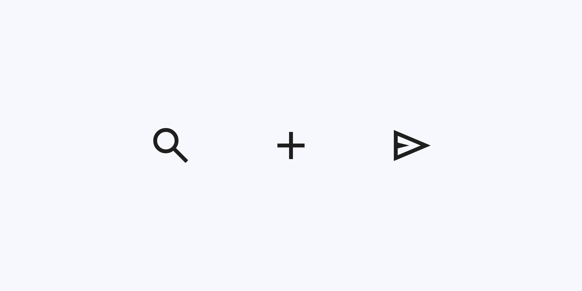
Maintain consistent stroke width, style and shape across all icons.
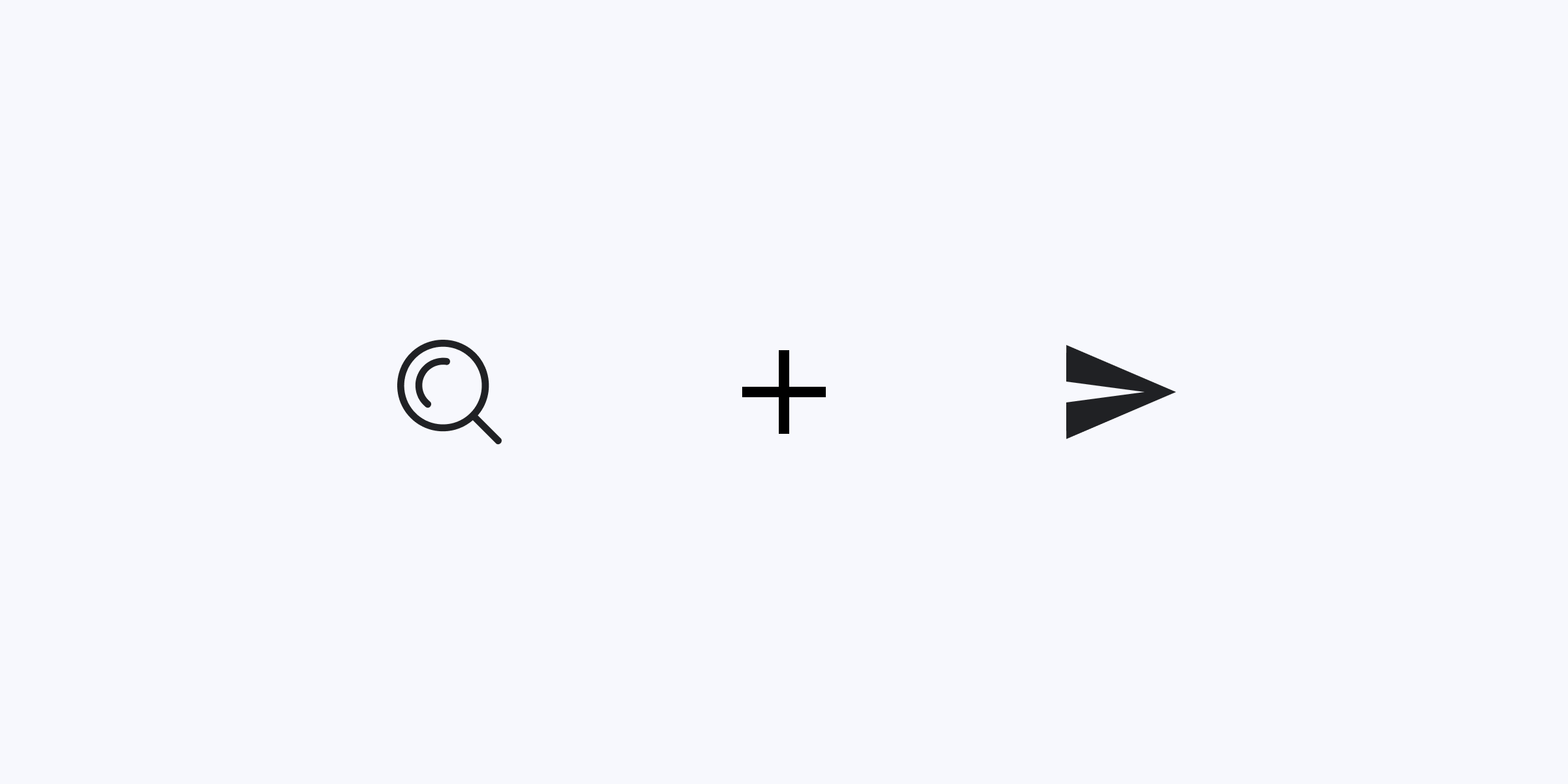
Use varying stroke widths and shapes within the same icon set.
#Simplicity
Use simple shapes and minimal detail to ensure clarity and quick comprehension, especially at small sizes.
Use simple shapes and minimal detail to convey the icon's meaning
Overcomplicate icons with unnecessary elements
#Stroke, corners and end caps
Maintain a consistent 2px stroke width with rounded corners, sharp interior corners, and flat end caps for a clear, balanced aesthetic. Design on a 48px art-board using our template with a 4px stroke for greater precision, then scale down to achieve the desired 2px.
Adhere to a consistent stroke width. Where possible use rounded corners with sharp interior corners and flat end caps.
Round off end caps or use curves on all internal corners and anchor points.
#Perspective
Present icons straight-on. Avoid diagonal perspectives or 3D effects that can hinder comprehension.
Present icons straight-on.
Use diagonal perspectives or 3D effects. These can make icons harder to understand, especially at small sizes.
#Color
Utilize the defined color palette from the Siteimprove design system to ensure accessibility and visual harmony.
Use colors from the Siteimprove design system palette. Follow color usage guidelines.
Use colors that don't align with the design system and its established color usage guidelines.
#Usage guidelines
These guidelines ensure our icons are used effectively to enhance the user experience, improve accessibility, and maintain consistency across all Siteimprove products.
#Label for clarity
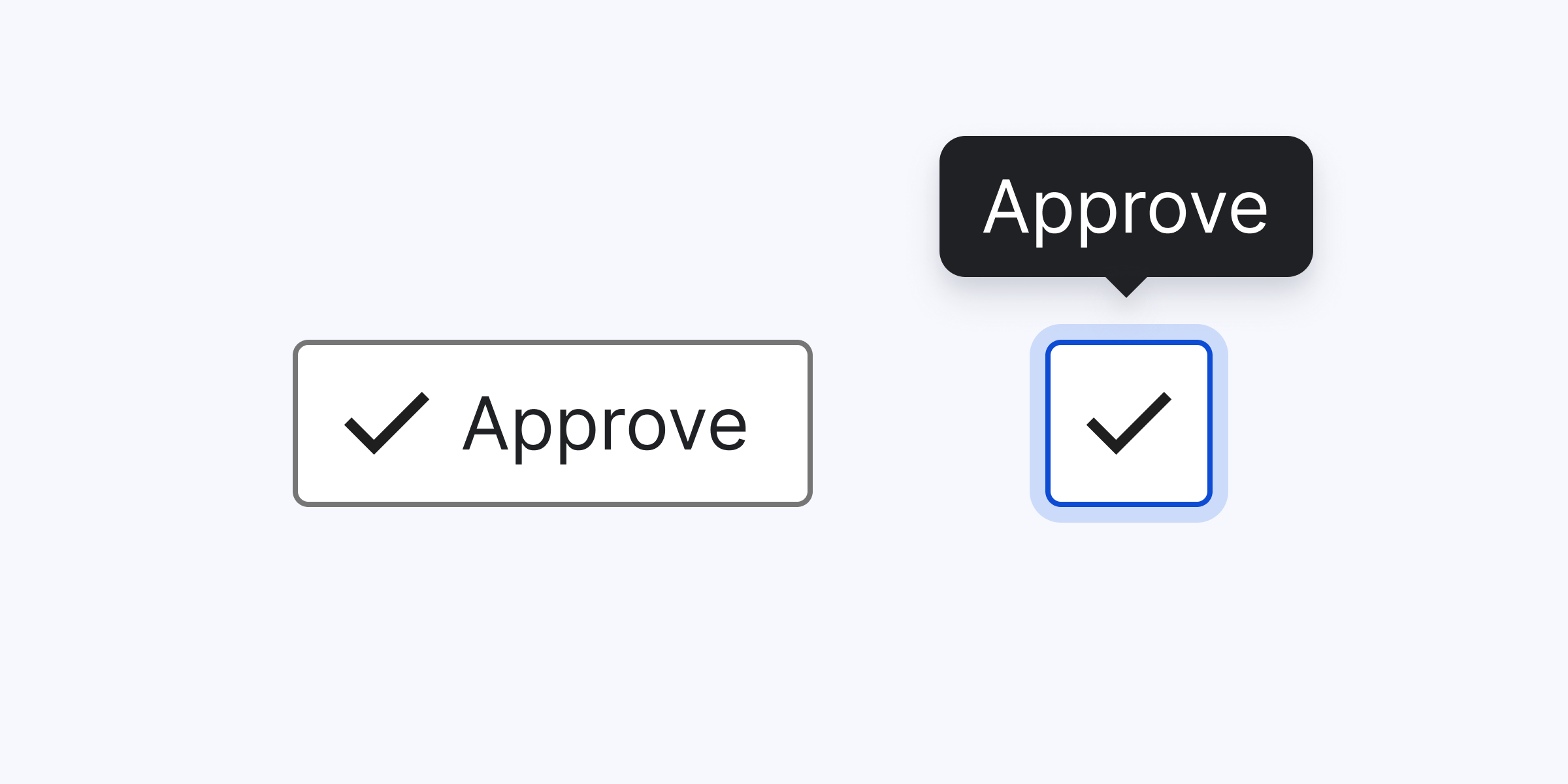
Icons should enhance understanding, not add confusion. Use them strategically with clear labels and only when they add value to the user experience.
Use icons with meaningful text labels.
Use icons without labels when they are likely to be misunderstood or unclear.
#Avoid overuse
Icons should enhance understanding, not add confusion. Use them strategically and only when they add value to the user experience.
Use icons purposefully to support user actions, aid navigation, and provide clear visual cues.
Overuse icons or use them redundantly. This can lead to visual clutter and a confusing interface.
#Be universal
Use universally recognized symbols and metaphors in your icons. Avoid cultural or language-specific references to ensure understanding across diverse audiences.
Use clear, established symbols and metaphors that users can readily understand.
Rely on cultural-specific, niche, or outdated metaphors that may not be universally understood.
#Variations
To enhance flexibility and clarity, Siteimprove icons are available in two variations:
- Outlined: This is the default style for icons in the Siteimprove design system. Outlined icons maintain visual balance and work well in close proximity to other icons or elements.
- Filled: Use filled icons sparingly to represent a completed action or status change. For example, a filled star could indicate that an item has been favorited. Color can further reinforce this interaction.
Prioritize the use of outlined icons in most cases to ensure visual consistency and clarity across the Siteimprove interface.
#Size
The default icon container is 24 × 24 px. The content of an icon should be confined within a safe space of 20 × 20 px.
#Contributing new icons
At Siteimprove, we encourage contributions to our icon library to support new designs and features. Before submitting a new icon, please review our existing library and consider the following:
- Uniqueness: Is the icon you're proposing significantly different from existing icons in the library?
- Versatility: Could an existing multi-purpose icon fulfill the same need?
- Clarity: Could your icon be confused with another concept or icon already used in Siteimprove products?
- Necessity: Is an icon truly necessary in this context? Would a text label, button, or other UI element provide clearer communication?
To contribute a new icon, follow the icon contribution guidelines to ensure your icon is properly integrated into the Siteimprove design system.