Widget
This guideline offers direction for creating self-contained, customizable widgets that convert data into actionable insights to genuinely inform and effectively engage users.
#Principle
When designing a widget, follow these principles:
- Singular focus: Each widget serves one purpose. Avoid combining unrelated data or features. Use clear follow-up actions (links, buttons) to provide deeper context when needed.
- Intuitive clarity: Widgets should be immediately understandable, even in isolation. Include relevant timeframes, avoid jargon, and minimize dependencies on external information.
- Insight-driven: Prioritize valuable conclusions over raw data. Visualize data thoughtfully, favoring charts and diagrams over dense text. Tailor widgets for their specific context (dashboard vs. detailed report).
#Widget structure
When designing a widget, follow this structure:
- Title (Card Header): Clear, concise, and specific. Accurately reflects the widget's content and purpose, even when viewed alone.
- Export: Located on the right side of the header, allowing users to export data or add the widget to a dashboard.
- Toolbar (optional): Located below the header, offering primary actions (e.g., "Create"), filtering, and search functionality.
- Key metrics (optional): Highlight the most important data points, using abbreviated numbers and clear units (e.g., 1.2M). Use tooltips to explain complex metrics.
- Content: The main area for data visualization, combining charts, metrics, and brief text where appropriate. Ensure all graphs within a widget share the same time range. Use tabs sparingly to separate related metrics for the same item.
- Footnotes (optional): Brief contextual notes placed in the bottom-left corner. Prioritize in-line tooltips for explanations.
- Follow-Up Actions (optional): Consistent across all widgets. A maximum of two call-to-action buttons at the bottom, guiding users to the next logical step.
#Widget type
Choose the most suitable widget based on the content, complexity, and user goals: Link to Figma Widgets
| Type | Example |
|---|---|
#ChartIdeal for visualizing trends and comparisons. Use line charts, bar charts, pie charts, etc., appropriately. Usage:
|  |
#ListPerfect for displaying items, tasks, or records in a structured way. Usage:
|  |
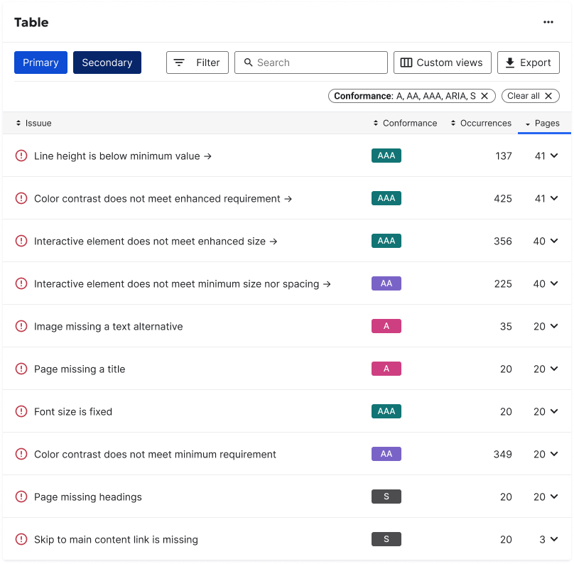
#TableSuitable for detailed data analysis and comparison. Include filtering and sorting options. Usage:
|  |
#DescriptionProvides textual information, instructions, or summaries. Usage:
|  |
#FormFacilitates user input. Prioritize clear validation and error handling. Usage:
|  |
#Rule builderEmpowers users to create custom conditions or criteria. Usage:
|  |
#HighlightEmphasizes critical information or metrics. Usage:
|  |
#Side PanelA collapsible panel that can contain any of the above widget types for flexible layouts. Usage:
|  |