Spacing and Layout
These principles establish a consistent rhythm that guides users through Siteimprove’s interface.
#Why layout matters
Grids provide the foundation for a cohesive and consistent user experience across all products within our platform. It's a structured way to organize content and UI elements, ensuring visual hierarchy, readability, and responsiveness.
#Grid: The invisible framework
#What is a grid?
Imagine a network of intersecting horizontal and vertical lines that divide the screen into columns, rows, and the spaces between them, known as gutters. This underlying, invisible framework provides a consistent structure for positioning UI elements in a balanced and harmonious manner.
#Our baseline grid unit: The 4px foundation
Our design system use an 4px baseline grid unit. This fundamental unit serves as the atomic building block for all spacing, sizing, and alignment decisions within our UI, ensuring consistent visual rhythm throughout.
#Key grid terminology
- Columns: Vertical divisions of the grid. Fancy uses a 12-column grid for maximum flexibility.
- Rows: Horizontal divisions of the grid. The height of a row is primarily dictated by the content it contains.
- Gutters: The spacing between columns. Gutters provide visual breathing room and help separate content blocks.
- Margins: The empty space around the edges of the overall content area, providing separation from the screen edges.
Example: On a 1440px wide layout, a 12-column grid with 24px gutters and 24px side margins results in each column being 94px wide. This configuration offers a balanced and spacious canvas for content arrangement.

#Layouts: Purposeful arrangement within the grid
#What is a layout?
A layout is the specific arrangement of UI elements within the defined grid structure. Effective layouts guide user attention, highlight key information, and contribute to a positive and intuitive user experience.
#Benefits of grid-based layouts
- Order and Hierarchy: Strategic placement of elements within the grid establishes clear visual flow and prioritizes information.
- Balance and Consistency: The grid ensures uniform spacing and alignment, creating a clean and professional appearance.
- Responsiveness: Flexible grids adapt to different screen sizes, optimizing the user experience on any device.
#Defining column widths
Use the Grid.Section component to define column widths based on a 12-column grid system: For example:
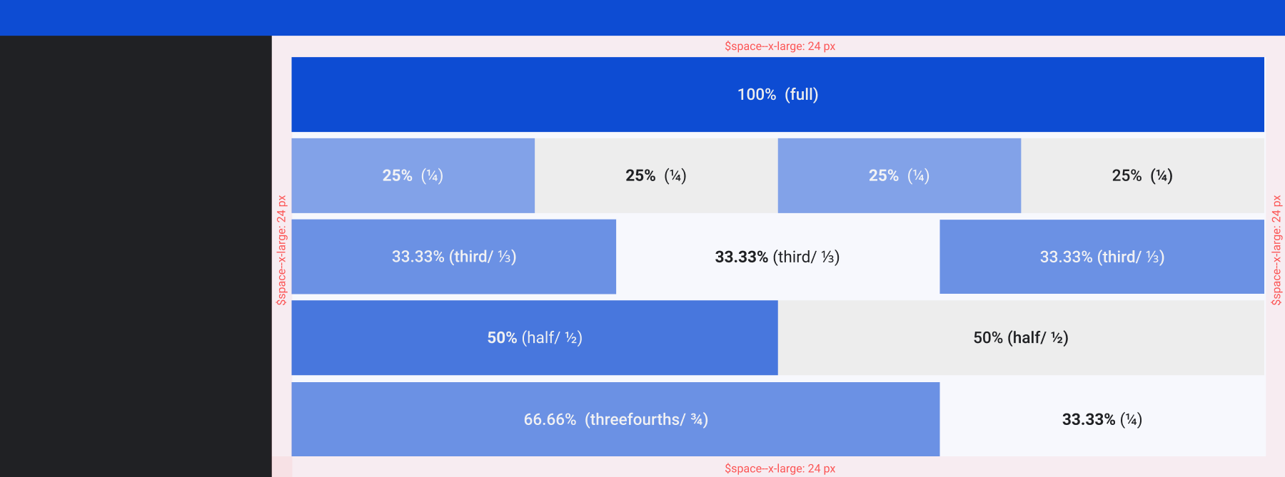
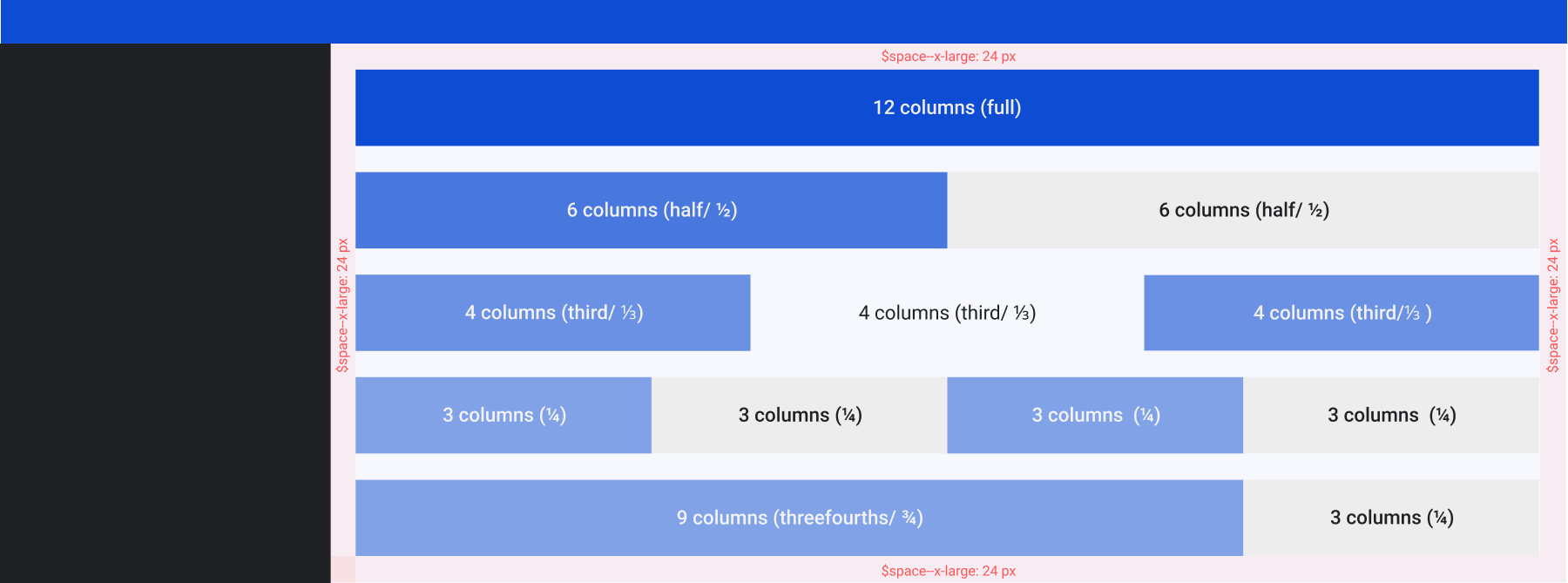
- full (12 columns or 100%): will occupy a whole row.
- half/½ (6 columns or 50%): will occupy half of the row's width.
- third/⅓ (4 columns or approximately 33.33%): will occupy a third of the row's width.
- ¼ (3 columns or 25%): will occupy a quarter of the row's width.
#Column size by percentage
#Column size by number
#Use Grid Section based on content type
These guidelines help determine the appropriate width for the Grid.Section component based on content type and information complexity within a 12-column grid system.
#Use Cases
#Dashboards
- Simple overviews:
- Recommended: Full width (12 columns/100%) or half width (6 columns/50%).
- Rationale: Ideal for showcasing key metrics, prominent charts, and high-level KPIs in a focused and easily digestible manner.
- Detailed views:
- Recommended: Third width (4 columns/≈33.33%) or quarter width (3 columns/25%).
- Rationale: Suitable for dashboards with more granular data, allowing for side-by-side comparisons of multiple data points or the inclusion of supplementary information alongside primary visualizations.
#Data tables
- Limited columns:
- Recommended: Half width (6 columns/50%) to quarter width (3 columns/25%).
- Rationale: Sufficient for tables with a focused set of essential data points, enabling quick scanning and comparison.
- Extensive data:
- Recommended: Quarter width (3 columns/25%) or smaller.
- Rationale: Prioritize clarity. If the data is overwhelming, explore solutions like:
- Horizontal scrolling: Allow users to scroll horizontally to view all columns.
- Collapsible sections: Enable users to expand or collapse groups of columns.
- Progressive Disclosure: Show only essential columns initially and allow users to reveal more.
#Feature lists and comparisons
- Simple comparisons:
- Recommended: Half width (6 columns/50%).
- Rationale: Effectively presents two sets of features or plans for direct side-by-side comparison.
- Detailed comparisons:
- Recommended: Third width (4 columns/≈33.33%).
- Rationale: Provides enough space to display more features or additional details for each item being compared.
#Forms
- Short forms (modals, settings):
- Recommended: Full width (12 columns/100%) or half width (6 columns/50%).
- Rationale: Full width keeps the form focused. Half width can logically group a few short, related fields (e.g., "Name" and "Email").
- Forms with mixed field lengths:
- Recommended: Half width (6 columns/50%) to quarter width (3 columns/25%).
- Rationale: Accommodates labels that require more space or a combination of shorter and longer input fields within a row. This allows for better visual organization and readability.
#UI common scales
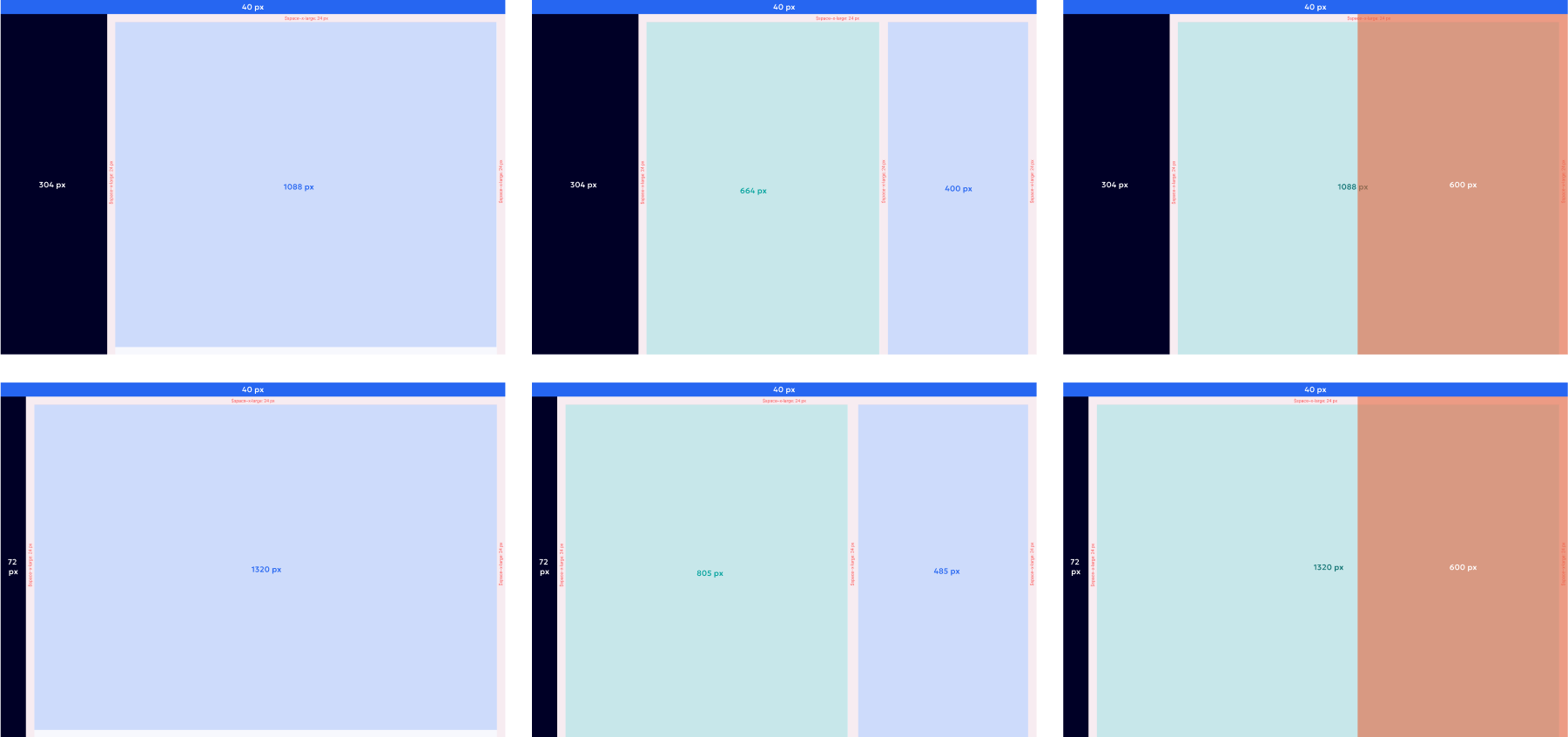
For design efficiency and visual harmony, consider using pre-defined pixel values for UI elements. Here are some commonly used values from our scale:
- Full Container: 1088px (ideal for full-width layouts)
- Content Container: 684px (suitable for main content areas)
- Side navigation: 304px
- Section: 400px (effective for split views)
- Side panel: 600px
#Recommended spacing
When working with Fancy components, aim to use their inherent spacing features first. Only introduce custom spacing if the component lacks the necessary options. Use Grid, Content, or Layout components to fine-tune the spacing as needed.
To maintain a consistent visual flow across our platform, we recommend the following specific spacing amounts in various design contexts, such as side panels, modals, or widgets:
- Between separate blocks (like individual cards or distinct sections): 24 pixels.
- Think of the gap between one card and the card next to it, or the space above and below a whole section of content.
- We refer to this size as
var(--space--large)in our system.
- Inside a contained content area (left, right, top and bottom): 16 pixels.
- Inside a contained content area, the default padding we recommend is 16 pixels on both the top and bottom, as well as on the left and right edges of a specific content block.
- We refer to this size as
var(--space--medium)in our system.
- Between smaller elements that are next to each other horizontally or vertically (within a content area):
- Standard spacing: 12 pixels. Use this in most cases for a comfortable amount of space between inline elements or items within a content block.
- We refer to this size as
var(--space--small)in our system. - Tighter spacing: 8 pixels. Use this when you need elements to be closer together, for a more compact layout.
- We refer to this size as
var(--space--x-small)in our system.
Note: Specific adjustments may be necessary based on the overall design and content of the interface.
#Beyond the basics
The core principles pave the way for further exploration and creativity. While these pre-defined elements offer a strong starting point, the true value lies in understanding the "why" behind them. By understanding the reasoning behind these principles, designers can make informed decisions and achieve layouts that are not just functional, but also visually engaging and user-friendly.