Integration
This guide explains how to design user interfaces for Siteimprove integrations
#Overview
This guide explains how to design user interfaces (UIs) for Siteimprove integrations. These integrations can be browser extensions, content management system (CMS) plugins, or page reports.
#What this guide is for
- To help you create a user-friendly experience for people using your Siteimprove integration.
- To give you recommendations on what UI components to use depending on what your integration does.
#Types of integrations
- Browser extensions: Directly add Siteimprove features to a user's web browser. Examples include accessibility checks and content suggestions.
- CMS plugins: Integrate Siteimprove features and recommendations into your content management system for streamlined content optimization.
- Page Reports: Highlight identified issues and their locations within webpage content to facilitate problem resolution.
#Designing
There are three main UI options for Siteimprove integrations:
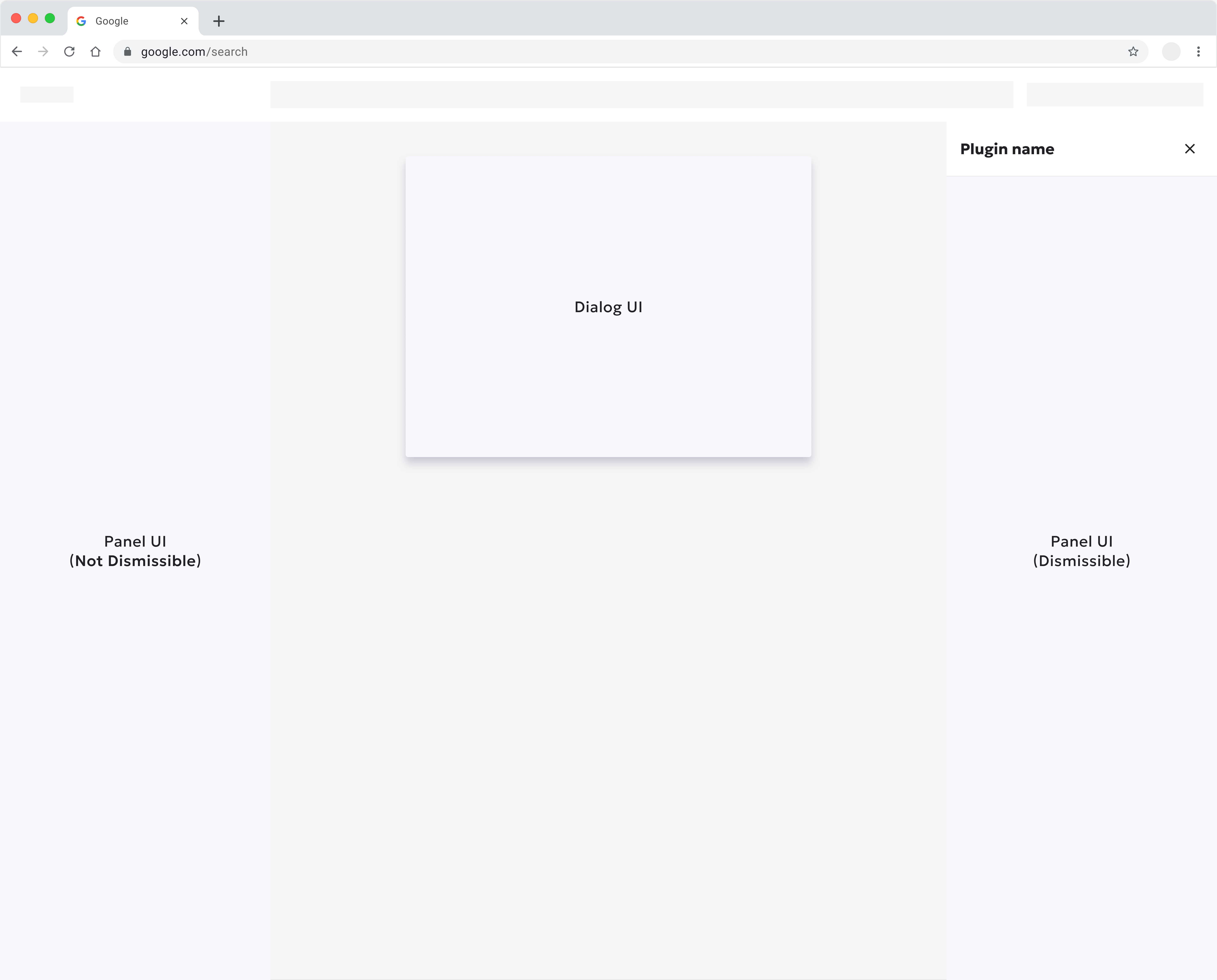
- Dismissible panel: These can be closed by the user (e.g., via a close button, clicking outside). They're often used for quick actions, temporary settings, or displaying detailed information that the user might want to hide to regain full screen focus. Fancy Side Panel often fall into this category, as they prioritize user control.
- Non-dismissible panel: These remain visible at all times, providing continuous access to critical contextual information, such as a live report, dynamic suggestions, or a primary navigation structure for an application. They are an integral part of the layout and are not intended to be hidden by the user.
- Dialog: A separate window that opens when a user clicks the extension icon. Suitable for quick actions or presenting multiple features simultaneously.
#An example of dismissible and non-dismissible panel
#Panel UI - Specs
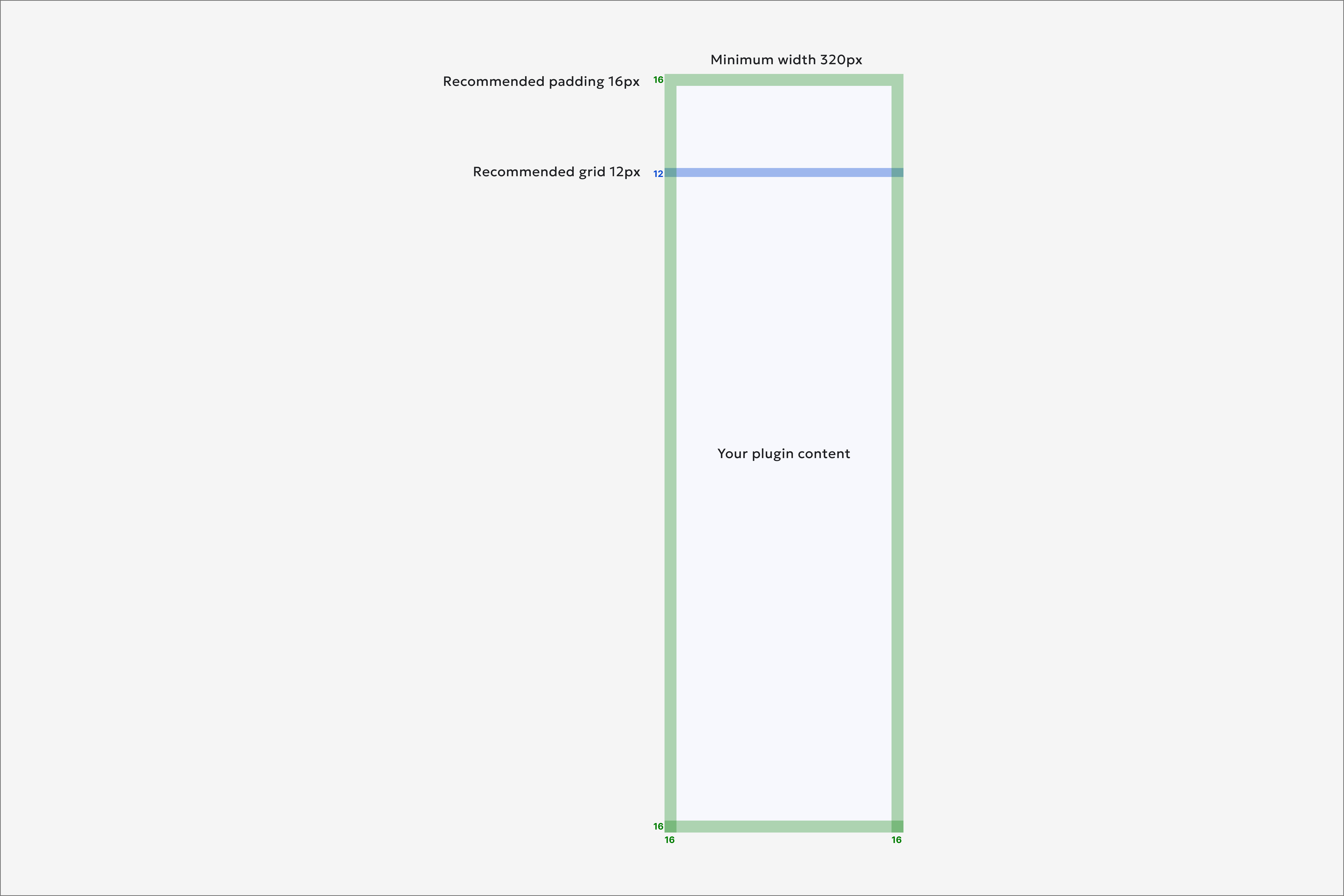
- Responsive width: We recommend to start with 370 pixels, but it should be adjustable between a minimum of 320 pixels and a maximum of 600 pixels.
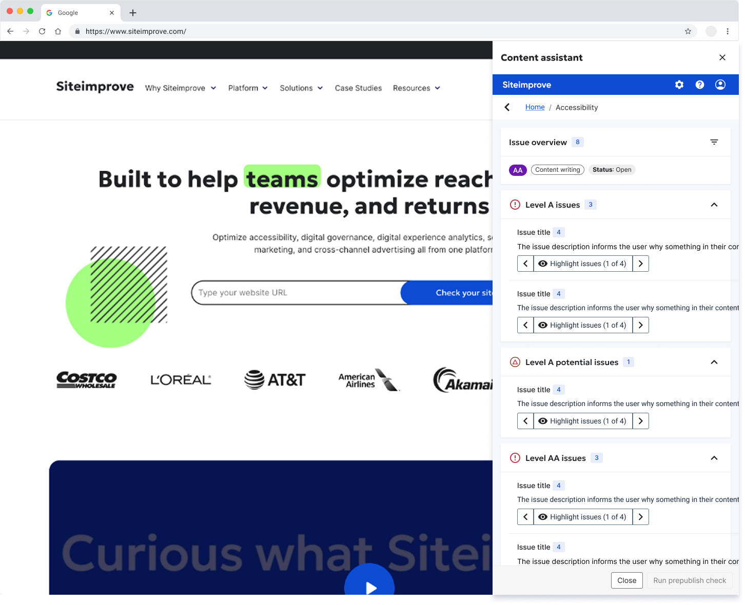
- Dismissibility: Generally, we recommend using dismissible panels for plugins. This allows users to close the panel when they're finished with it. For example, the Content Assistant browser extension and CMS plugin use a dismissible "Side Panel" component from the Fancy design system. However, in some cases, like Page Reports, a non-dismissible panel might be more appropriate, to ensure visibility by pushing the main page content to the left.
- Content prioritization: Due to limited space, prioritize essential elements and keep them easily accessible. Aim to limit the Side Panel navigation to one level, or at most three levels. Use breadcrumbs to indicate the current page level within the side panel.
Not a Fancy component, therefore a default width 370px is recommended.
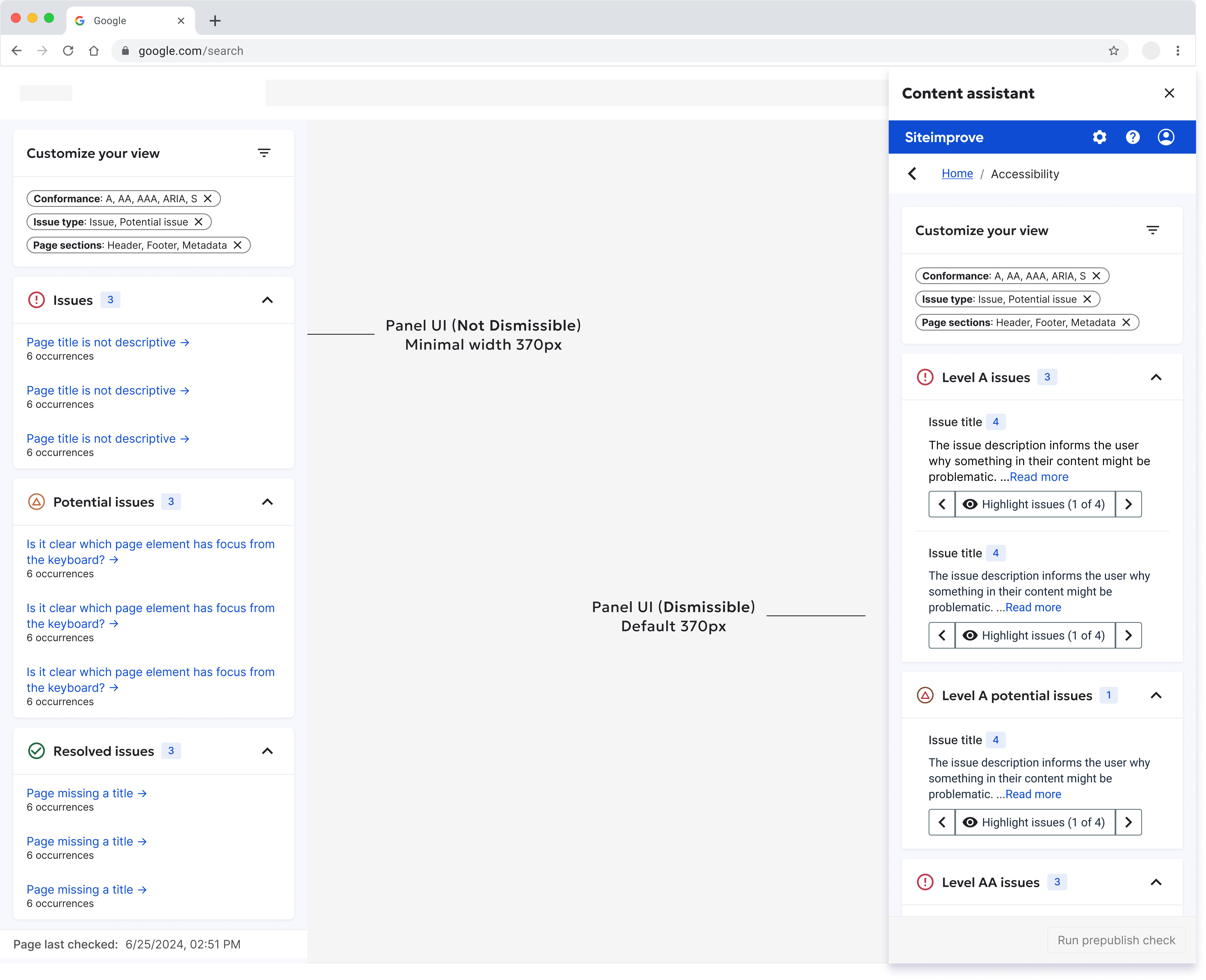
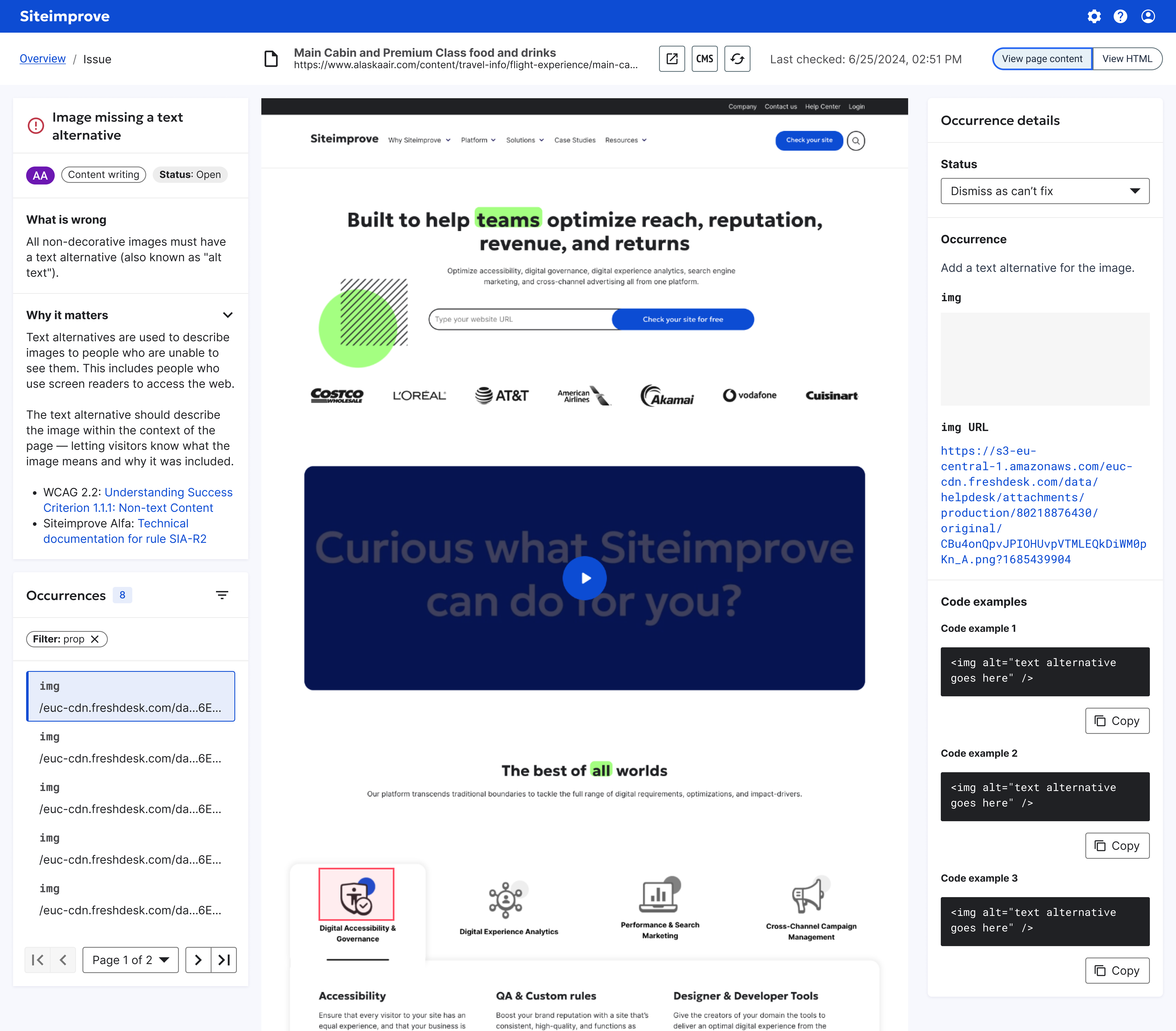
#Page Report UI - Issue overview
If your user's needs or purpose aligns with the Issue overview or category features, please adhere to the following specifications or view Figma
- Accessibility score: Overall Accessibility score (out of 100). This score is dynamically calculated based on the number and severity of unresolved issues found on the page. A higher score indicates fewer issues.
- Filter: Clicking this icon reveals options to filter the issues listed below. Active filters are displayed as removable pills (e.g., "Conformance: A, AA").
- Issue categories (e.g., Issues, Potential issues, Resolved issues): Expandable issue category. Groups issues by their status or content type. The header displays the category name and the total count of unique issues within it. Clicking the chevron icon toggles the visibility of the issue list.
- Individual issue link (e.g., "Text style mismatch"): Issue drill-down link. Navigates the user to a detailed view for this specific issue type, likely showing code snippets, issue locations, and remediation advice.
- Occurrence count (e.g., "6 occurrences"): Indicates the total number of times this specific issue was detected on the page.
- Page last checked timestamp: Timestamp. Displays the date and time the content check (e.g Accessibility) was last completed for this page. The timestamp should be displayed in the user's local time zone.
#Page Report - Issue description/Occurrence detail
If your user's needs or purpose aligns with the Issue description/Occurrence detail pattern, please adhere to the following specifications or view Figma
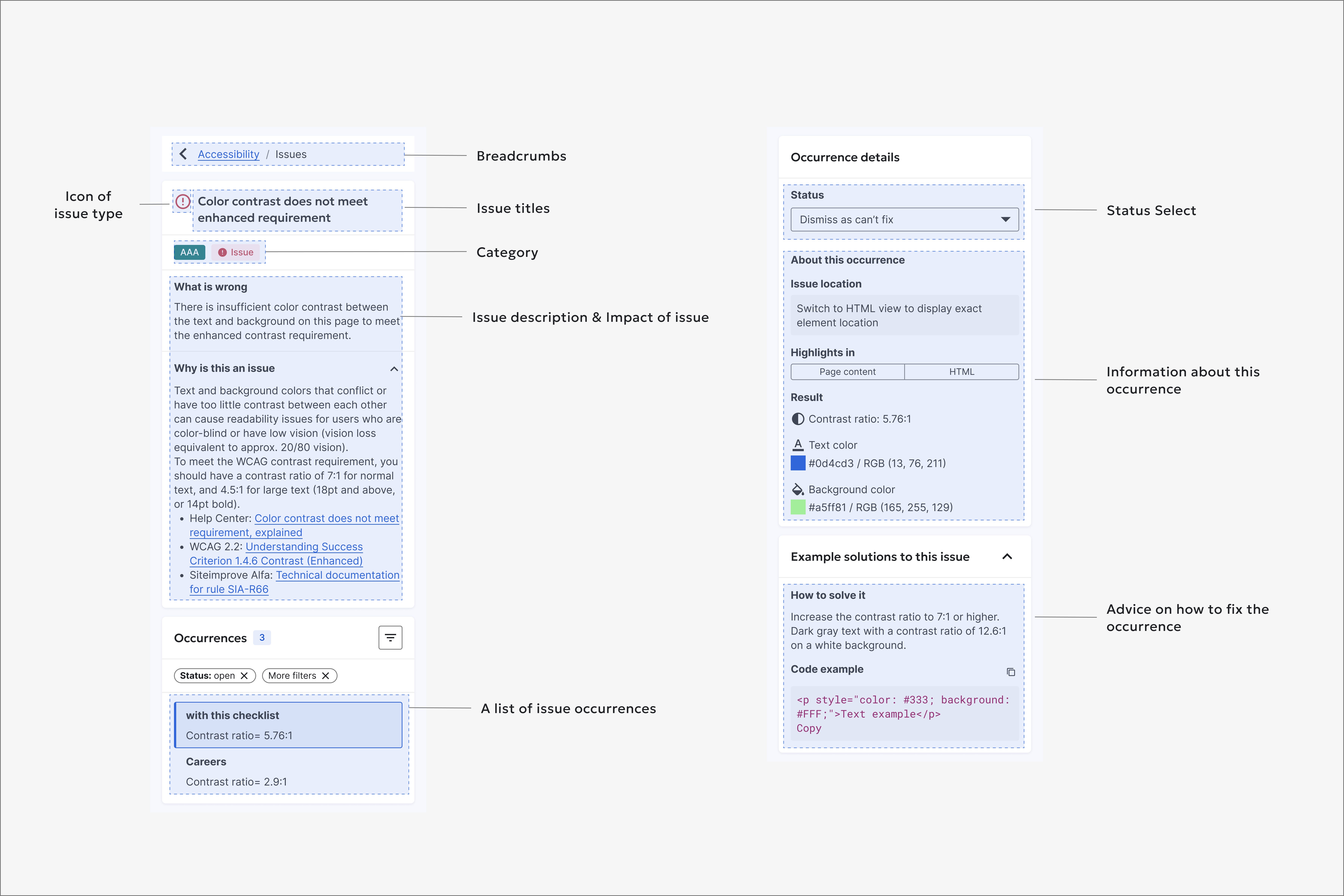
#Left Panel: Issue Details
- Breadcrumbs: Navigational breadcrumbs showing the user's path to this screen. Allows for quick navigation back to the main "Issues" list.
- Icon of issue type: Severity icon. Visually represents the issue's category or status (e.g., issue, potential, resolved).
- Issue title: A concise, human-readable summary of the problem.
- Category: A tag that classifies the issue for quick identification. It can indicate a WCAG level (A, AA, AAA), an SEO area (e.g., Technical, Content), or a policy type (e.g., Text, Media).
- Issue description & Impact of issue: A detailed explanation of the issue ("What is wrong") and its effect on end-users ("Why is this an issue"), often with links to official documentation.
- A list of issue occurrences: Lists all instances of this issue on the page. Clicking an item selects it and highlights the corresponding element on the live page or in the code.
#Right Panel: Occurrence Details
- Status Select: Occurrence status. Allows the user to update the status for the selected occurrence (e.g., "Open," "Resolved," "Dismiss as can't fix")
- Information about this occurrence: Occurrence data. Provides specific technical details for the selected instance, including:
- Issue location: A CSS selector or path to the specific HTML element.
- Highlights in: Toggle to switch the view between the rendered Page content and the HTML source code.
- Result: The specific data that failed the check (e.g., measured contrast ratio, text/background color values).
- Advice on how to fix the occurrence: Remediation guidance. Offers actionable advice ("How to solve it") and a specific, copyable "Code example" demonstrating a correct implementation.
#Examples
CMS Plugin/Content Assistant browser extension
Dynamic Content browser extension
2025 Page Report
#Logo and icons
The icon appears when the plugin is docked within the CMS or browser extension frame. When designing an icon for a panel plugin, consider the following factors: color, size, tooltip, padding, and background.
For additional properties and guidance on icon best practices, refer to the Iconography and Icon contribution guidelines.
#Example:
Here's an example of an icon and tooltip for a Siteimprove CMS/Content Assistant with a larger size (36x36 pixels). View Figma
#Branding/Sign in
To reinforce the connection between the plugin and our brand, incorporate branding elements throughout the plugin's user interface. Here is an example:
#Logo placement
Include the plugin logo prominently in the onboarding or sign-in screens to establish brand recognition and help users identify the plugin in the future.
#Customized UI
#Brand colors and themes
Apply our brand's colors, fonts, and overall aesthetic to the plugin's UI to create a cohesive and familiar experience.
#Messaging
Provide users with timely and informative feedback as they interact with your plugin. This includes alerts, success messages, permission requests, and loading indicators.
#Message types
- Avoid Silent Failures: Plugins should never fail silently. Use a Modal or Empty state to display error messages to reassurance users.
- Errors and Alerts: For critical feedback, such as failed actions or permission requests, a Toast or Message is recommended.
- Contextual Messaging: If a user initiates an action within the plugin UI, the corresponding feedback should be displayed in a contextually relevant location, inline feedback (Form Element Wrapper) is recommended.
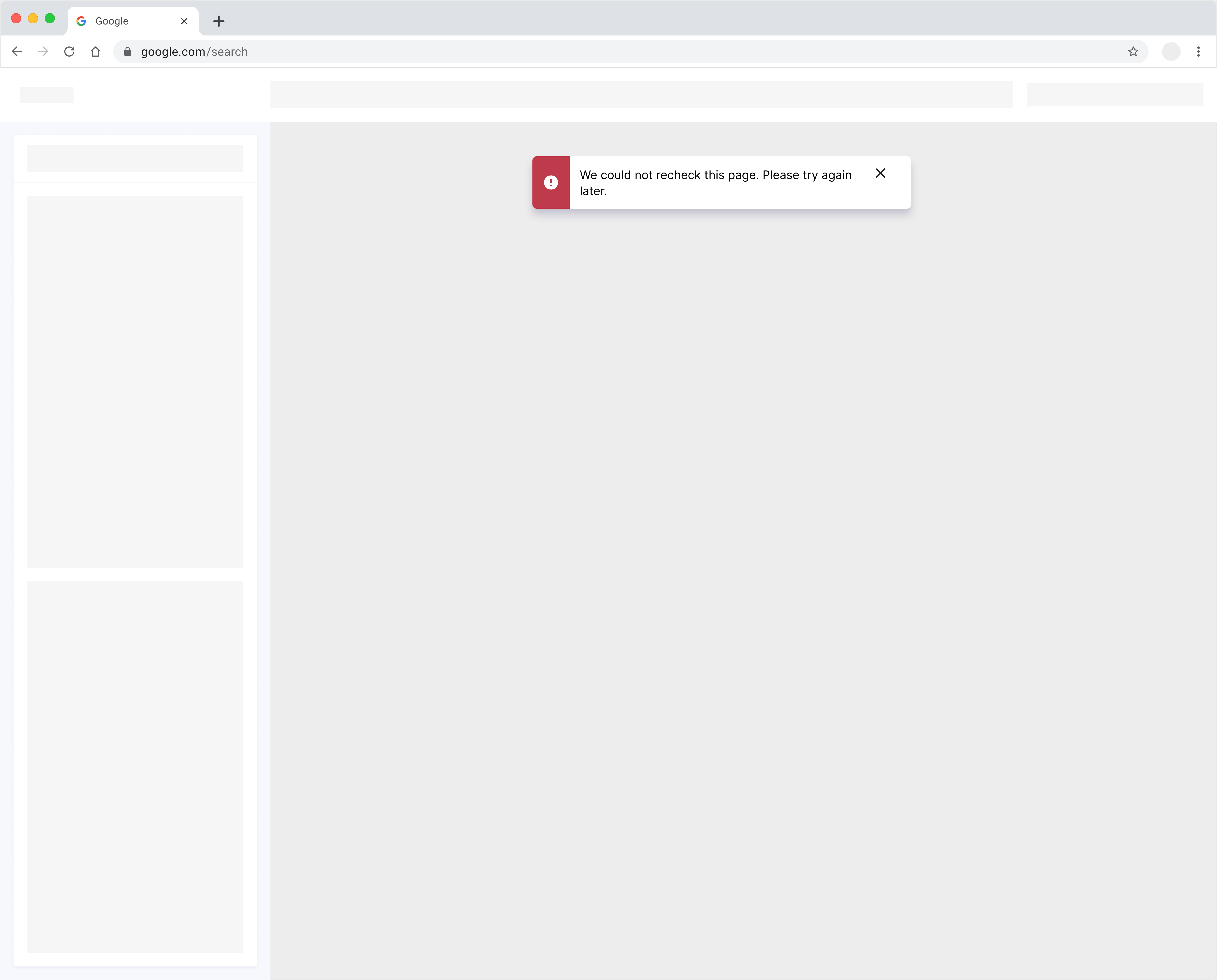
#Toast
Use a Toast component for minor errors or informational messages. If a plugin cannot successfully complete an action, display an error message that clearly communicates the failure and its underlying reason.
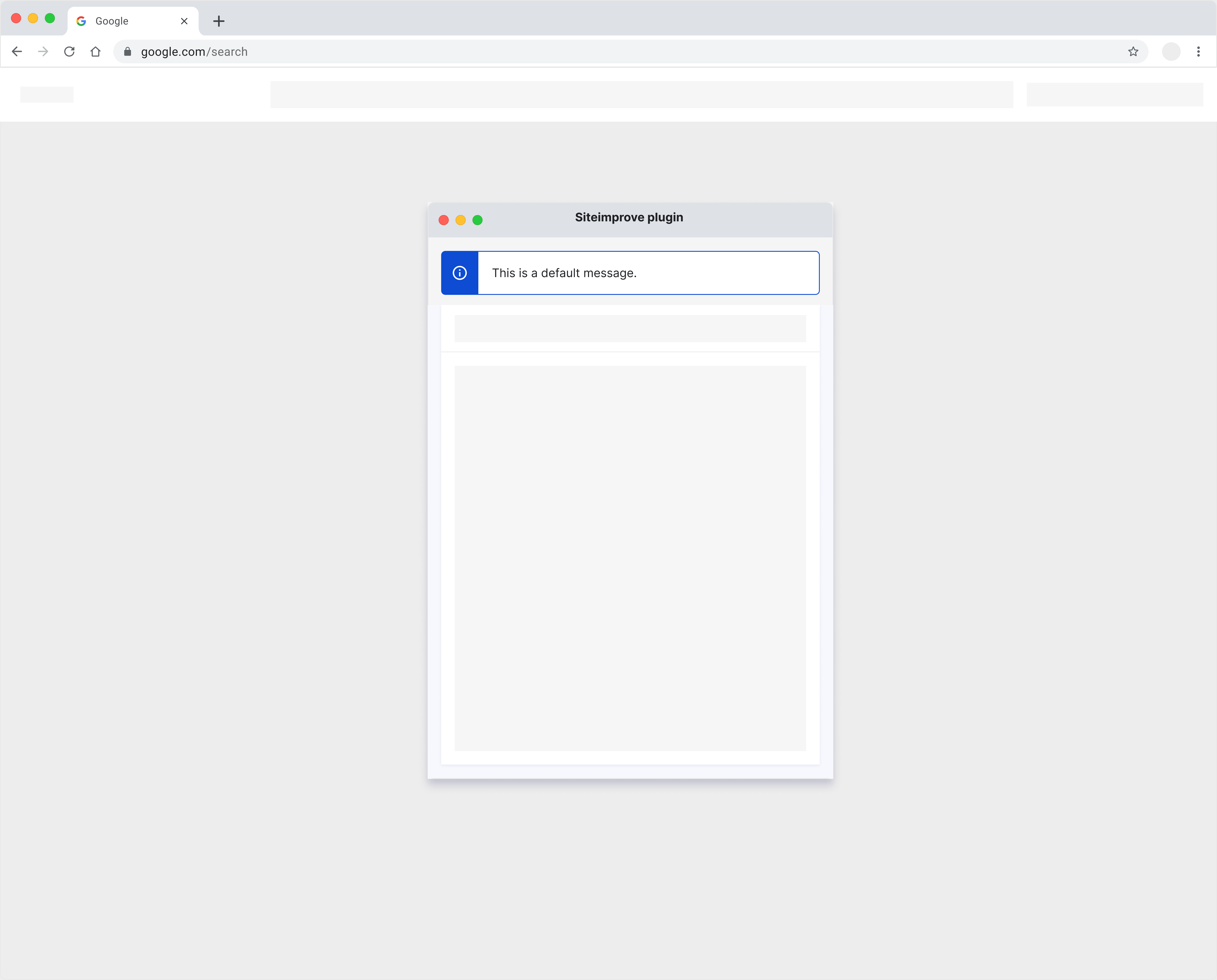
Dialog UI
Panel UI (Not Dismissible)
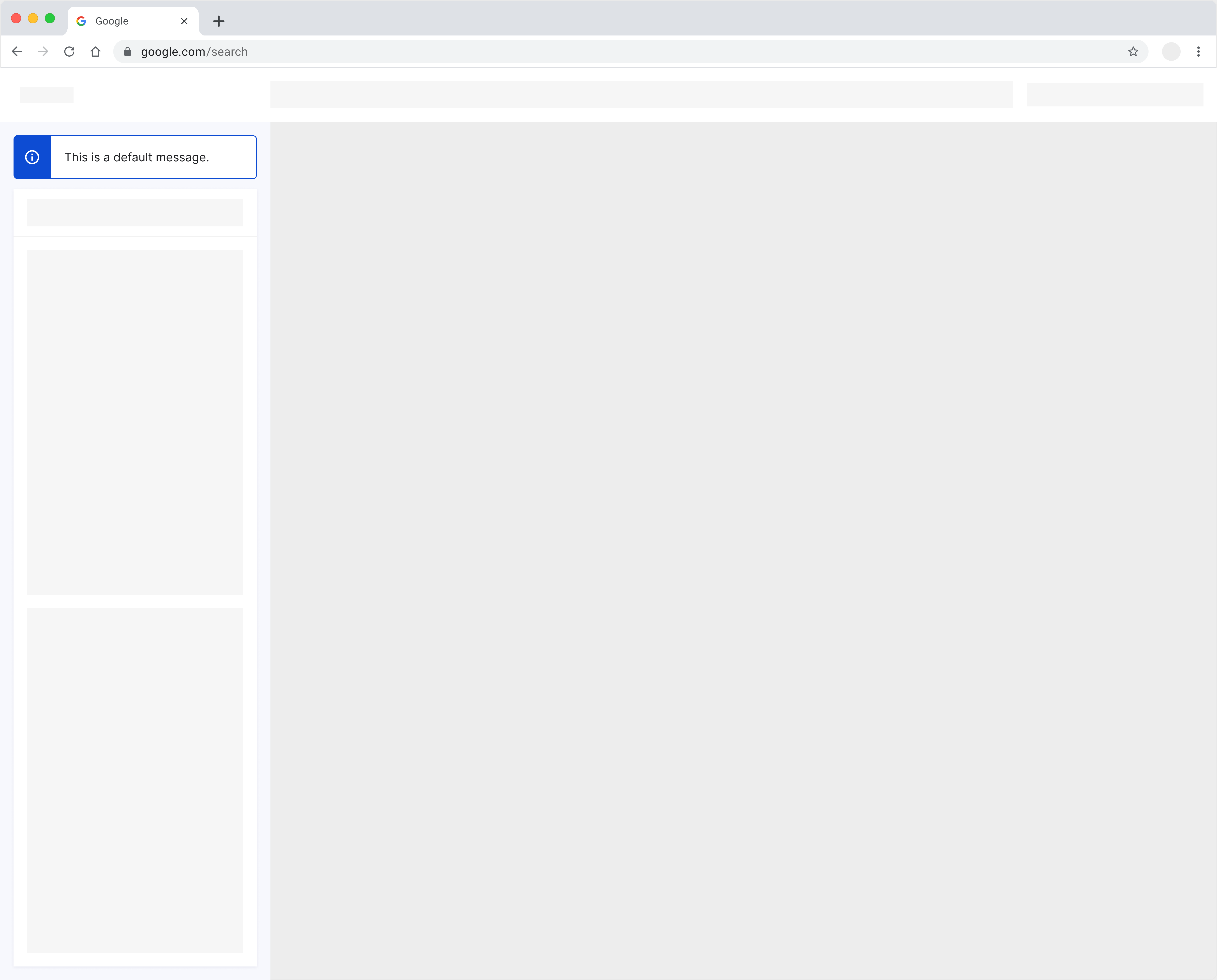
Panel UI (Dismissible)
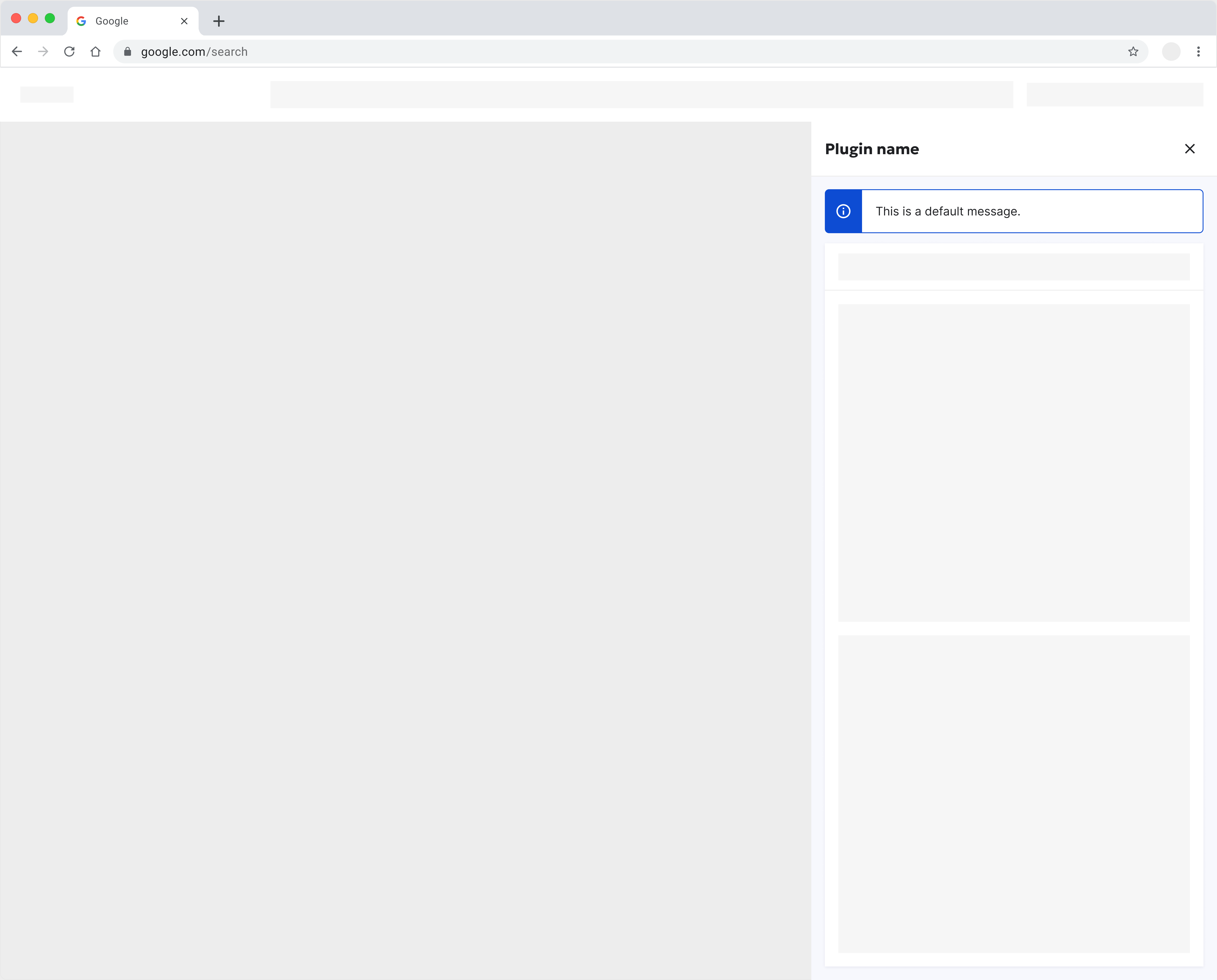
#Message
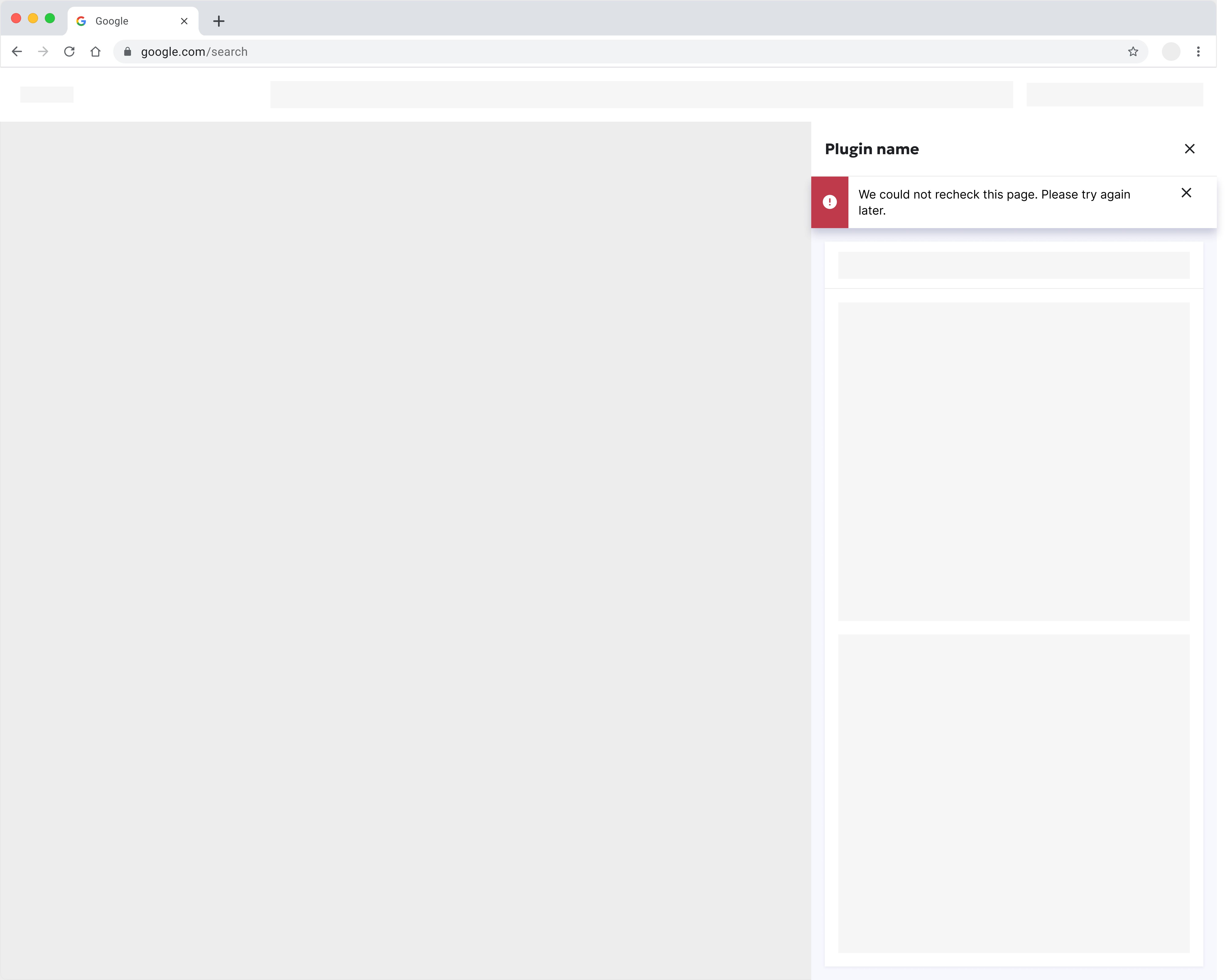
Use a Message component for critical errors or significant notifications that demand the user's immediate attention
Dialog UI
Panel UI (Not Dismissible)
Panel UI (Dismissible)
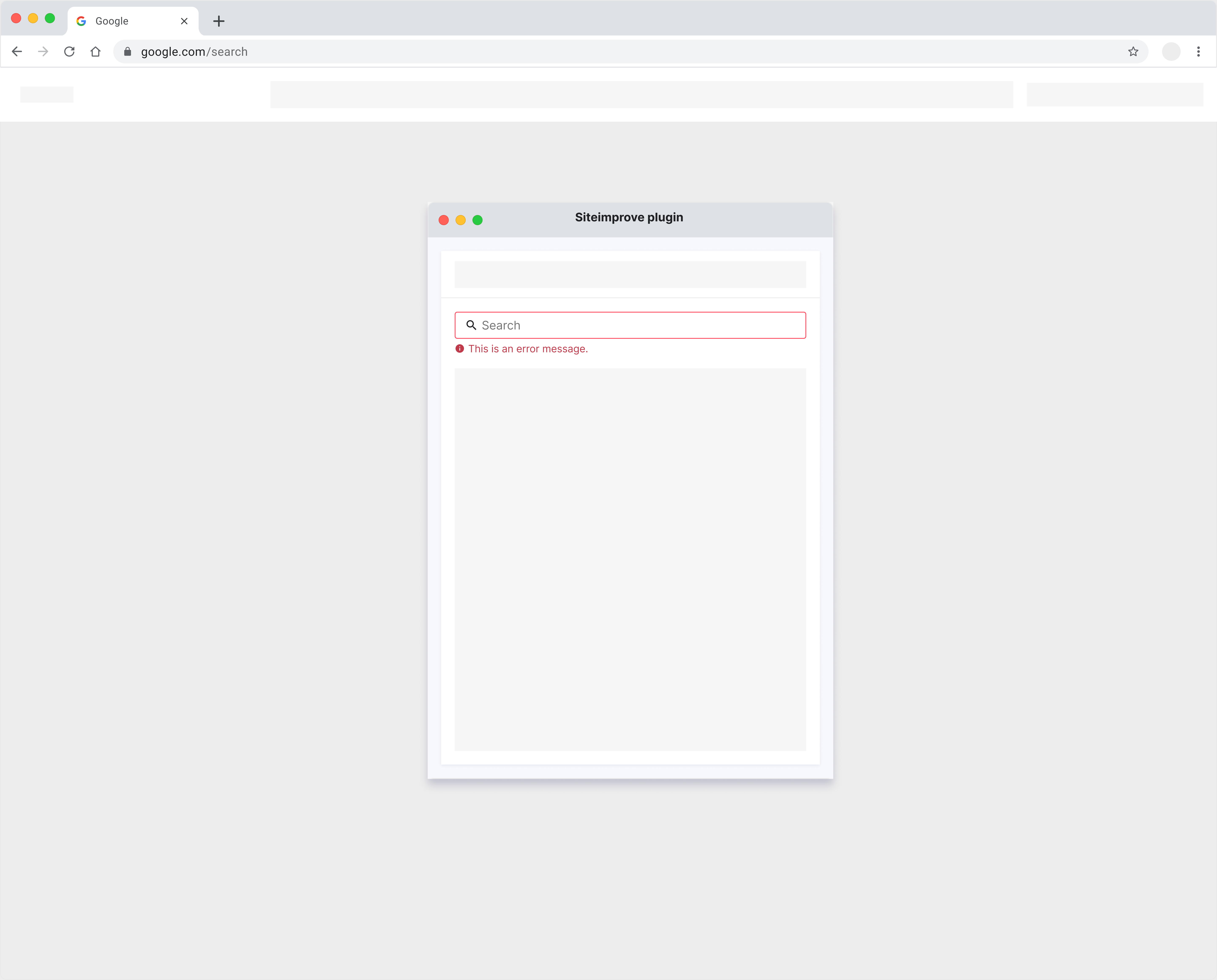
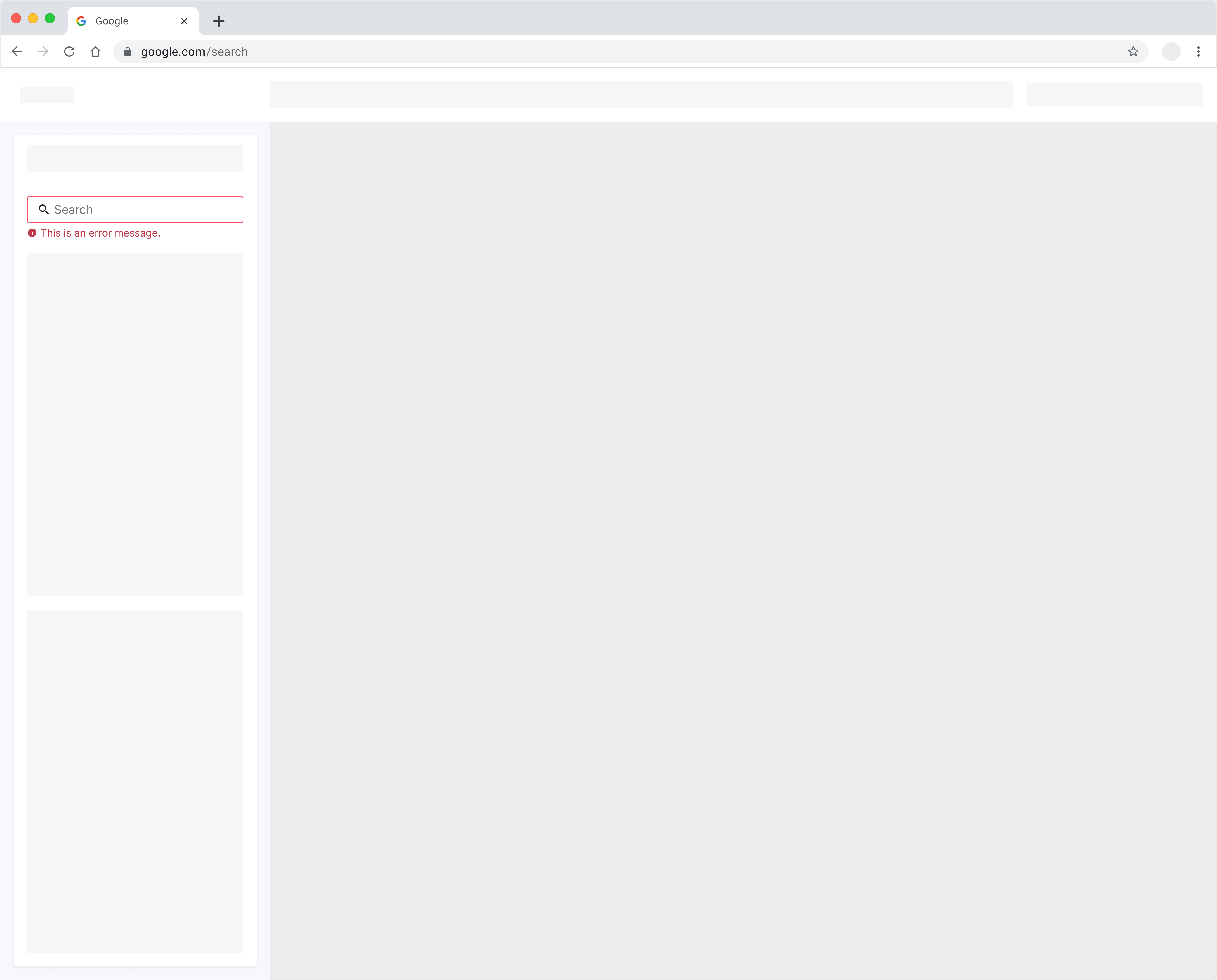
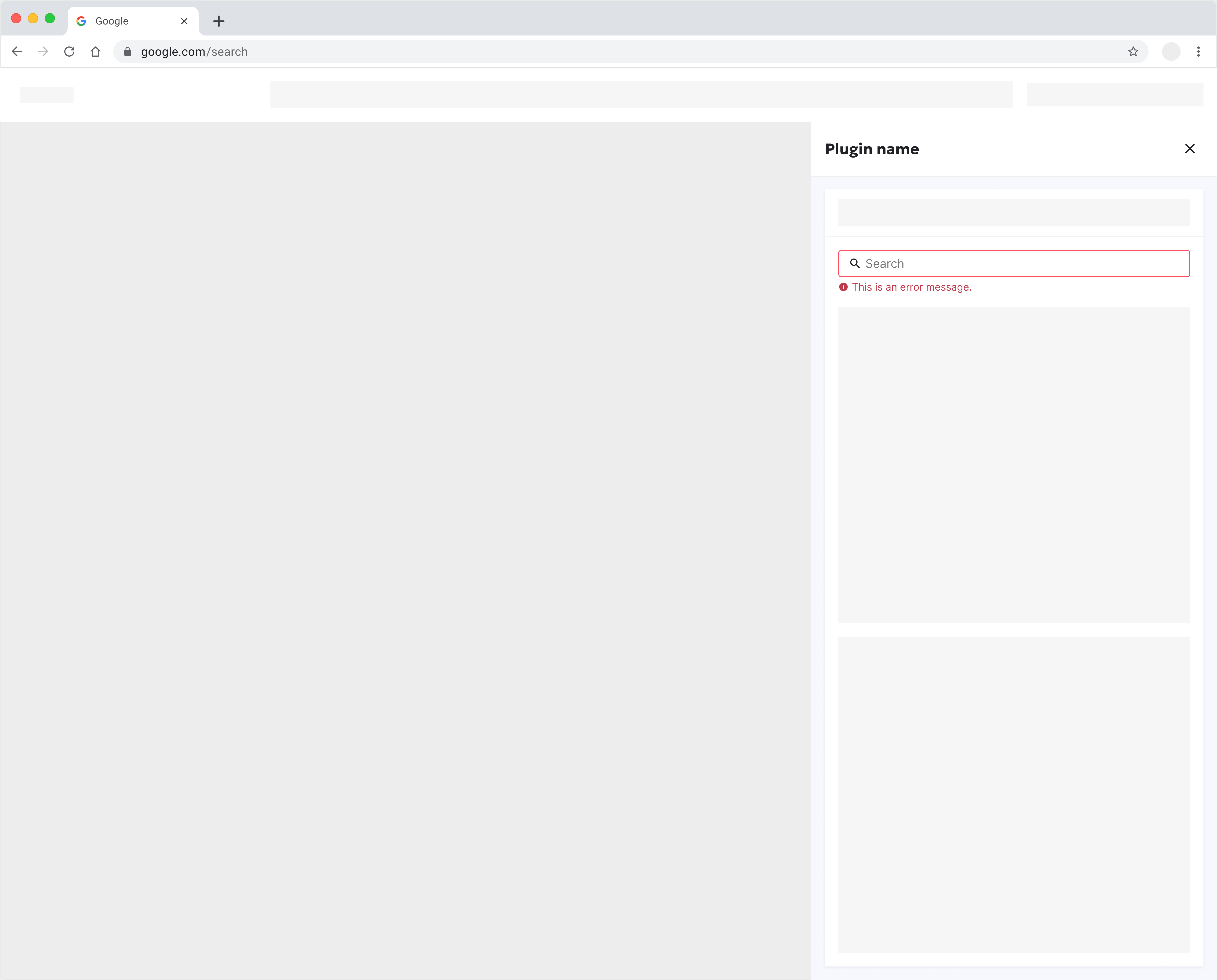
#Inline message
Use an Input Field component for contextual messaging, such as search input errors.
Dialog UI
Panel UI (Not Dismissible)
Panel UI (Dismissible)
#Progress indicator
Use Progress Bar component to indicate loading or progress. Keep users informed about background activities within the plugin interface.
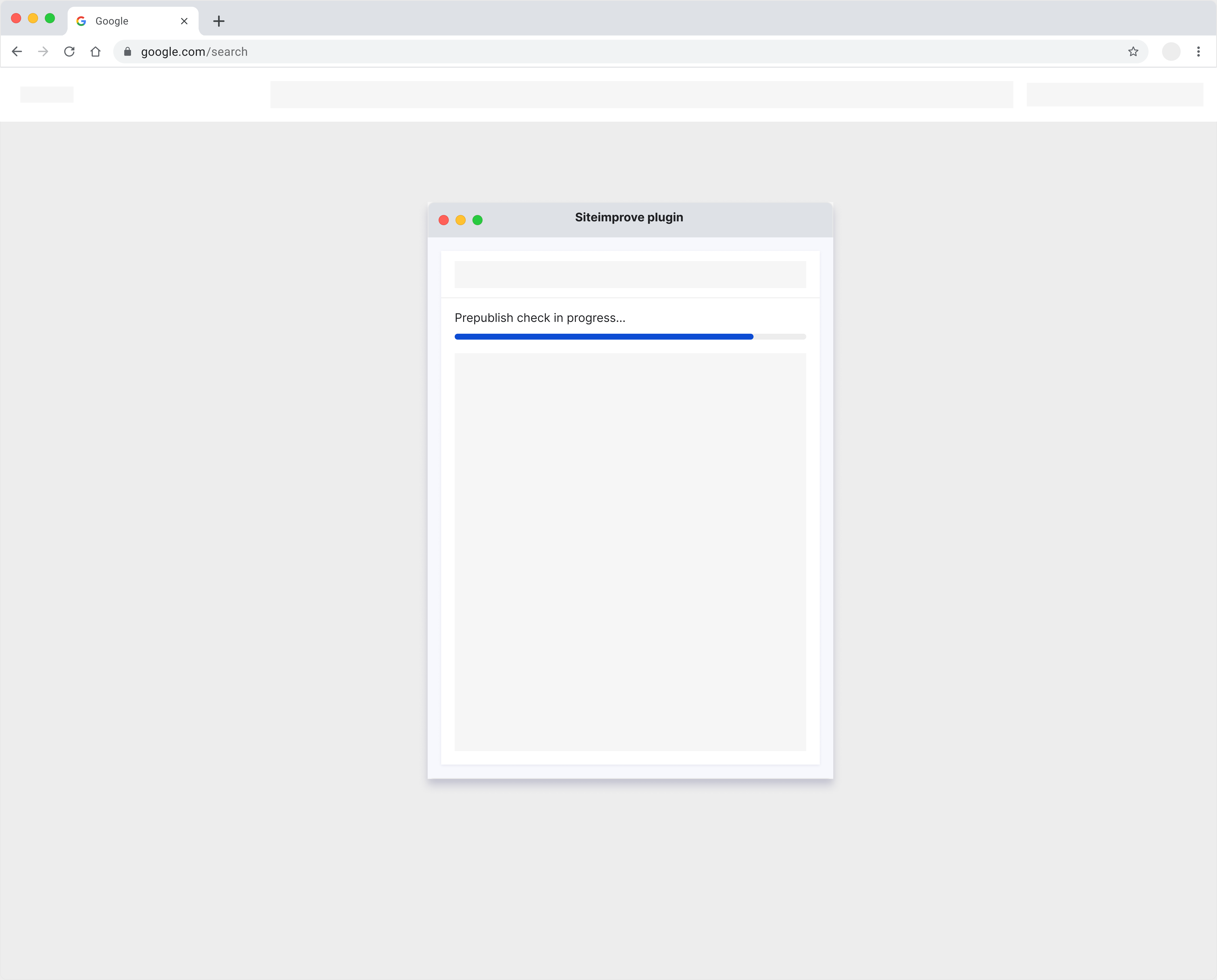
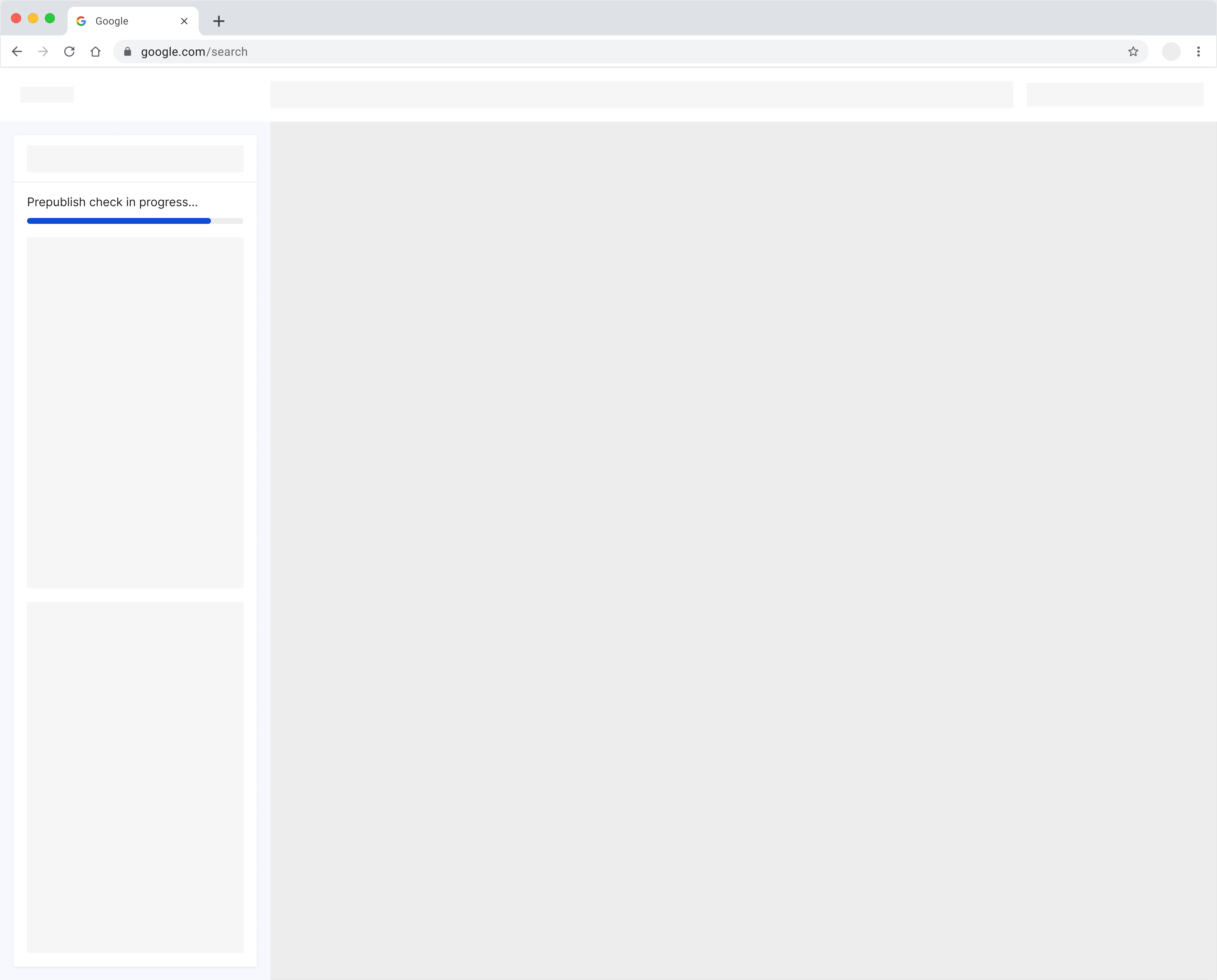
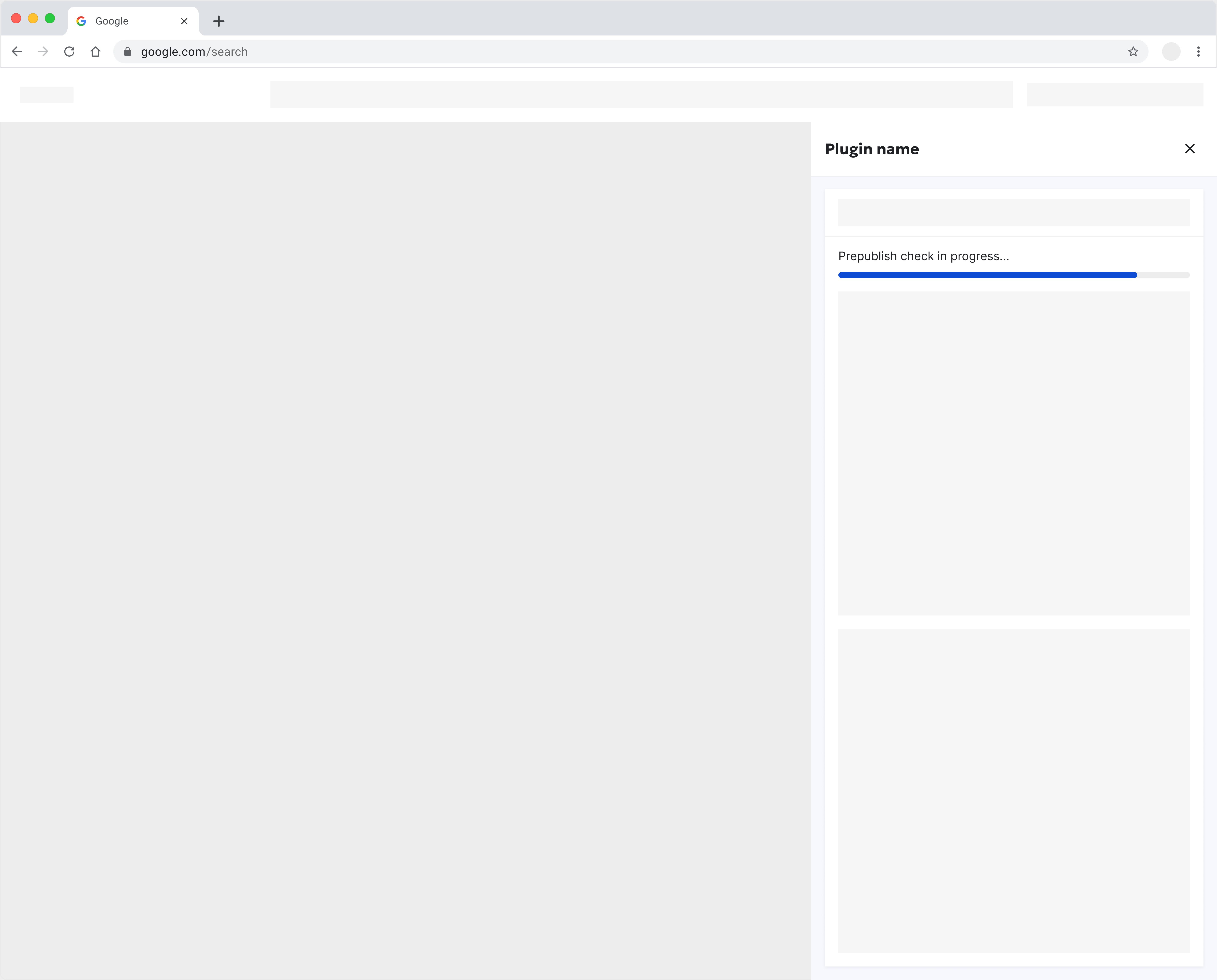
Dialog UI
Panel UI (Not Dismissible)
Panel UI (Dismissible)
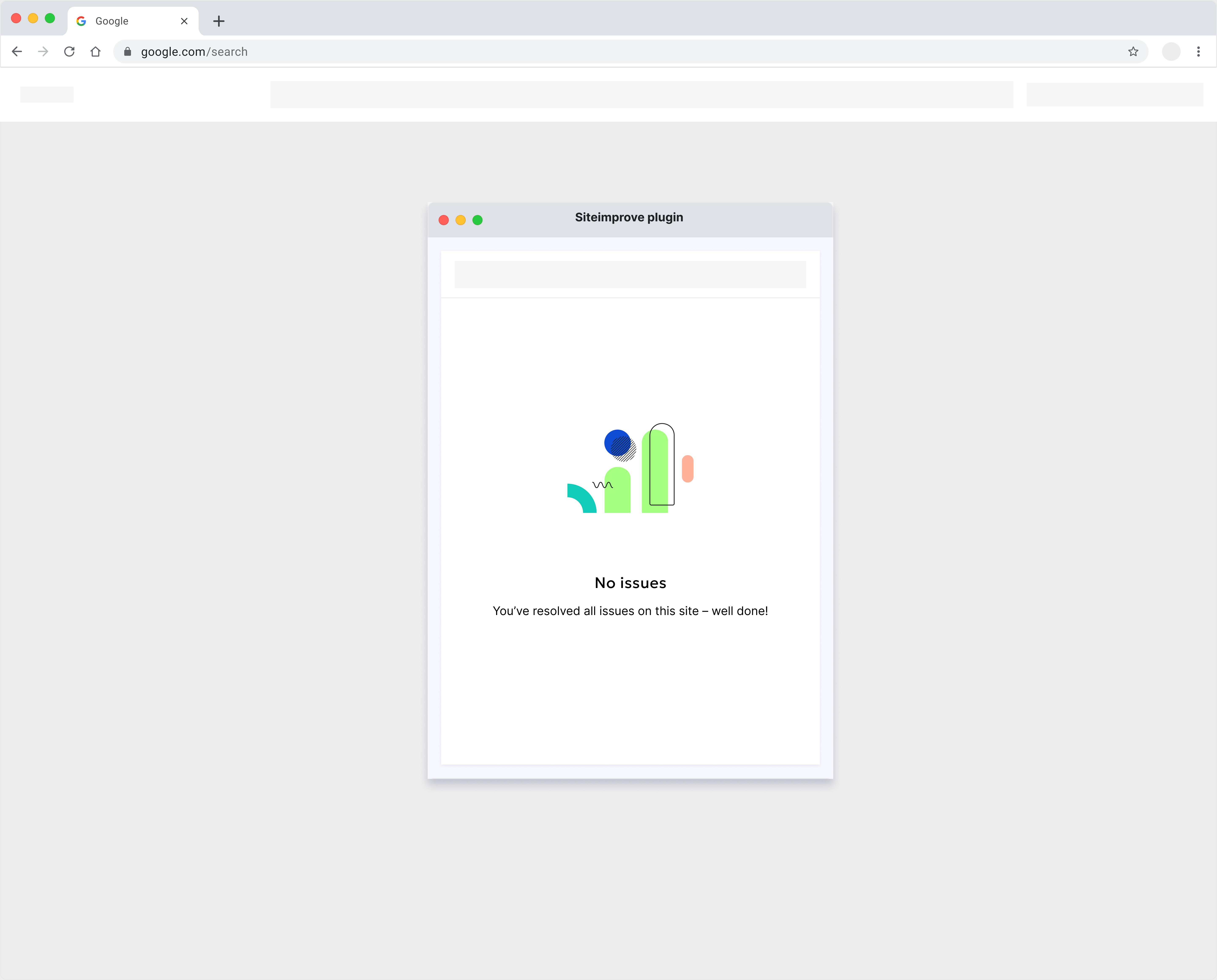
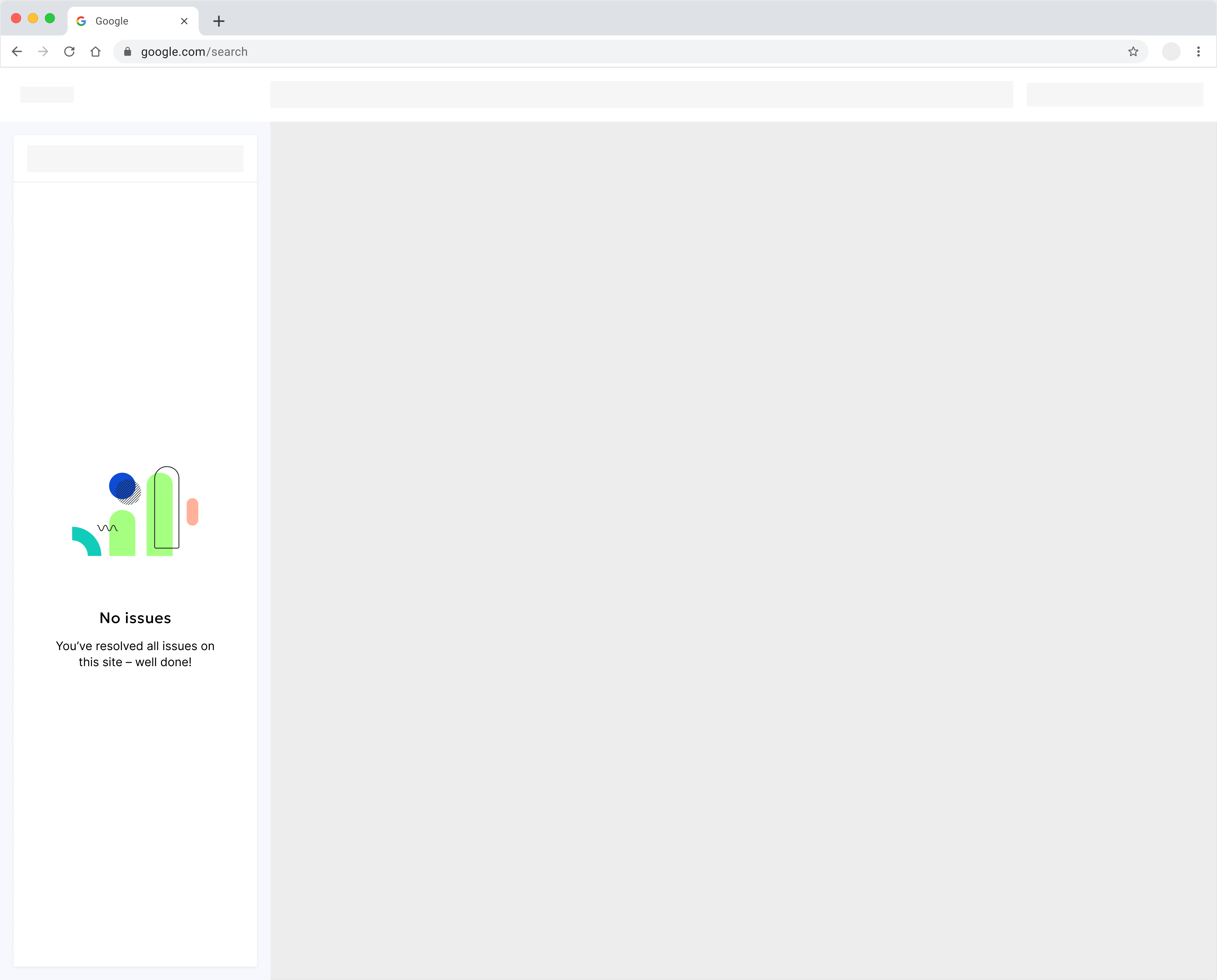
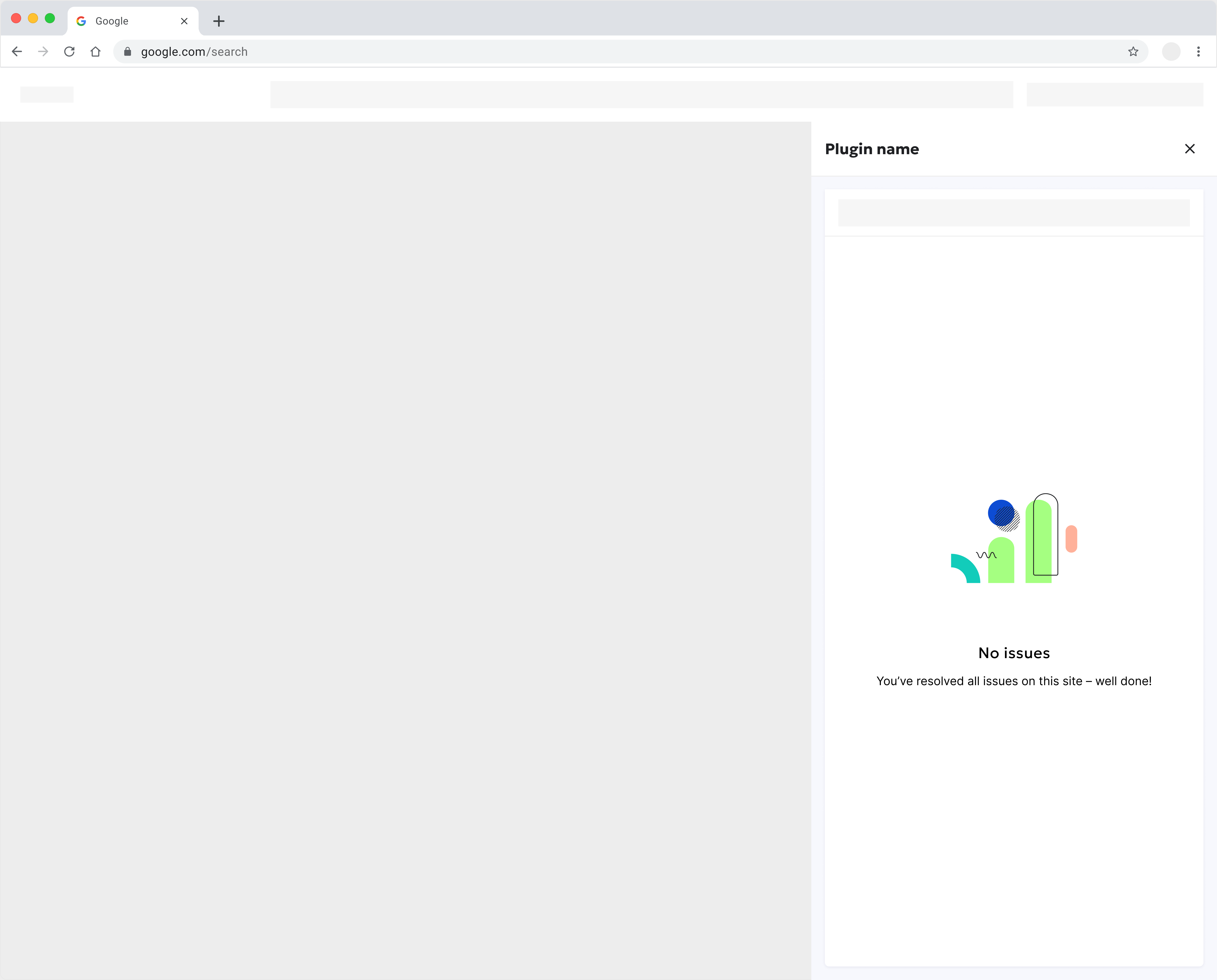
#Empty state
Use an Empty State component to display contextual messages.
CMS Plugin/Content Assistant browser extension
Dynamic Content browser extension
2025 Page Report
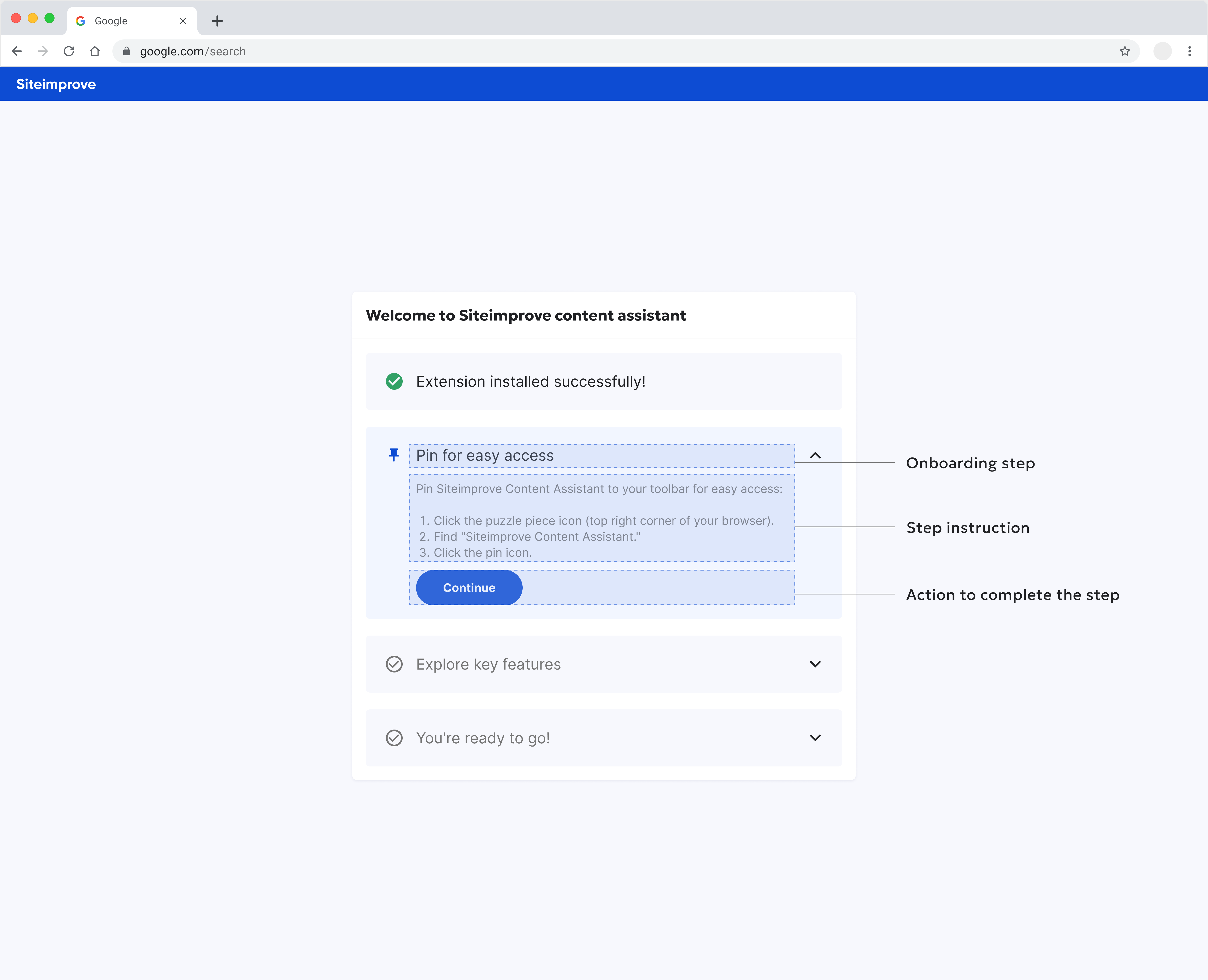
#Post-installation instructions
- Provide helpful tips: Offer users guidance and tips after they install the plugin.
- Highlight key features: Break down the plugin's usage into clear steps and emphasize features like "Pin for easy access" to help users locate the tool conveniently within their browser.
- Offer relevant help: Provide links to specific help center articles related to the plugin. This is particularly valuable for first-time users.
#Browser-Specific UI Guidelines
- Chrome: Refer to the Chrome Web Store's developer documentation for design guidelines, action button placement, and pop-up window dimensions. Explore resources like
chrome.sidePaneland Best practices. - Firefox: Adhere to the Mozilla Add-ons guidelines for toolbar icon size, context menus, and options pages. Review the User experience best practices.
- Other Browsers: Research and adapt to the specific UI guidelines of each target browser. Explore resources like Safari Design and Edge's best practices for extensions.