Spacing
Consistent and intentional spacing creates a harmonious user experience. Our spacing system lays the foundation for responsive design and customizable UI density, enhancing the quality and accessibility of Siteimprove products.
#Spacing tokens
Our spacing system uses a base unit of 1 rem (16px), represented by the token--space--medium (proposed --space--100). All other spacing tokens are multiples of this base unit. For example --space--xxlarge (proposed--space--200) is 32px (200% of the base unit). Always use these tokens instead of raw pixel or rem values for spacing between components and objects.
| Token (current) | Token (proposed) | Base unit multiple | REM | Pixels |
|---|---|---|---|---|
|
| 0.25x | 0.25rem | 4px |
|
| 0.50x | 0.5rem | 8px |
|
| 0.75x | 0.75rem | 12px |
|
| 1x | 1rem | 16px |
|
| 1.25x | 1.25rem | 20px |
|
| 1.5x | 1.5rem | 24px |
|
| 2x | 2rem | 32px |
|
| 2.5x | 2.5rem | 40px |
n/a |
| 3x | 3 rem | 48px |
n/a |
| 4x | 4 rem | 64px |
n/a |
| 5x | 5 rem | 80px |
#Spacing usage
To achieve optimal visual balance, we categorize spacing tokens into three ranges, each with its own general use cases:
#Values 0px to 8px
Use --space--xx-small and --space--x-small (0px to 8px) for small and compact UI elements.
- Gap between small icons and text
- Container padding for small components (e.g., badges, icon buttons, table cells)
- Gap between repeating elements (e.g., button groups)
- Padding within input components
- Vertical spacing between typographic elements in a card (e.g., a title and description)
- Gap between a trigger and its associated element (e.g., a dropdown button and its menu)
#Values 12px to 20px
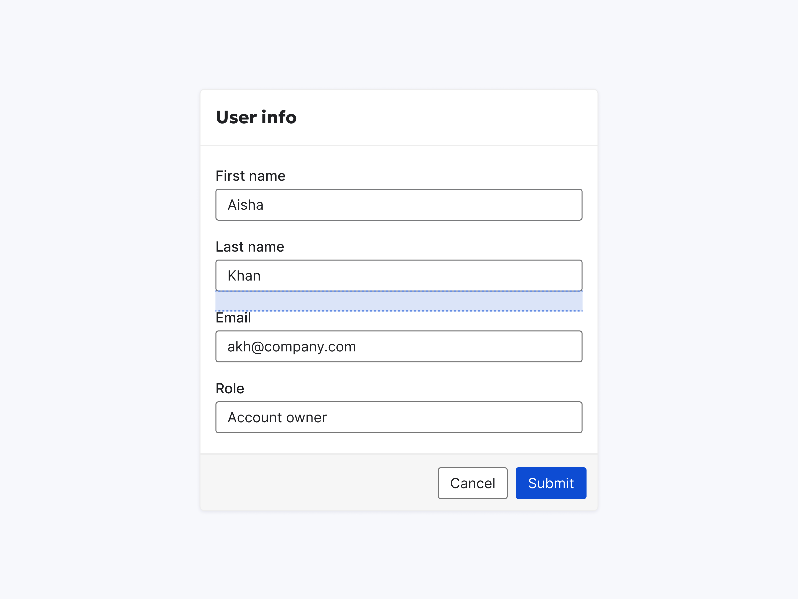
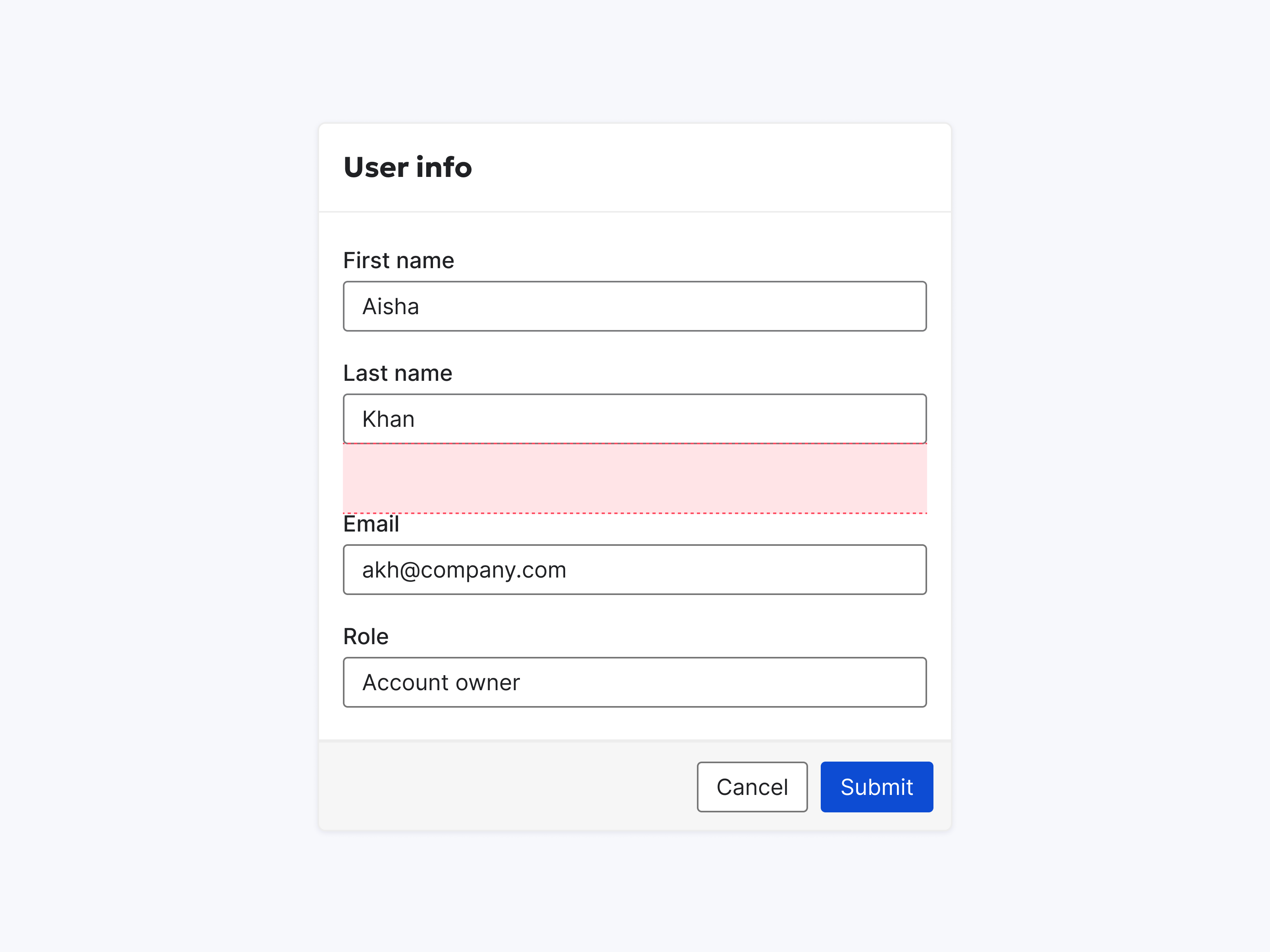
Use --space--small, --space--medium and --space--large (12px to 20px) for larger, less dense UI elements.
- Container padding around larger components (e.g., buttons and cards).
- Vertical spacing between larger elements in cards (e.g., form inputs)
- Spacing between items in less dense layouts or larger components
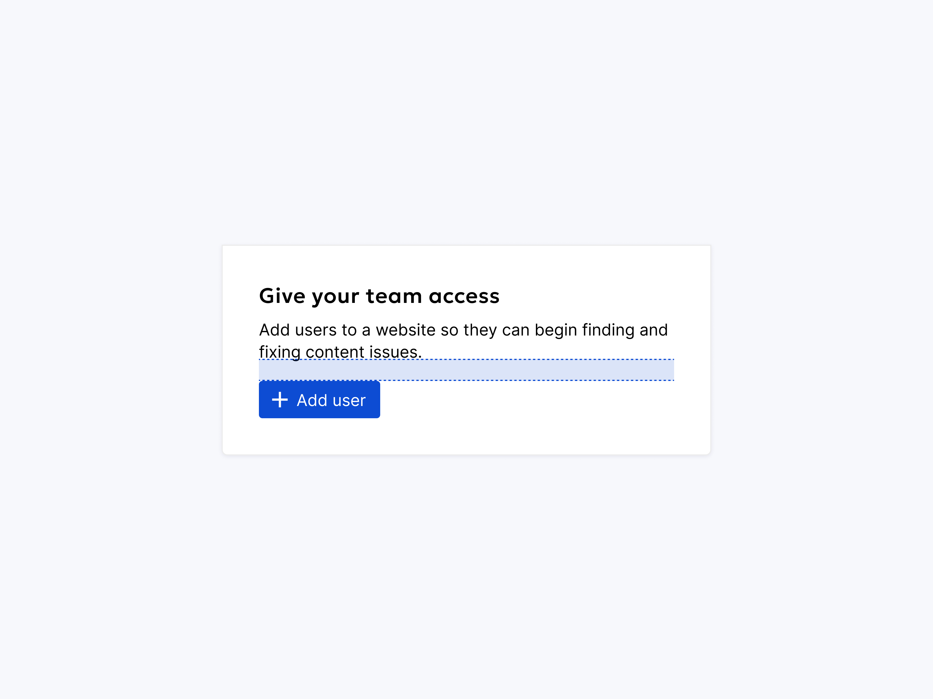
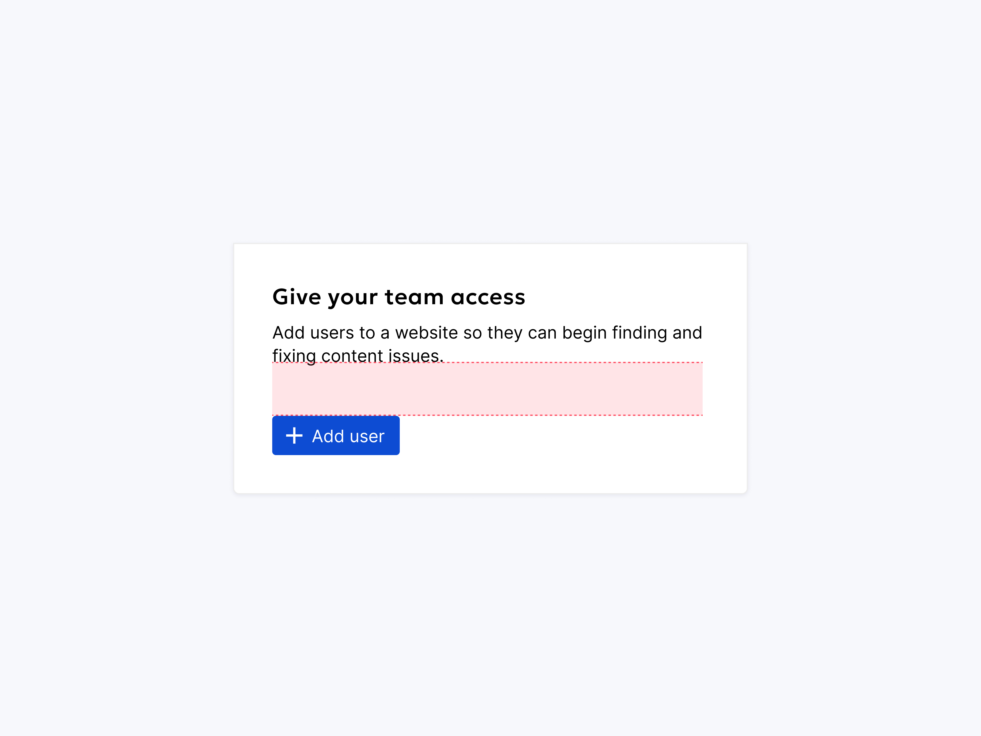
#Values 24px - 40px
Use --space--x-large, --space--xx-large and --space--xxx-large (24px to 40px) for the largest UI elements and layout structures.
- Space between content on the page (e.g., spacing between the top of the page and the header)
- Page-level spacing (e.g., header margins)
- Container padding (e.g., around forms)
- Macro-level content block alignment (e.g., padding around prominent elements.)
#Layout Guidelines
Effective layouts combine UI elements and components with intentional spacing. These spacings help users quickly understand the relationship between elements, allowing them to scan and digest page content with ease. Use these guidelines in conjunction with our spacing tokens to create consistent and user-friendly layouts.
#Group by Similarity
Users expect elements to be grouped semantically. Consistent spacing reinforces these relationships, helping users understand the information architecture. For example, consistent spacing between items in a form, table or list creates a sense of a cohesive unit.
Group similar items together using similar spacing.
Group similar items differently.
#Group by Proximity
The distance between elements conveys meaning. Elements placed close together are perceived as related. Use proximity to create visual hierarchy and guide users through the page. For example, place elements involved in the same user flow close together.
Group related items close together.
Group related items far apart.
#Create Order and Hierarchy
Visual order reduces cognitive load for users. Use element placement, size, and spacing to guide users through the page and emphasize important information. Larger elements and those with more whitespace around them naturally draw attention.
Use variations in scale and whitespace to rank elements.
Neutralize visual hierarchy by assigning the same amount of space to every element.
#Use Optical Adjustment
While the spacing system provides a solid foundation, some situations may require minor adjustments to achieve visual harmony. Use your best judgment to fine-tune spacing based on the visual weight of elements and the overall page flow.
Adjust spacing to create visual balance.
Use standard spacing without considering its alignment with other elements.