Chat
A flexible conversational UI with pluggable adapters and built-in feedback support.
The Chat component renders a message thread with a composer, optional welcome content, and optional error presentation. It is transport-agnostic: the component does not talk to a backend by itself. Instead, it uses a ChatAdapter to send user input and (optionally) to handle actions such as message feedback.
To integrate Chat into your product, you typically:
- Provide and manage
messagesandloadingstate. - Implement a
ChatAdapter(or use the built-in HTTP adapter) that updates the message state. - Optionally provide welcome content, error handling, and feedback support.
Basic usage
This example uses a small in-memory adapter and keeps all state in the parent. It demonstrates the core API: adapter, messages, and loading.
AI Assistant

const { adapter, messages, loading, error, resetChat } = useMockedAdapter();

const welcomeChoices: Choice[] = [
	{
		label: "Where are users dropping off or struggling?",
		icon: (
			<Icon>
				<IconAreaChart />
			</Icon>
		),
	},
	{
		label: "Compare traffic and conversions to last month.",
		icon: (
			<Icon>
				<IconSite />
			</Icon>
		),
	},
	{
		label: "Show me unusual patterns in user behavior.",
		icon: (
			<Icon>
				<IconCampaign />
			</Icon>
		),
	},
];

return (
	<div style={{ height: "800px" }}>
		<Chat
			adapter={adapter}
			messages={messages}
			loading={loading}
			onClear={resetChat}
			welcomeHeading="Let’s dive in to your Analytics data"
			welcomeText="If you're looking to explore visitor behavior, page performance, or traffic trends, you're in the right place."
			welcomeChoices={welcomeChoices}
			error={error}
			data-observe-key="ConversationalAnalytics"
		/>
	</div>
);API
Chat props
The Chat component is controlled: you own the state. The adapter is responsible for updating messages, loading, and any error state.
| Prop | Type | Description |
|---|---|---|
| adapter | ChatAdapter | Required. The transport + orchestration layer. Called when the user sends a prompt and when the UI triggers actions such as feedback. |
| messages | ChatMessage[] | The message thread to render. When empty, the welcome state can be shown. |
| loading | boolean | Whether the assistant is currently working. When true, the list shows a reasoning indicator. |
| loadingMessage | string | Optional label next to the reasoning indicator. |
| onClose | () => void | Called when the user closes the chat (for example when the chat is rendered inside a floating container). |
| disableTypingEffect | boolean | Disable the typing effect. This is automatically disabled for users who has enabled prefers-reduced-motion on their device. |
| composerPlaceholder | string | Placeholder for the text input in the composer. |
| welcomeHeading | string | Heading shown when there are no messages yet. |
| welcomeText | string | Supporting text shown in the welcome state. |
| welcomeChoices | Choice[] | Optional prompt suggestions shown in the welcome state. When clicked, the choice label is sent as a prompt. |
| error | ChatError | null | Optional error state. Use displayMode: "interrupt" to replace the chat with a retry screen, or displayMode: "notify" to show a non-blocking message. |
| onMessageInterrupted | (payload) => void | Promise<void> | Optional callback fired when a response is stopped during typing. The payload contains messageId, stoppedMarkdown, andcancellationMarkdown. Use this to persist interrupted state so reloads can restore the same truncated message and cancellation notice. |
Message types
Messages are rendered based on their payload type. This enables structured UI responses while keeping the message model explicit and type-safe.
Markdown messages
Use markdown messages for regular free-form content. Markdown is rendered using the platform styling.
Payload shape:
type MarkdownChatMessagePayload = {
		type: "markdown";
		markdown: string;
};
AI Assistant
const [messages] = useState<ChatMessage[]>([
		{
			id: "1234",
			role: "assistant",
			payload: {
				type: "markdown",
				markdown: `
## Sample Markdown Message

This is an example of a markdown message rendered in the Chat component.

- It supports **bold** and *italic* text.
- You can create lists:
  1. First item
  2. Second item
  3. Third item
`,
			},
			createdAt: new Date(),
		},
	]);

	const adapter: ChatAdapter = {
		send: async () => {},
	};
	return (
		<div style={{ height: "420px" }}>
			<Chat adapter={adapter} messages={messages} loading={false} {...commonProps} />
		</div>
);Table messages
Use table messages for displaying tabular data. Tables are rendered as Fancy Table components.
Payload shape:
type TableChatMessagePayload = {
		type: "table";
		table: TableProps<TDto>;
};
AI Assistant
type DishItem = { id: number; title: string; cookTime: number; servings: number };

const items: DishItem[] = [
	{ id: 1, title: "Lasagna", cookTime: 45, servings: 2 },
	{ id: 2, title: "Pancakes", cookTime: 20, servings: 4 },
	{ id: 3, title: "Sushi", cookTime: 90, servings: 6 },
	{ id: 4, title: "Cake", cookTime: 30, servings: 8 },
];

const [messages] = useState<ChatMessage[]>([
	{
		id: "1234",
		role: "assistant",
		payload: {
			type: "table",
			table: {
				columns: [
					{
						header: {
							content: "Dish",
							"data-observe-key": "table-header-dish",
						},
						render: (dto: DishItem) => dto.title,
						options: {
							isKeyColumn: true,
						},
					},
					{
						header: {
							content: "Cook Time",
							tooltip: "in minutes",
							"data-observe-key": "table-header-cook-time",
						},
						render: (dto: DishItem) => dto.cookTime,
					},
					{
						header: {
							content: "Servings",
							tooltip: "in persons",
							"data-observe-key": "table-header-servings",
						},
						render: (dto: DishItem) => dto.servings,
					},
				],
				items,
				sort: null,
				setSort: () => {},
				loading: false,
				caption: "Basic usage table",
			},
		},
		createdAt: new Date(),
	} as ChatMessage,
]);

const adapter: ChatAdapter = {
	send: async () => {},
};

return (
	<div style={{ height: "420px" }}>
		<Chat adapter={adapter} messages={messages} loading={false} {...commonProps} />
	</div>
);Choices messages
Use choices messages when the assistant should guide the user with suggested actions. Choices are similar to Fancy interactive Pill components in style, but has been changed slightly to support multi-line content.
Payload shape:
type ChoicesChatMessagePayload = {
		type: "choices";
		choices: Array<{ label: string; icon?: ReactElement }>;
};
The welcome view also uses the same Choice type. This makes it easy to reuse the same prompt suggestions both before and during the conversation.
AI Assistant
const [messages] = useState<ChatMessage[]>([
	{
		id: "1234",
		role: "assistant",
		payload: {
			type: "choices",
			choices: [
				{
					label: "Option 1",
					icon: (
						<Icon>
							<IconOpenNew />
						</Icon>
					),
				},
				{
					label: "Option 2",
				},
				{
					label: "Option 3",
				},
			],
		},
		createdAt: new Date(),
	},
]);

const adapter: ChatAdapter = {
	send: async () => {},
};

return (
	<div style={{ height: "420px" }}>
		<Chat adapter={adapter} messages={messages} loading={false} {...commonProps} />
	</div>
);Reasoning messages
Use reasoning messages to show the assistant's internal thought process or decision-making steps. Reasoning messages are collapsible and render after content messages (markdown, chart, table) but before choices when part of a message group. When part of a message group with reasoning, message actions are attached to the reasoning message (comes right after it, but doesn't copy its content).
Payload shape:
type ReasoningChatMessagePayload = {
		type: "reasoning";
		markdown: string;
};
AI Assistant
const [messages, setMessages] = useState<ChatMessage[]>([]);
const [loading, setLoading] = useState(false);

const adapter: ChatAdapter = {
	send: async (draft: ChatMessageDraft) => {
		setMessages((prev) => [
			...prev,
			{
				id: crypto.randomUUID(),
				role: "user",
				payload: { type: "markdown", markdown: draft.content },
				createdAt: new Date(),
			},
		]);
		setLoading(true);
		await new Promise((r) => setTimeout(r, 800));

		// Messages are deliberately in the wrong order to demonstrate automatic sorting.
		// The UI will render them as: chart → markdown → reasoning + actions → choices.
		const groupId = crypto.randomUUID();
		setMessages((prev) => [
			...prev,
			{
				id: crypto.randomUUID(),
				groupId,
				role: "assistant",
				payload: {
					type: "choices",
					choices: [
						{ label: "Drill into mobile traffic" },
						{ label: "Compare with last quarter" },
					],
				},
				createdAt: new Date(),
			},
			{
				id: crypto.randomUUID(),
				groupId,
				role: "assistant",
				payload: {
					type: "reasoning",
					markdown: `- Aggregated 12K sessions over 30 days\n- Segmented by device type and referrer\n- Detected a 15% week-over-week increase on mobile`,
				},
				createdAt: new Date(),
			},
			{
				id: crypto.randomUUID(),
				groupId,
				role: "assistant",
				payload: {
					type: "markdown",
					markdown:
						"Traffic is trending upward, especially on mobile. The chart above shows daily sessions over the past week.",
				},
				createdAt: new Date(),
				feedback: MessageFeedbackType.NEUTRAL,
			},
			{
				id: crypto.randomUUID(),
				groupId,
				role: "assistant",
				payload: {
					type: "chart",
					chart: {
						options: {
							series: [
								{
									type: "line",
									name: "Sessions",
									data: [320, 410, 390, 480, 520, 610, 590].map((val, i) => ({
										x: i,
										y: val,
										name: `Day ${i + 1}`,
									})),
								},
							],
						},
					},
				},
				createdAt: new Date(),
			},
		]);
		setLoading(false);
	},
};

return (
	<div style={{ height: "800px" }}>
		<Chat adapter={adapter} messages={messages} loading={loading} {...commonProps} />
	</div>
);Chart messages
Use chart messages for chart visualization. Charts are rendered as Fancy Chart components.
Payload shape:
type ChartChatMessagePayload = {
		type: "chart";
		chart: ChartWithoutAnnotationProps | ChartWithAnnotationProps;
};
AI Assistant
const [messages] = useState<ChatMessage[]>([
	{
		id: "1234",
		role: "assistant",
		payload: {
			type: "chart",
			chart: {
				options: {
					series: [
						{
							type: "bar",
							name: "Series 1",
							data: [25, 23, 48, 52, 52, 57, 56, 61, 66].map((val, i) => {
								return {
									x: i,
									y: val,
									name: i.toString(),
								};
							}),
						},
						{
							type: "bar",
							name: "Series 2",
							data: [18, 26, 36, 44, 49, 59, 65, 71, 82].map((val, i) => {
								return {
									x: i,
									y: val,
									name: i.toString(),
								};
							}),
						},
					],
				},
			},
		},
		createdAt: new Date(),
	},
]);

const adapter: ChatAdapter = {
	send: async () => {},
};
return (
	<div style={{ height: "500px" }}>
		<Chat adapter={adapter} messages={messages} loading={false} {...commonProps} />
	</div>
);Error messages
Use error messages for failures that should remain in the conversation thread. They render using the Fancy Message component, default to a negative, dismissible message, and can provide a retry action. Use errorType to render another message type or set dismissible to false when the message must remain visible.
The consuming application is responsible for attaching the optional retry and dismiss callbacks. A retry removes the error message from view before invoking its callback.
For all examples on this page you can also type error to simulate this error.
Payload shape:
type ErrorChatMessagePayload = {
		type: "error";
		message: string;
		dismissible?: boolean;
		errorType?: "positive" | "neutral" | "warning" | "negative";
		onDismiss?: () => void;
		retry?: {
			label?: string;
			callback: () => void | Promise<void>;
		};
};
AI Assistant
const [showRetryError, setShowRetryError] = useState(true);
const [showWarning, setShowWarning] = useState(true);

const messages: ChatMessage[] = [
	{
		id: "error-message-example-user",
		role: "user",
		payload: { type: "markdown", markdown: "Generate my analytics summary." },
		createdAt: new Date(),
	},
	...(showRetryError
		? [
				{
					id: "error-message-example-retry",
					role: "assistant" as const,
					payload: {
						type: "error" as const,
						message: "The summary could not be generated.",
						retry: {
							label: "Try again",
							callback: () => setShowRetryError(false),
						},
					},
					createdAt: new Date(),
				},
			]
		: [
				{
					id: "error-message-example-success",
					role: "assistant" as const,
					payload: {
						type: "markdown" as const,
						markdown: "The analytics summary is ready.",
					},
					createdAt: new Date(),
				},
			]),
	...(showWarning
		? [
				{
					id: "error-message-example-warning",
					role: "assistant" as const,
					payload: {
						type: "error" as const,
						errorType: "warning" as const,
						message: "Some data sources were unavailable, so the result may be incomplete.",
						onDismiss: () => setShowWarning(false),
					},
					createdAt: new Date(),
				},
			]
		: []),
];

const adapter: ChatAdapter = {
	send: async () => {},
};

return (
	<div style={{ height: "500px" }}>
		<Chat adapter={adapter} messages={messages} loading={false} {...commonProps} />
	</div>
);Custom messages
Use custom messages to render arbitrary React components inside the chat thread. This enables rich, domain-specific experiences without modifying the Chat component itself.
Custom messages use a name field to look up a renderer from the customRenderers prop — a map of name to render function. The data field carries whatever data the renderer needs. Since messages must be serializable, the renderer map is passed to the Chat component at construction time rather than stored in the message data.
Payload shape:
type CustomChatMessagePayload = {
	type: "custom";
	name: string;
	data: unknown;
};

// The renderer map, passed as a Chat prop:
type CustomRenderers = Record<string, (message: CustomMessage) => ReactNode>;
AI Assistant
type ProgressPayload = { label: string; percent: number };

const customRenderers: CustomRenderers = {
	"progress-bar": (message) => {
		const { label, percent } = message.payload.data as ProgressPayload;
		return (
			<div style={{ padding: "12px 0" }}>
				<Paragraph>
					<strong>{label}</strong> — {percent}%
				</Paragraph>
				<ProgressBar value={percent} total={100} aria-label={`${label} progress`} />
			</div>
		);
	},
};

const [messages] = useState<ChatMessage[]>([
	{
		id: "custom-user-1",
		role: "user",
		payload: { type: "markdown", markdown: "How is the migration going?" },
		createdAt: new Date(),
	},
	{
		id: "custom-assistant-progress",
		role: "assistant",
		payload: {
			type: "custom",
			name: "progress-bar",
			data: { label: "Database migration", percent: 73 },
		},
		createdAt: new Date(),
	},
]);

const adapter: ChatAdapter = {
	send: async () => {},
};

return (
	<div style={{ height: "420px" }}>
		<Chat
			adapter={adapter}
			messages={messages}
			loading={false}
			customRenderers={customRenderers}
			{...commonProps}
		/>
	</div>
);Message grouping
Messages that belong to the same assistant response can share a single set of action buttons by providing the same groupId. Only the last message in a group will render action buttons, reducing visual clutter when multiple content types (markdown, table, chart) are returned together.
The backend assigns the same groupId to related messages. The UI automatically calculates which message is last in each group and only renders actions for that message.
AI Assistant
const groupId = "response-123";

	const [messages] = useState<ChatMessage[]>([
		{
			id: "msg-1",
			groupId,
			role: "assistant",
			payload: {
				type: "markdown",
				markdown:
					"Here's an analysis of your data. First, let me provide some context about what we're looking at:",
			},
			createdAt: new Date(),
		},
		{
			id: "msg-2",
			groupId,
			role: "assistant",
			payload: {
				type: "table",
				table: {
					columns: [
						{
							header: {
								content: "Page",
								"data-observe-key": "table-header-page",
							},
							render: (dto: unknown) => (dto as { page: string }).page,
							options: {
								isKeyColumn: true,
							},
						},
						{
							header: {
								content: "Views",
								"data-observe-key": "table-header-views",
							},
							render: (dto: unknown) => (dto as { views: number }).views,
						},
					],
					items: [
						{ page: "/home", views: 1250 },
						{ page: "/about", views: 890 },
						{ page: "/contact", views: 456 },
					],
					caption: "Page views",
					sort: null,
					setSort: () => {},
					loading: false,
				},
			},
			createdAt: new Date(),
		},
		{
			id: "msg-3",
			groupId,
			role: "assistant",
			payload: {
				type: "chart",
				chart: {
					options: {
						series: [
							{
								type: "line",
								name: "Trend",
								data: [850, 920, 1050, 1180, 1250].map((val, i) => ({
									x: i,
									y: val,
									name: `Week ${i + 1}`,
								})),
							},
						],
					},
				},
			},
			createdAt: new Date(),
		},
		{
			id: "msg-4",
			groupId,
			role: "assistant",
			payload: {
				type: "markdown",
				markdown:
					"As you can see, traffic has been steadily increasing. Notice how all three content types above share a single set of action buttons at the bottom.",
			},
			createdAt: new Date(),
			feedback: MessageFeedbackType.NEUTRAL,
		},
		{
			id: "msg-5",
			groupId,
			role: "assistant",
			payload: {
				type: "choices",
				choices: [
					{ label: "Dive deeper into the traffic trends" },
					{ label: "Compare with previous period" },
					{ label: "Show me the top referral sources" },
				],
			},
			createdAt: new Date(),
		},
		{
			id: "msg-6",
			groupId,
			role: "assistant",
			payload: {
				type: "reasoning",
				markdown: `- Scanned all page elements. Found 156 elements including images, links, and forms.
- Checked accessibility standards and compared against WCAG 2.1 AA guidelines.
- Identified critical issues and prioritized by impact on user experience`,
			},
			createdAt: new Date(),
		},
	]);

	const adapter: ChatAdapter = {
		send: async () => {},
	};

	return (
		<div style={{ height: "700px" }}>
			<Chat adapter={adapter} messages={messages} loading={false} {...commonProps} />
		</div>
);Message sorting
Within a message group, the Chat component automatically sorts messages to ensure the correct rendering order, regardless of how they arrive from the backend:
- Content messages (markdown, chart, table) render first in their original order.
- Reasoning messages render next.
- Choices messages always render last.
Message actions (copy, feedback) are attached to the last reasoning message when reasoning exists in the group. If there is no reasoning, actions appear on the last content message. The UI order is: content → reasoning + actions → choices.
In the example below, messages are provided in random order:
AI Assistant
const groupId = "sorted-response-456";

	// Messages provided in random order to demonstrate automatic sorting
	const [messages] = useState<ChatMessage[]>([
		{
			id: "sort-msg-choices",
			groupId,
			role: "assistant",
			payload: {
				type: "choices",
				choices: [
					{ label: "View detailed analytics" },
					{ label: "Generate a report" },
					{ label: "Compare with competitors" },
				],
			},
			createdAt: new Date(),
		},
		{
			id: "sort-msg-markdown-1",
			groupId,
			role: "assistant",
			payload: {
				type: "markdown",
				markdown:
					"## Performance Summary\n\nHere's an overview of your system performance. The data below shows key metrics across different dimensions.",
			},
			createdAt: new Date(),
		},
		{
			id: "sort-msg-reasoning",
			groupId,
			role: "assistant",
			payload: {
				type: "reasoning",
				markdown: `- Analyzed 1,250 data points across 4 time periods
- Compared current metrics against historical averages
- Identified 3 anomalies worth investigating`,
			},
			createdAt: new Date(),
		},
		{
			id: "sort-msg-chart",
			groupId,
			role: "assistant",
			payload: {
				type: "chart",
				chart: {
					options: {
						series: [
							{
								type: "bar",
								name: "Performance",
								data: [45, 52, 48, 61, 55].map((val, i) => ({
									x: i,
									y: val,
									name: `Day ${i + 1}`,
								})),
							},
						],
					},
				},
			},
			createdAt: new Date(),
		},
		{
			id: "sort-msg-table",
			groupId,
			role: "assistant",
			payload: {
				type: "table",
				table: {
					columns: [
						{
							header: {
								content: "Metric",
								"data-observe-key": "table-header-metric",
							},
							render: (dto: unknown) => (dto as { metric: string }).metric,
							options: {
								isKeyColumn: true,
							},
						},
						{
							header: {
								content: "Value",
								"data-observe-key": "table-header-value",
							},
							render: (dto: unknown) => (dto as { value: string }).value,
						},
					],
					items: [
						{ metric: "Uptime", value: "99.95%" },
						{ metric: "Latency", value: "45ms" },
						{ metric: "Throughput", value: "15K req/s" },
					],
					caption: "Key metrics",
					sort: null,
					setSort: () => {},
					loading: false,
				},
			},
			createdAt: new Date(),
		},
		{
			id: "sort-msg-markdown-2",
			groupId,
			role: "assistant",
			payload: {
				type: "markdown",
				markdown:
					"**Note:** All messages above were provided in random order, but rendered in the correct sequence. The message actions (copy and feedback) are attached to the reasoning section.",
			},
			createdAt: new Date(),
		},
	]);

	const adapter: ChatAdapter = {
		send: async () => {},
	};

	return (
		<div style={{ height: "750px" }}>
			<Chat adapter={adapter} messages={messages} loading={false} {...commonProps} />
		</div>
);Extra message actions
Use the Chat component's extraMessageActions prop to add custom action buttons to chart and table messages. The actions are defined once at the Chat level and receive the current message in their isVisible and onClick callbacks. This lets the consuming application decide which messages should show an action without storing React elements or callback functions in the serialized message payload.
For use cases such as "Add to dashboard", keep any dashboard-specific metadata outside Fancy in the consuming application. For example, PFG can store a serializable metadata lookup keyed by ChatMessage.id. When metadata events arrive from the stream, PFG updates that lookup. The action's isVisible callback can then check whether the current chart/table message has matching metadata, and onClick can use that metadata to open the Add to dashboard modal.
AI Assistant
const [showModal, setShowModal] = useState(false);
const [selectedMetadata, setSelectedMetadata] = useState<{
	requestType: string;
	request: unknown;
	service: string;
} | null>(null);

// In a real application, this would be synced with the backend as metadata arrives
// during the chat session. For now, we use a static mock.
const dashboardMetadataByMessageId: Record<
	string,
	{ requestType: string; request: unknown; service: string }
> = {
	"extra-actions-assistant-1": {
		requestType: "PfgFramework.Common.Analytics.Models.Something.SomeRequest",
		request: {
			account_id: 123,
			site_id: 456,
			period: {
				start: "2026-01-01",
				end: "2026-01-31",
			},
		},
		service: "analytics",
	},
};

const extraMessageActions: ChatMessageAction[] = [
	{
		id: "add-to-dashboard",
		tooltip: "Add to dashboard",
		icon: (
			<Icon>
				<IconAdd />
			</Icon>
		),
		isVisible: (message) => {
			// Only show for chart/table messages that have metadata
			const isChartOrTable = message.payload.type === "chart" || message.payload.type === "table";
			const hasMetadata = dashboardMetadataByMessageId[message.id] !== undefined;
			return isChartOrTable && hasMetadata;
		},
		onClick: (message) => {
			const metadata = dashboardMetadataByMessageId[message.id];
			if (metadata) {
				setSelectedMetadata(metadata);
				setShowModal(true);
			}
		},
	},
];

const [messages] = useState<ChatMessage[]>([
	{
		id: "extra-actions-assistant-1",
		role: "assistant",
		payload: {
			type: "chart",
			chart: {
				options: {
					series: [
						{
							type: "line",
							name: "Trend",
							data: [850, 920, 1050, 1180, 1250].map((val, i) => ({
								x: i,
								y: val,
								name: `Week ${i + 1}`,
							})),
						},
					],
				},
			},
		},
		createdAt: new Date(),
		feedback: MessageFeedbackType.NEUTRAL,
	},
]);

const adapter: ChatAdapter = {
	send: async () => {},
};

const [value, setValue] = useState("Top Regional Performance");
const items = [
	{ value: 0, title: "Dashboard 1" },
	{ value: 1, title: "Dashboard 2" },
	{ value: 2, title: "Dashboard 3" },
	{ value: 3, title: "Dashboard 4" },
	{ value: 4, title: "Dashboard 5" },
];
const [selectedItems, setSelectedItems] = useState<number[]>([]);

return (
	<>
		<div style={{ height: "520px" }}>
			<Chat
				adapter={adapter}
				messages={messages}
				loading={false}
				extraMessageActions={extraMessageActions}
				{...commonProps}
			/>
		</div>
		<Modal shown={showModal} headerTitle="Add to dashboard" onClose={() => setShowModal(false)}>
			<Modal.Content>
				<FormElementWrapper label="Widget title" name="widget-title">
					<InputField value={value} onChange={setValue} fullWidth />
				</FormElementWrapper>
				<FormElementWrapper label="Add to dashboard(s)" name="add-to-dashboard">
					<Select
						items={items}
						value={selectedItems}
						onChange={setSelectedItems}
						noDefaultOption
						bulkActions
						placeholder="Select one or more"
						fullWidth
					/>
				</FormElementWrapper>
			</Modal.Content>
			<Modal.Footer>
				<ActionBar
					primary={{
						children: "Confirm",
						onClick: () => {
							console.log("Adding to dashboard with metadata:", {
								widgetTitle: value,
								selectedDashboards: selectedItems,
								metadata: selectedMetadata,
							});
							setShowModal(false);
						},
					}}
					cancel={{ children: "Cancel", onClick: () => setShowModal(false) }}
				/>
			</Modal.Footer>
		</Modal>
	</>
);Adapters
The adapter is the only piece that knows how to communicate with your backend. It receives a ChatMessageDraft when the user sends something.
type ChatMessageDraft = {
	content: string;
	type: "prompt" | "choice";
};

type ChatAdapter = {
	send: (draft: ChatMessageDraft) => Promise<void>;
	act?: (action: ChatAction) => Promise<void>;
};
The Chat UI is controlled; therefore the adapter is expected to update your message state. A common pattern is:
- Append the user message to
messagesas soon as the user sends. - Set
loadingwhile your backend request is in flight. - Append the assistant response as one (or more)
ChatMessageitems.
AI Assistant
const [messages, setMessages] = useState<ChatMessage[]>([]);
const [loading, setLoading] = useState<boolean>(false);

const mockAdapter: ChatAdapter = {
	send: async (draft: ChatMessageDraft) => {
		// depending on the use case, one might want to implement different logic for prompts vs choices. For this demo, we treat them the same, but you could easily branch based on draft.type.
		setMessages((prev) => [
			...prev,
			{
				id: crypto.randomUUID(),
				role: "user",
				payload: { type: "markdown", markdown: draft.content },
				createdAt: new Date(),
			},
		]);
		setLoading(true);
		await sleep(800);
		setMessages((prev) => [
			...prev,
			{
				id: crypto.randomUUID(),
				role: "assistant",
				payload: {
					type: "markdown",
					markdown: `You said: ${draft.content}`,
				},
				createdAt: new Date(),
			},
		]);
		setLoading(false);
	},
	act: async (action: ChatAction) => {
		if (action.type === "feedback") {
			const { feedbackValue, feedbackContext } = action.payload;
			setMessages((prev) =>
				prev.map((msg) =>
					msg.id === feedbackContext.id ? { ...msg, feedback: feedbackValue } : msg
				)
			);
		}
	},
};

return (
	<div style={{ height: "800px" }}>
		<Chat adapter={mockAdapter} messages={messages} loading={loading} {...commonProps} />
	</div>
);Built-in HTTP adapter
If your backend is reachable via HTTP, you can use the built-in hook useHttpChatAdapter. The hook owns the messages and loading state, and it returns an adapter compatible with Chat.
AI Assistant
const { adapter, messagesState, loadingState } = useHttpChatAdapter({
	baseUrl: "https://api.example.com",
	endpoints: {
		chat: "/chat",
		feedback: "/feedback",
	},
	// optional customizations
	mapInbound: (data): ChatMessage => ({
		id: data.id,
		role: "assistant",
		payload: data.payload ?? { type: "markdown", markdown: data.content ?? "" },
		createdAt: data.createdAt ? new Date(data.createdAt) : new Date(),
		feedback: data.feedback ?? undefined,
	}),
	// mock fetch implementation for demonstration purposes
	fetchImpl: async (input: RequestInfo | URL, init?: RequestInit) => {
		console.log("HTTP Adapter fetch called with:", input, init);
		await sleep(800);

		// Feedback endpoint demo
		if (String(input).endsWith("/feedback")) {
			return new Response(JSON.stringify({ ok: true }), {
				status: 200,
				headers: { "Content-Type": "application/json" },
			});
		}

		const body = JSON.parse(String(init?.body ?? "{}"));
		return new Response(
			JSON.stringify({
				id: crypto.randomUUID(),
				content: "You sent: " + (body?.messages?.[0]?.content ?? ""),
			}),
			{ status: 200, headers: { "Content-Type": "application/json" } }
		);
	},
});

const [messages] = messagesState;
const [loading] = loadingState;

return (
	<div style={{ height: "800px" }}>
		<Chat adapter={adapter} messages={messages} loading={loading} {...commonProps} />
	</div>
);
By default, the HTTP adapter:
- Serializes outbound drafts as
{ messages: [{ role: 'user', content: string }] }. - Maps inbound JSON into an assistant markdown message.
- Optionally posts feedback to a dedicated feedback endpoint when configured.
You can customize the adapter using:
composeMessageto control how user messages are appended locally.mapOutboundto match your backend request schema.mapInboundto map the backend response into aChatMessage.headersandfetchImplfor auth and testing.
Feedback
Assistant markdown messages can store feedback via the optional feedback field. The UI uses the adapter action act with type: "feedback".
Feedback values use MessageFeedbackType:
enum MessageFeedbackType { POSITIVE = 1, NEGATIVE = -1, NEUTRAL = 0 }The built-in HTTP adapter will automatically:
- POST feedback to
endpoints.feedbackwhen provided. - Update the feedback field in local message state after a successful call.
AI Assistant
const initialAssistant: ChatMessage = {
	id: "1234",
	role: "assistant",
	payload: {
		type: "markdown",
		markdown:
			"This message supports feedback. Use the message actions to rate it and optionally leave a comment.",
	},
	createdAt: new Date(),
	feedback: MessageFeedbackType.NEUTRAL,
};

const [messages, setMessages] = useState<ChatMessage[]>([initialAssistant]);
const [loading] = useState<boolean>(false);

const adapter: ChatAdapter = {
	send: async () => {
		// not needed for this demo
	},
	act: async (action: ChatAction) => {
		if (action.type === "feedback") {
			const { feedbackValue, feedbackContext } = action.payload;
			// In a real adapter, you would also persist feedback to your backend.
			setMessages((prev) =>
				prev.map((m) => (m.id === feedbackContext.id ? { ...m, feedback: feedbackValue } : m))
			);
		}
	},
};

return (
	<div style={{ height: "500px" }}>
		<Chat adapter={adapter} messages={messages} loading={loading} {...commonProps} />
	</div>
);Errors
Cancellation error message
When a user stops a response while the Chat is in its loading state a cancellation message is added to the messages list. If a markdown message is being animated using the typing effect, when the user stops a response, a cancellation message is appended to the end of the partial markdown response. Chat passes the visible, truncated response to onMessageInterrupted as stoppedMarkdown and the localized cancellation line as cancellationMarkdown. Applications can persist both values and restore the same user-stopped state without replaying the typing effect.
In-stream error message
When the error message should remain in the conversation history, use an error message.
Pinned and blocking error messages
The Chat component supports two distinct error modes through the error prop: interrupt and notify.
displayMode: "interrupt"is a distinct blocking state. It replaces the chat content area with the interrupt error view, and the composer is disabled while it is active.displayMode: "notify"is intended for session-level errors and warnings during an active conversation. It shows a non-blocking and pinned error message near the composer while keeping the conversation visible and usable, along with a retry button that resends the last prompt by default. SetfooterActions.renderActionsto render custom content in the footer instead, orfooterActions.show: falseto hide the footer.
Example integration pattern
This pattern centralizes how notify errors are created and cleared in one place, so your adapter can apply consistent behavior across all message types. The snippet includes helper functions for positive, neutral, warning, and negative notifications, while the interactive demo below still focuses on warning and negative triggers to mirror common runtime cases.
type ErrorPolicy = ChatError | null;
type NotifyType = "positive" | "neutral" | "warning" | "negative";

const autoClearOnSend: NotifyType[] = ["positive", "neutral", "warning"];

function clearOnSend(prev: ErrorPolicy): ErrorPolicy {
	if (
		prev?.displayMode === "notify" &&
		prev.errorType !== undefined &&
		autoClearOnSend.includes(prev.errorType)
	) {
		return null;
	}
	return prev;
}

function toNotify(type: NotifyType, message: string, dismiss: () => void): ChatError {
	return {
		displayMode: "notify",
		errorType: type,
		message,
		onDismiss: dismiss,
	};
}

const toNotifyWarning = (message: string, dismiss: () => void) =>
	toNotify("warning", message, dismiss);

const toNotifyNegative = (message: string, dismiss: () => void) =>
	toNotify("negative", message, dismiss);

const toNotifyNeutral = (message: string, dismiss: () => void) =>
	toNotify("neutral", message, dismiss);

const toNotifyPositive = (message: string, dismiss: () => void) =>
	toNotify("positive", message, dismiss);

// Usage in your adapter/state layer:
// 1) Before sending: setError((prev) => clearOnSend(prev))
// 2) Warning failures: setError(toNotifyWarning("...", () => setError(null)))
// 3) Negative failures: setError(toNotifyNegative("...", () => setError(null)))
// 4) Informational state: setError(toNotifyNeutral("...", () => setError(null)))
// 5) Success state: setError(toNotifyPositive("...", () => setError(null)))
// 6) Retry or explicit clear action: setError(null)
Interactive example
In the interactive example below use the buttons to trigger the pinned and blocking error messages. For all examples on this page you can also type notify-warning,notify-negative, or interrupt to simulate the corresponding error.
AI Assistant
const [messages, setMessages] = useState<ChatMessage[]>([
	{
		id: "error-example-user-1",
		role: "user",
		payload: { type: "markdown", markdown: "Show me my analytics summary." },
		createdAt: new Date(),
	},
	{
		id: "error-example-assistant-1",
		role: "assistant",
		payload: {
			type: "markdown",
			markdown: "Sure! Use the buttons below to simulate different error states.",
		},
		createdAt: new Date(),
	},
]);
const [loading] = useState(false);
const [mode, setMode] = useState<"none" | "notifyWarning" | "notifyError" | "interrupt">("none");
const [chatResetKey, setChatResetKey] = useState(0);

const handleNoError = () => {
	setMode("none");
	setChatResetKey((key) => key + 1);
};

const adapter: ChatAdapter = {
	send: async (draft: ChatMessageDraft) => {
		setMessages((prev) => [
			...prev,
			{
				id: crypto.randomUUID(),
				role: "user",
				payload: { type: "markdown", markdown: draft.content },
				createdAt: new Date(),
			},
		]);

		const normalizedContent = draft.content.toLowerCase();
		const containsToken = (token: string) =>
			normalizedContent.split(/\s+/).some((part) => part.trim() === token);
		if (containsToken("notify-warning")) {
			setMode("notifyWarning");
		} else if (containsToken("notify-negative")) {
			setMode("notifyError");
		} else if (normalizedContent.includes("interrupt")) {
			setMode("interrupt");
		}
	},
};

const error: ChatError | null = (() => {
	switch (mode) {
		case "notifyWarning":
			return {
				displayMode: "notify",
				errorType: "warning",
				dismissible: true,
				message: "This is a non-blocking notification warning. The chat remains usable.",
				onDismiss: handleNoError,
				footerActions: { show: false },
			};
		case "notifyError":
			return {
				displayMode: "notify",
				message: "This is a non-blocking notification error. The chat remains usable.",
				onDismiss: handleNoError,
			};
		case "interrupt":
			return {
				displayMode: "interrupt",
				heading: "We couldn't connect to the assistant.",
				message: "This is a blocking interrupt error. Provide an action to retry.",
				onDismiss: handleNoError,
				action: {
					label: "Try again",
					callback: () => setMode("none"),
				},
			};
		default:
			return null;
	}
})();

return (
	<div style={{ height: "650px" }}>
		<Content gap="small" padding="none">
			<Button.Group aria-label="Error mode">
				<Button onClick={handleNoError} variant={mode === "none" ? "primary" : "default"}>
					No error
				</Button>
				<Button
					onClick={() => setMode("notifyWarning")}
					variant={mode === "notifyWarning" ? "primary" : "default"}
				>
					Notify warning
				</Button>
				<Button
					onClick={() => setMode("notifyError")}
					variant={mode === "notifyError" ? "primary" : "default"}
				>
					Notify error
				</Button>
				<Button
					onClick={() => setMode("interrupt")}
					variant={mode === "interrupt" ? "primary" : "default"}
				>
					Interrupt error
				</Button>
			</Button.Group>
		</Content>
		<div style={{ height: "560px", marginTop: 16 }}>
			<Chat
				key={chatResetKey}
				adapter={adapter}
				messages={messages}
				loading={loading}
				error={error}
				{...commonProps}
			/>
		</div>
	</div>
);Layout
Floating container
Use ChatFloatingContainer when you need a floating chat that overlays page content. The container handles positioning and the close affordance.
Full-screen mode
The ChatFloatingContainer supports full-screen mode using the following three props: isFullScreen, onFullScreen and overlayContainer. When onFullScreen is provided, a full-screen toggle button is automatically rendered in the ChatHeader.
You must manage the full-screen state yourself and toggle it in the onFullScreen callback:
const [isFullScreen, setIsFullScreen] = useState(false);

<ChatFloatingContainer
    data-observe-key="chat-floating"
    isFullScreen={isFullScreen}
    onFullScreen={() => setIsFullScreen(!isFullScreen)}
    // ...other props
/>
When isFullScreen is true, the container expands to fill the specified overlay container (see below). The full-screen button icon automatically updates to show either an expand or collapse icon based on the current state.
The floating container automatically adjusts its position and size based on any changes to the overlay container or the viewport.
const { adapter, messages, loading, error, resetChat } = useMockedAdapter();
const [shown, setShown] = useState<boolean>(false);
const [isFullScreen, setIsFullScreen] = useState<boolean>(false);

return (
	<>
		<Button onClick={() => setShown(!shown)} variant="primary">
			Toggle chat
		</Button>
		<ChatFloatingContainer
			data-observe-key="chat-floating-container"
			shown={shown}
			onClose={() => setShown(false)}
			isFullScreen={isFullScreen}
			onFullScreen={() => setIsFullScreen(!isFullScreen)}
			overlayContainer="#main-content"
		>
			<Chat
				adapter={adapter}
				messages={messages}
				loading={loading}
				onClear={resetChat}
				error={error}
				data-observe-key="chat"
				{...commonProps}
			/>
		</ChatFloatingContainer>
	</>
);Typing effect
Assistant markdown messages are rendered with a typing effect that progressively reveals the content. Inline formatting (bold, italic, code), code blocks, links, images, blockquotes, and nested lists are all handled gracefully during the animation — formatting is applied as it appears rather than showing raw syntax.
The example below demonstrates the typing effect with a large markdown response that exercises all supported syntax.
AI Assistant
const typingEffectMarkdownContent = `
# Heading 1 — Typing effect
## Heading 2 — Overview
This response demonstrates the full range of supported markdown syntax.
## Text formatting
Plain paragraph with **bold text**, *italic text*, and \`inline code\` all in one sentence.
You can also combine them: ***bold and italic*** at the same time.
## Lists
Unordered list:
- First item
- Second item with **bold** inside
- Third item with *italic* inside
Ordered list:
1. Step one — install dependencies
2. Step two — run the build
3. Step three — verify the output
## Link and image
Here is a [link to the Markdown specification](https://spec.commonmark.org/).
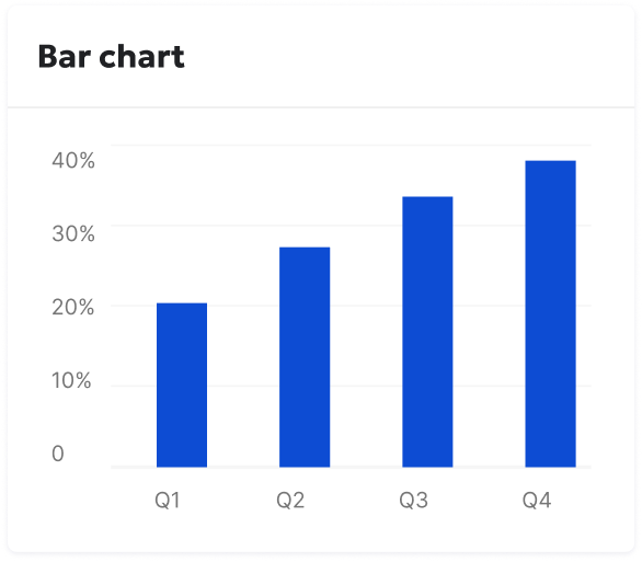
And here is an image:
## Code
Inline code: \`const x = 42;\`
Double-backtick inline code: \`\`const y = \`hello\`;\`\`
Code block:
\`\`\`typescript
function greet(name: string): string {
return \`Hello, \${name}!\`;
}
console.log(greet("world"));
\`\`\`
## Blockquote
> Simplicity is a prerequisite for reliability.
> — Edsger W. Dijkstra
## Nested list
- Animals
- Mammals
- Dog
- Cat
- Birds
- Eagle
- Parrot
- Plants
- Trees
- Flowers
`.trim();
const [messages, setMessages] = useState<ChatMessage[]>([]);
const [loading, setLoading] = useState(false);
const [streaming, setStreaming] = useState(false);
const adapter: ChatAdapter = {
send: async (draft: ChatMessageDraft) => {
setMessages((prev) => [
...prev,
{
id: crypto.randomUUID(),
role: "user",
payload: { type: "markdown", markdown: draft.content },
createdAt: new Date(),
},
]);
setLoading(true);
setStreaming(true);
await new Promise((r) => setTimeout(r, 800));
setMessages((prev) => [
...prev,
{
id: crypto.randomUUID(),
role: "assistant",
payload: { type: "markdown", markdown: typingEffectMarkdownContent },
createdAt: new Date(),
},
]);
setLoading(false);
setStreaming(false);
},
};
return (
<div style={{ height: "800px" }}>
<Chat
adapter={adapter}
messages={messages}
loading={loading}
streaming={streaming}
{...commonProps}
/>
</div>
);Simulated backend streaming
The example above hands the assistant the full response in one go and lets the typing effect animate over already-complete text. In production, a response streams in from the backend incrementally, in small, unevenly sized chunks arriving at irregular intervals. The example below simulates that more realistically: a long, varied markdown response is appended to the message a few characters at a time, on a random delay, so the typing effect has to keep up with genuinely growing text rather than a static string.
AI Assistant
const streamingSimulationMarkdownContent = `
# Traffic Overview — Streaming Simulation
## Summary
**Site:** Siteimprove.com - 2020 Website
**Period:** June 1 – June 30, 2026
## Key Insights
- **Total Sessions in June:** 56,452
- **Primary Traffic Source:** Direct Traffic (consistently the highest daily contributor)
- **Secondary Sources:** Search Engine and Internal Traffic
- **Smaller Contributors:** External Traffic, Social Media, and AI
## Text formatting
Plain paragraph with **bold text**, *italic text*, and \`inline code\` all mixed together in a
single sentence, the way real assistant responses often are. You can also combine them:
***bold and italic*** at the same time, or nest emphasis **like *this***.
## Lists
Unordered list with formatting:
- **First item** — with a bold lead-in
- Second item with *italic* inside
- Third item with \`inline code\` inside
Ordered list:
1. Step one — install dependencies
2. Step two — run the build
3. Step three — verify the output
## Link and image
Here is a [link to the Markdown specification](https://spec.commonmark.org/), inline with
surrounding text.
And here is an image:

## Code
Inline code: \`const x = 42;\`
Code block:
\`\`\`typescript
function summarize(sessions: number): string {
return \`Total sessions: \${sessions}\`;
}
\`\`\`
## Blockquote
> Simplicity is a prerequisite for reliability.
> — Edsger W. Dijkstra
## Nested list
- Traffic Sources
- Direct
- Bookmarks
- Typed URLs
- Search Engine
- Organic
- Paid
- Contributors
- External Traffic
- Social Media
`.trim();
const [messages, setMessages] = useState<ChatMessage[]>([]);
const [loading, setLoading] = useState(false);
const [streaming, setStreaming] = useState(false);
const adapter: ChatAdapter = {
send: async (draft: ChatMessageDraft) => {
setMessages((prev) => [
...prev,
{
id: crypto.randomUUID(),
role: "user",
payload: { type: "markdown", markdown: draft.content },
createdAt: new Date(),
},
]);
setLoading(true);
setStreaming(true);
await new Promise((r) => setTimeout(r, 500));
const assistantId = crypto.randomUUID();
setMessages((prev) => [
...prev,
{
id: assistantId,
role: "assistant",
payload: { type: "markdown", markdown: "" },
createdAt: new Date(),
},
]);
setLoading(false);
// Simulates a real backend token stream: small, unevenly sized chunks
// arriving on a random delay rather than the whole response at once.
// This is the condition that used to desync the typing effect's reveal
// cursor from the growing text and drop characters mid-message (PLAF-3479).
const full = streamingSimulationMarkdownContent;
let sent = 0;
while (sent < full.length) {
const nextChunkSize = 1 + Math.floor(Math.random() * 6);
sent = Math.min(sent + nextChunkSize, full.length);
const partial = full.slice(0, sent);
setMessages((prev) =>
prev.map((message) =>
message.id === assistantId
? { ...message, payload: { type: "markdown", markdown: partial } }
: message
)
);
await new Promise((r) => setTimeout(r, 15 + Math.random() * 20));
}
setStreaming(false);
},
};
return (
<div style={{ height: "800px" }}>
<Chat
adapter={adapter}
messages={messages}
loading={loading}
streaming={streaming}
{...commonProps}
/>
</div>
);