Skip to content

Settings

This guideline offers direction for creating an organized, user-friendly structure for managing preferences and customizing the platform, emphasizing that changes should typically be applied immediately.

Composition

The settings layout is ideal for composing the following elements:

Essential components

  • Base layout (Header): Clearly and concisely identifies the page subject, providing immediate context.
  • Tabs or Accordions: Organize settings into distinct categories for clear navigation. Consider using accordions for space efficiency on smaller screens.
  • Forms: The core interaction mechanism. Utilize diverse form controls with the Form element wrapper component:
    • Text Fields: For open-ended input (names, emails)
    • Select: For selecting from predefined options.
    • Checkboxes: For toggling binary choices (on/off) or allowing users to select one or more items from a list.
    • Radio Buttons: For single selections from mutually exclusive options.

Optional components

  • Tables: When displaying editable lists of items (e.g., Tags, Groups) tables offer clear structure.

Layout type

Settings should be tailored to the user's needs and the platform's functionality. Choose the appropriate layout: Link to Figma Template component ↗

When to useExample

User Input


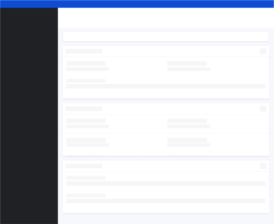
The user input layout is ideal for gathering user input through forms for configuration and preferences. (e.g., My Profile).


When designing these layouts:

  • Focus on components like Input field and Form element wrapper, enabling users to easily see the controls and understand their purpose.
  • Group related controls or themes together, potentially using separated Card or Tabs to categorize different settings.

Indicator dashboard

Split view


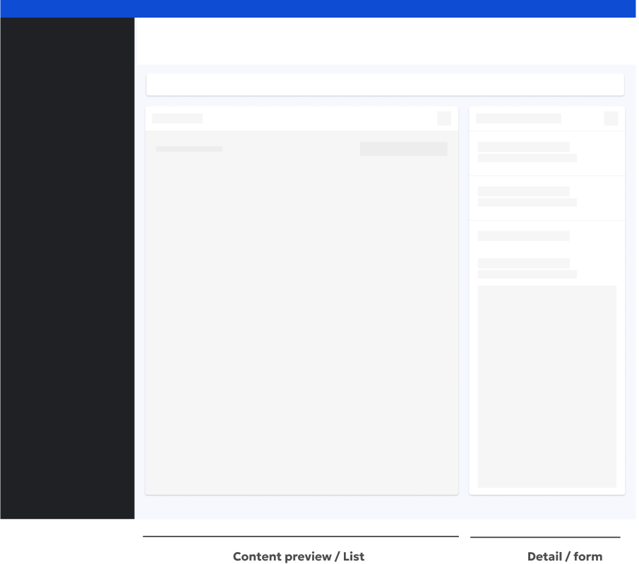
The split view layout is ideal for allowing users to see the real-time impact of their settings changes within a preview area. (e.g., Event tracking, Edit email template).


When designing these layouts:

  • Dedicate the left side to the content preview or a list of items.
  • Use the right side for the Detail view or a form where users can make adjustments.

Indicator dashboard

Guidelines

Do's

  • Employ visual hierarchy (headings, groups, whitespace) to guide the user.
  • Explain each setting's purpose and impact concisely. Utilize tooltips or inline help for additional clarity.
  • Preselect the most common or user-friendly options.
  • Cluster related settings together (e.g., all AI feature settings in one section).
  • Immediately reflect changes where possible. If not, provide clear status messages (e.g., "Saving...") using the Toast component.
  • Maintain visual harmony with the rest of the platform.
  • Reveal advanced options only when the user actively seeks them.
  • Undo/Redo: Allow users to revert changes, reducing anxiety and promoting experimentation.

Don'ts

  • Information overload: avoid overwhelming users with too many settings at once. Use progressive disclosure or multi-step wizards for complex setups.
  • Technical jargon: use plain language. If technical terms are unavoidable, provide explanations.
  • Hidden essentials: keep critical settings readily accessible. Consider a search function for large settings collections.
  • Ignoring errors: design clear error states and helpful recovery instructions.