Accessibility checklist for designers
Use this checklist to avoid common accessibility issues in your UI designs.
#What is this?
This is a checklist that Siteimprove designers can use to check whether their UI designs comply with a subset of WCAG 2.1 (level AA) guidelines related to UI design. Please reach out to us on Slack in the #ux_fancy channel if you have any questions or feedback.
#Does the checklist guarantee an accessible design?
No, but it's a solid start and you’ll have avoided a lot of common issues. To avoid other potential accessibility issues, we recommend you also consult the accessibility guidelines of the Fancy components you use in your designs. Lastly, when in doubt about anything accessibility related, don't hesitate to reach out to Fancy's accessibility experts through the #a11y_fancy channel.
#Checklist
#Hierarchy
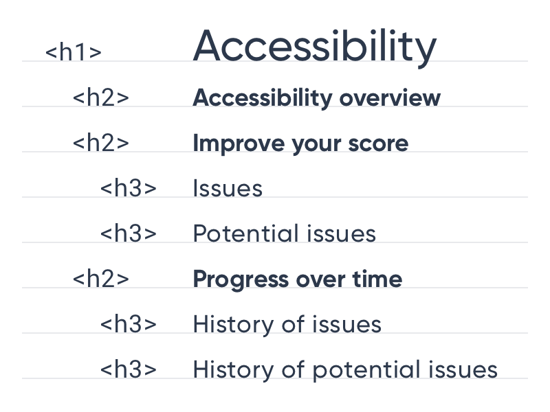
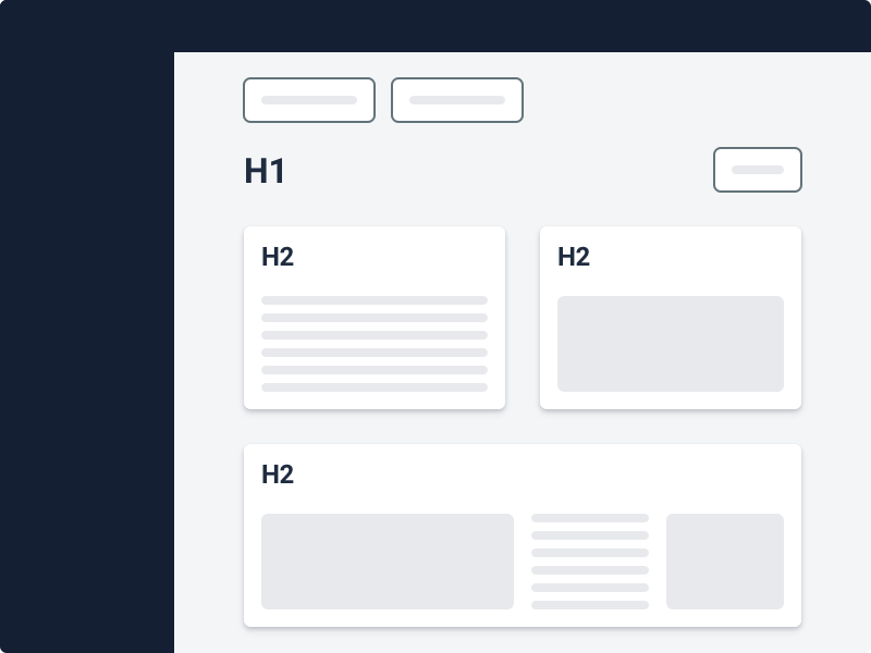
Use Headings to create a clear content hierarchy and help screen reader users navigate a page's content.
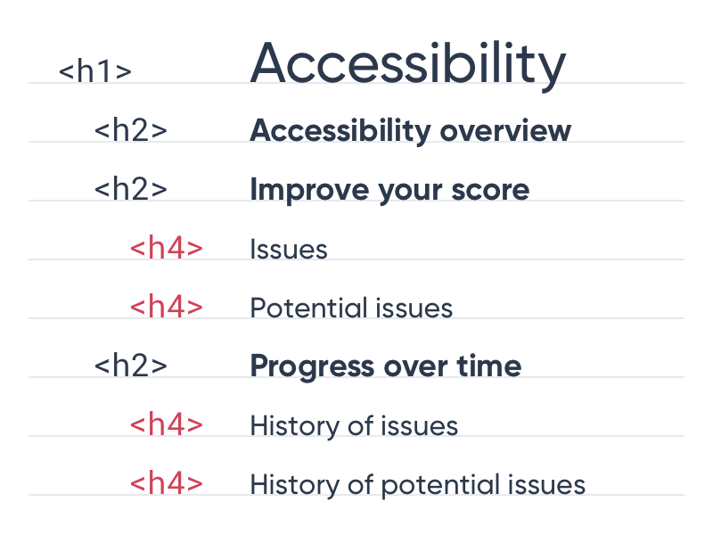
Skip Heading levels.
#H1 level
#Component or text styles
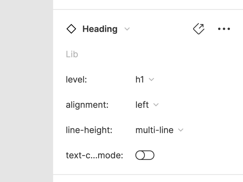
Use the text components or styles in the Fancy UI kit for Figma. This enables developers to inspect your designs and figure out the correct Heading level to use in code.
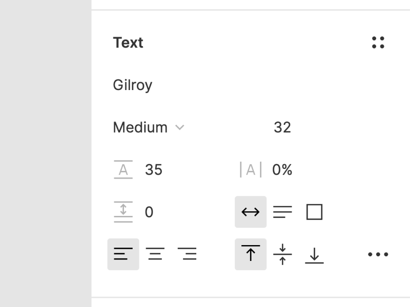
Style Heading level text manually (by selecting the font, font-size, line-height, etc.).
#Styling non-heading text
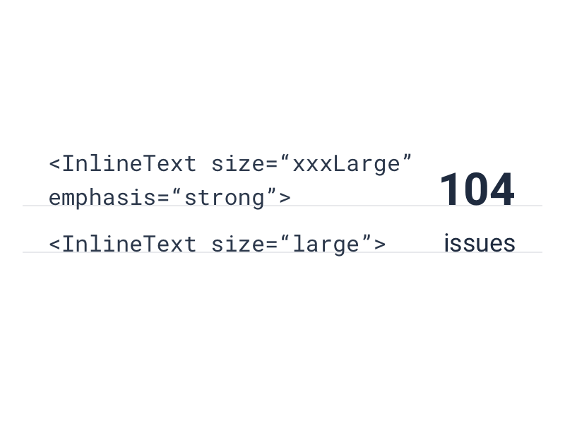
Use InlineText or Paragraph components (text styles in Figma) and their size and emphasis properties to style text that doesn’t function as a Heading.
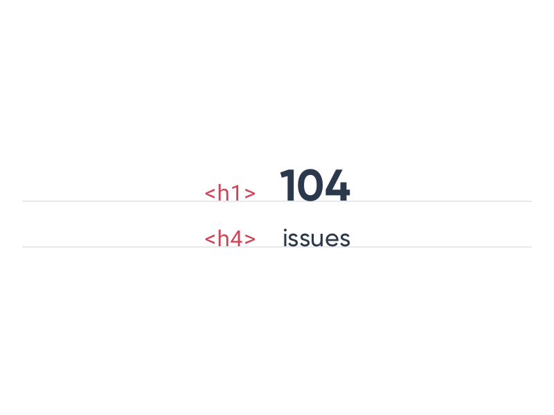
Use Headings to style text that doesn’t function as a heading.
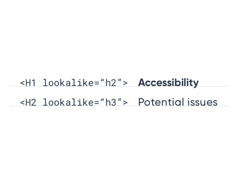
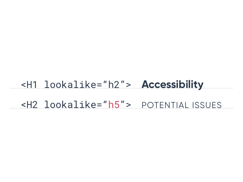
#Lookalike
#Color reliance
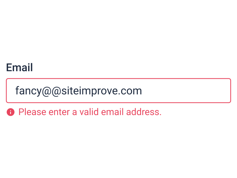
Add a descriptive label and/or graphic element, when color is used to convey something.
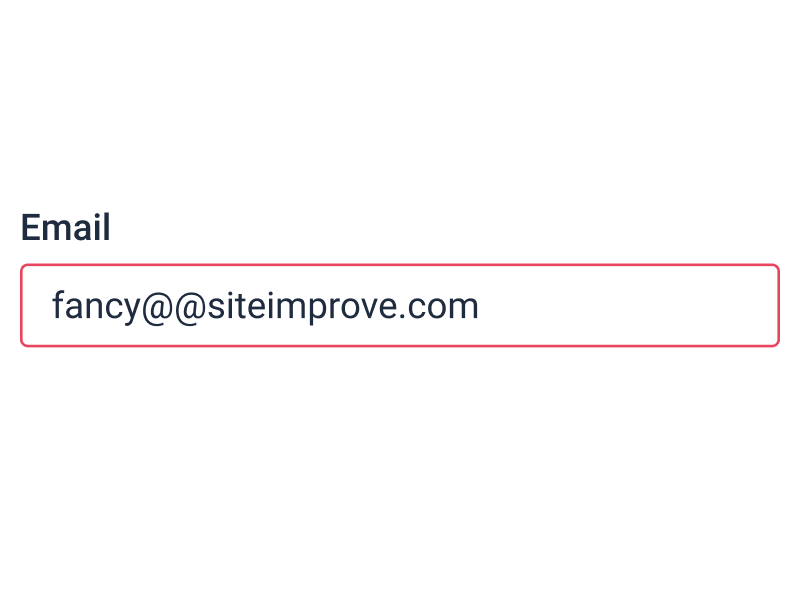
Rely on color alone to convey something.
#Text
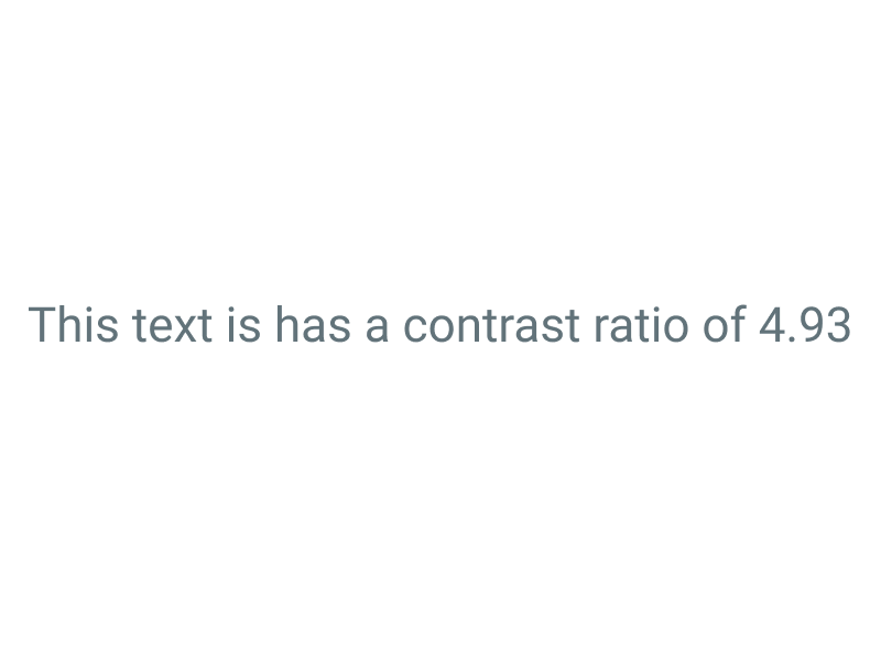
Make sure text has a contrast ratio of at least 4.5:1.

Use a contrast ratio below 4.5:1 for text.
#Graphic elements

Make sure the parts of a graphic element that are necessary to understand it, have a contrast ratio of 3:1 — both against their background and adjacent parts.

Use a contrast ratio below 3:1 for graphic elements.
#Interactive elements
Make sure interactive elements have a contrast ratio of at least 3:1.
Use a contrast ratio below 3:1 for interactive elements.
#Plugin
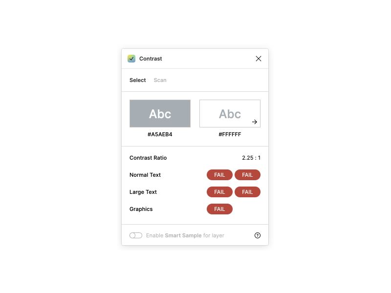
Use the pre-installed “Contrast” Figma plugin to check contrast ratios in your designs. Especially when deviating from the default border, background, and text colors.
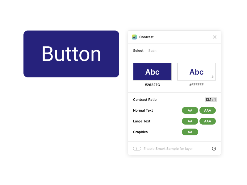
Worry about color contrast between the internal parts that make up Fancy components. They’ve been checked and pass the WCAG AA level.
#Order
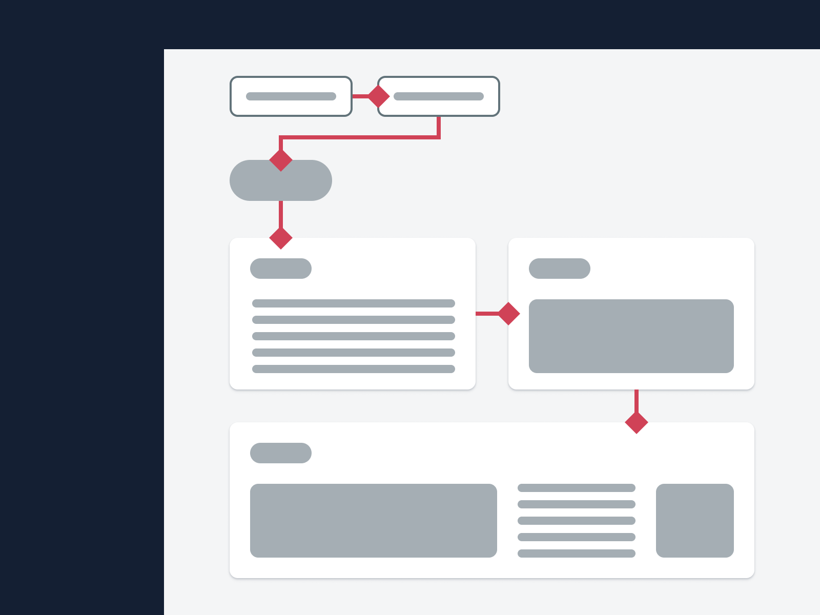
Keep in mind that screen reader uses will generally experience your design in a linear top-to-bottom, left-to-right order.
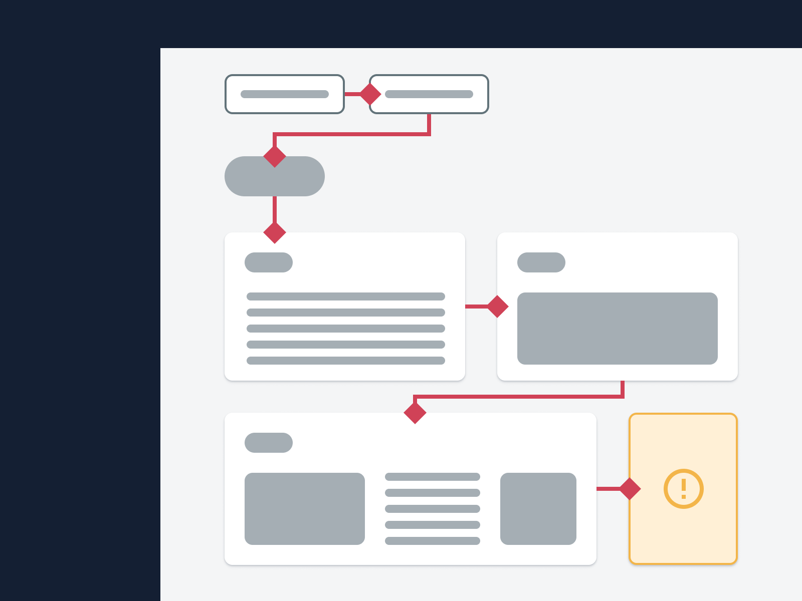
Assume all users will immediately notice visually prominent UI elements, regardless of their position on a page.
#Important information and actions
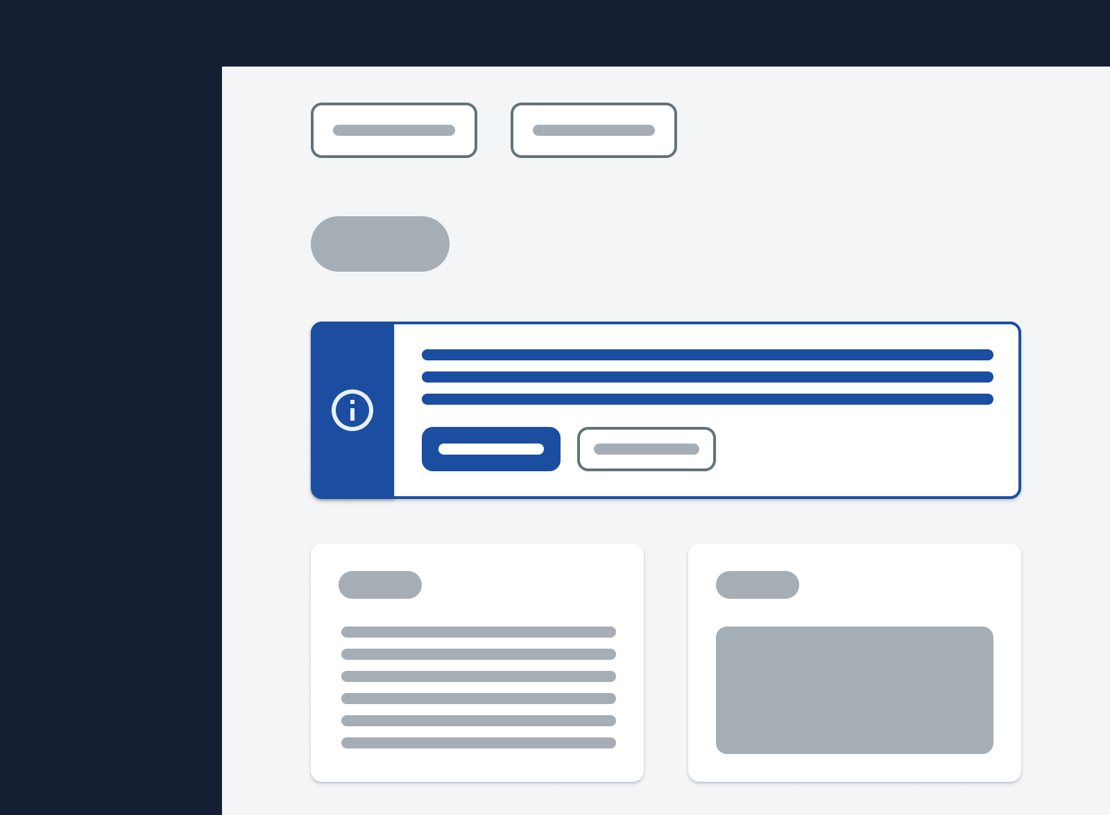
Place important information and actions before elements they concern.
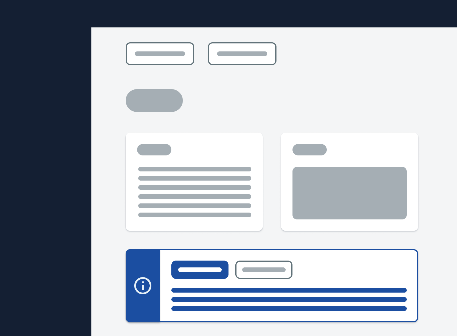
Place important information and actions after elements they concern.
#Connection
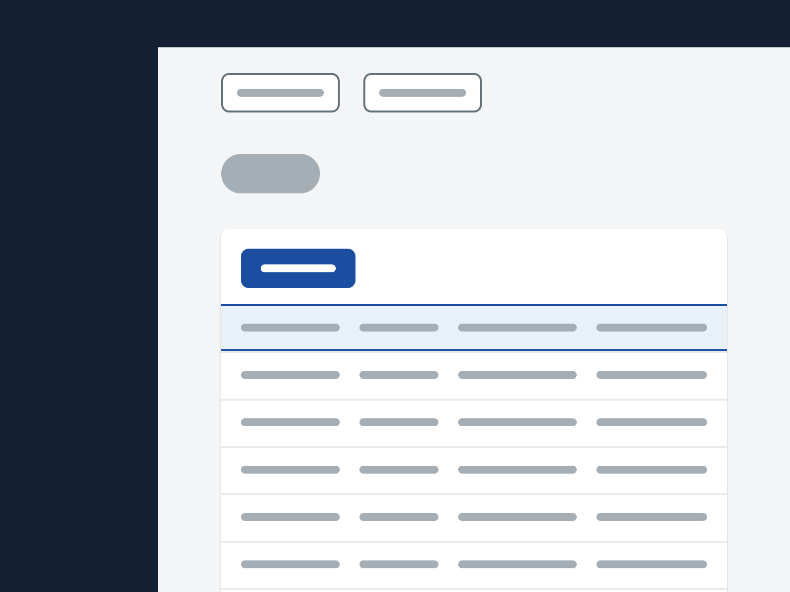
Try to place new content immediately after the element that triggered its creation.
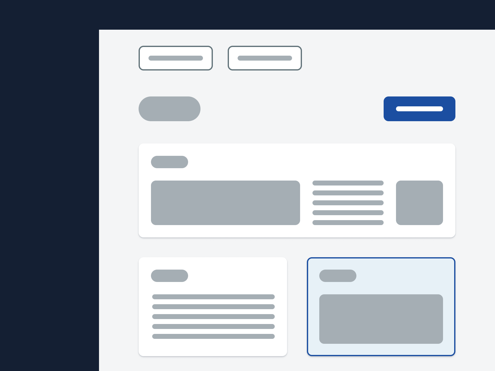
Hesitate to reach out to an accessibility specialist when this is not possible.
#Column headers

Try to put a visible label in each column header.

Omit visible column header labels for aesthetic reasons. Only omit them when every table cell in a column contains an interactive element.
#Interactive content
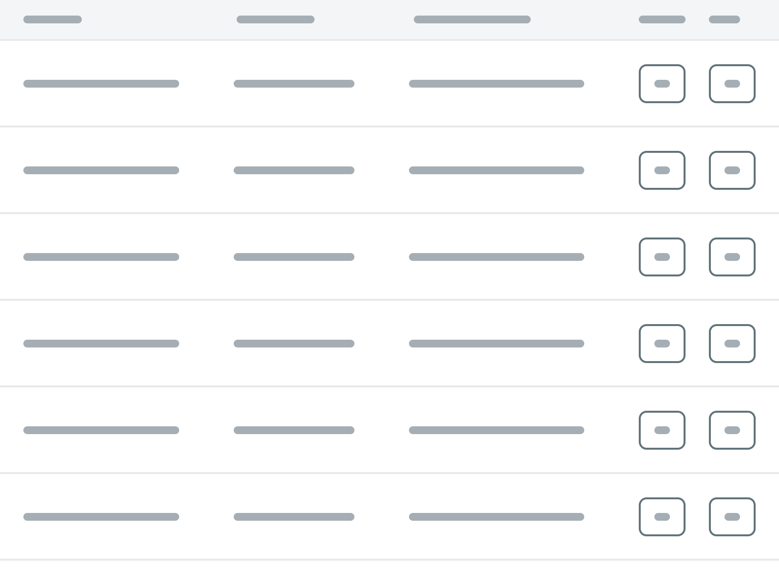
Put only a single interactive element, such as a Button, in a table cell.
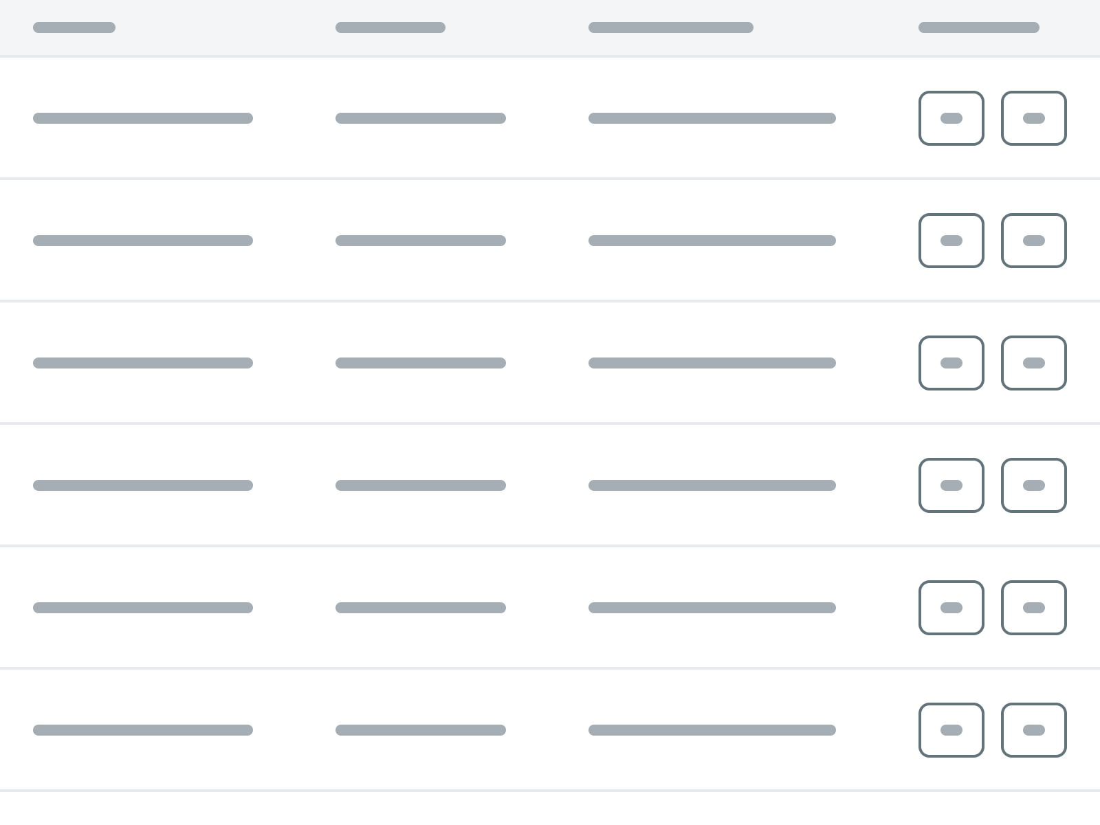
Put multiple interactive elements components in a table cell. Instead, put them in separate table cells in separate table columns.
#Static content

Try to put only a single static element, such as a piece of text, in a table cell.
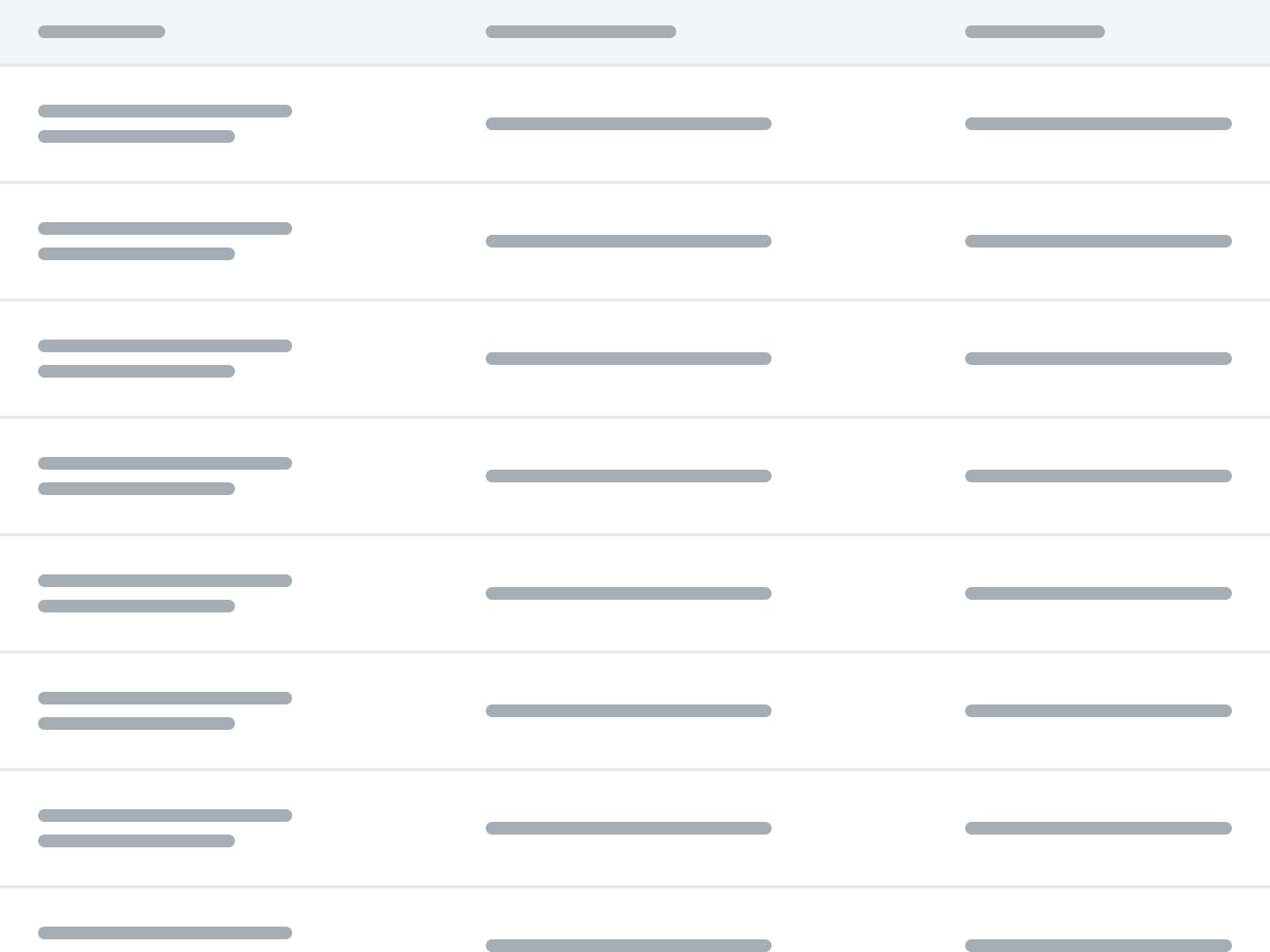
Put multiple static elements in a table cell, unless absolutely necessary. Always try splitting up such content into multiple columns.
#No data

Always put something in a table cell. When there’s no data for a table cell, put in an explanation for why this is the case.

Leave table cells empty or filled with only a symbol for missing data, such as a dash or icon.
#Visible input labels
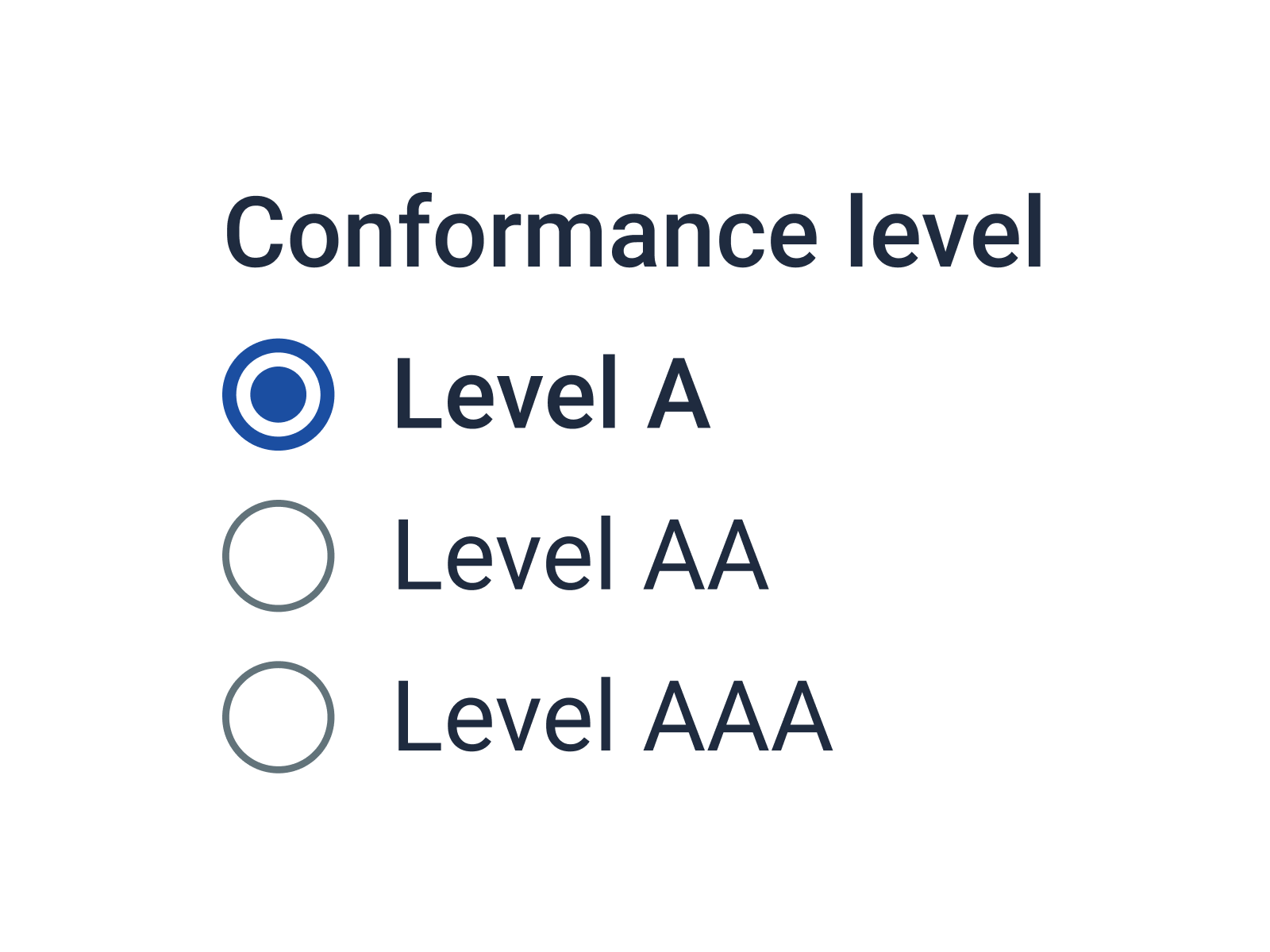
Add visible labels to input elements.
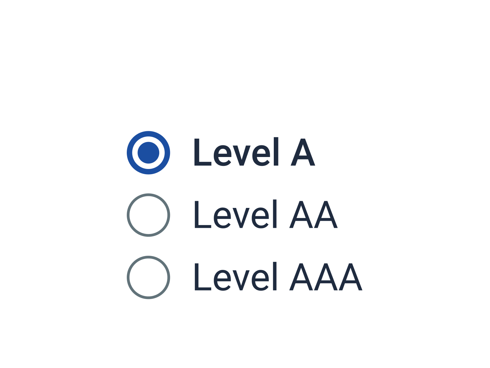
Omit visible labels from input elements.
#Placeholders
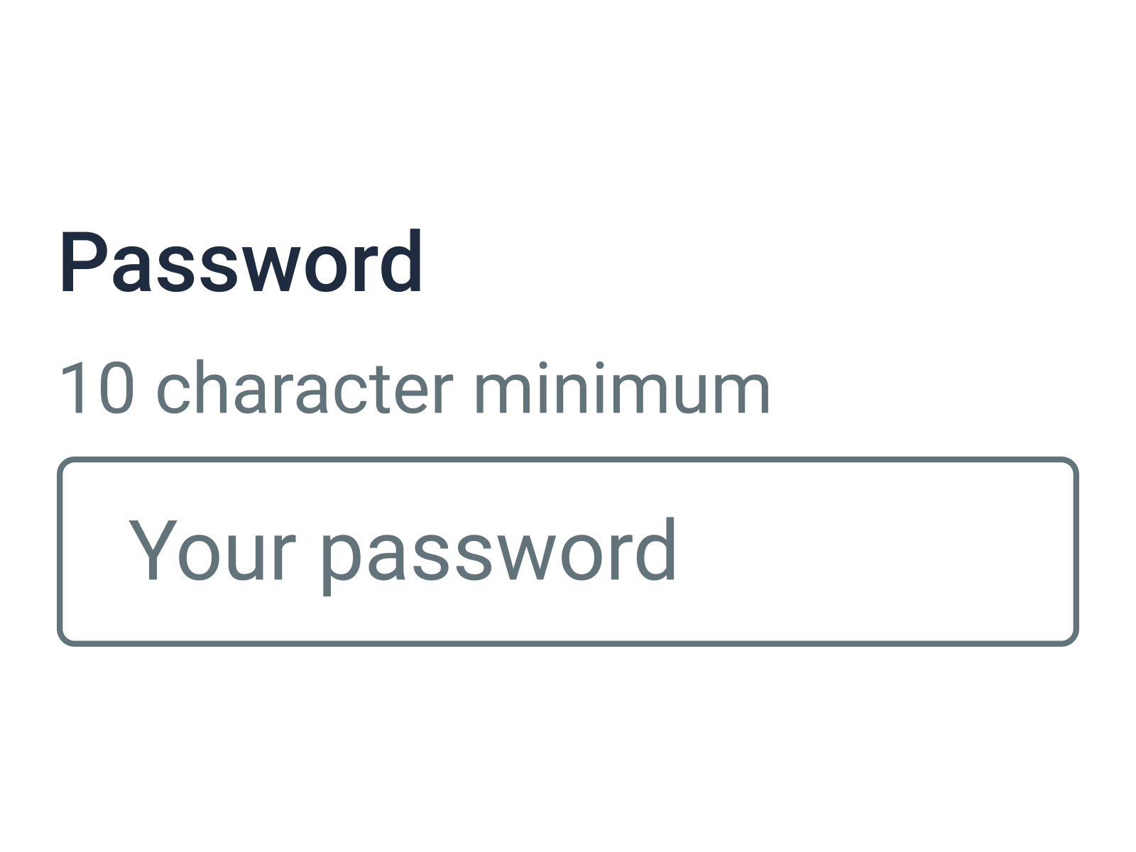
Use a visible label or help text for information essential to filling out an input field.
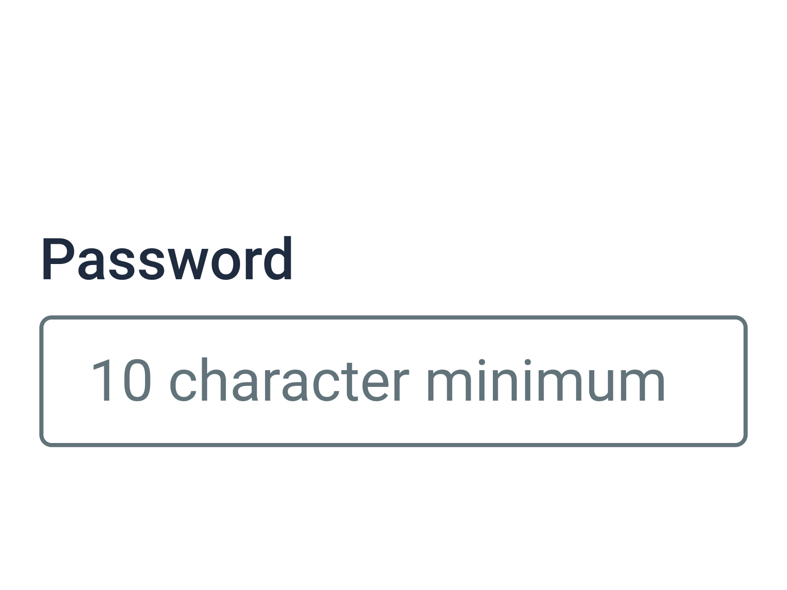
Use placeholder text for essential information.
#Required format
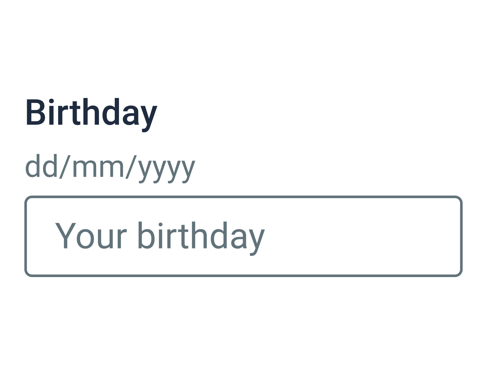
Provide instructions when an input requires a specific format (date, zip code, phone number, etc.)
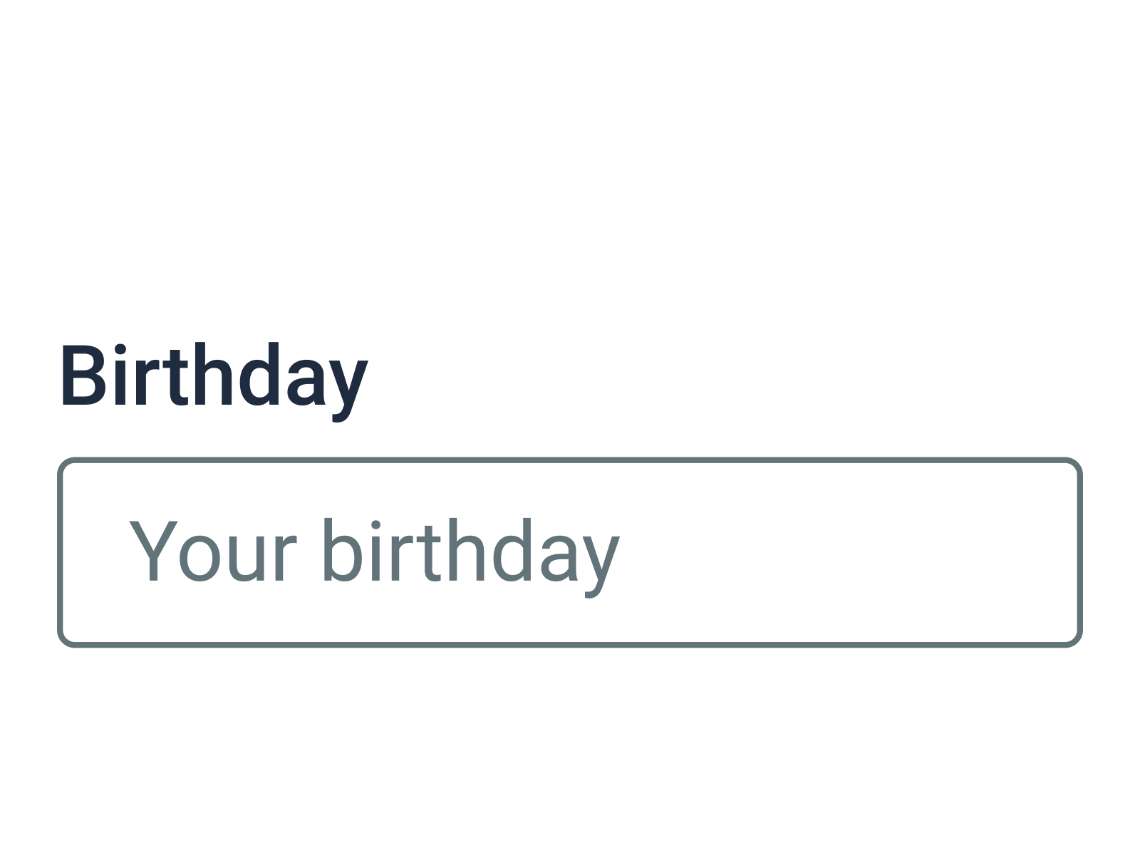
Assume users will know the correct input format.
#Multiple pages
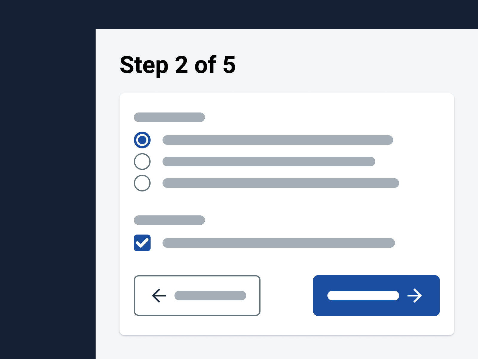
Inform users about their progress when a form is divided into multiple pages.
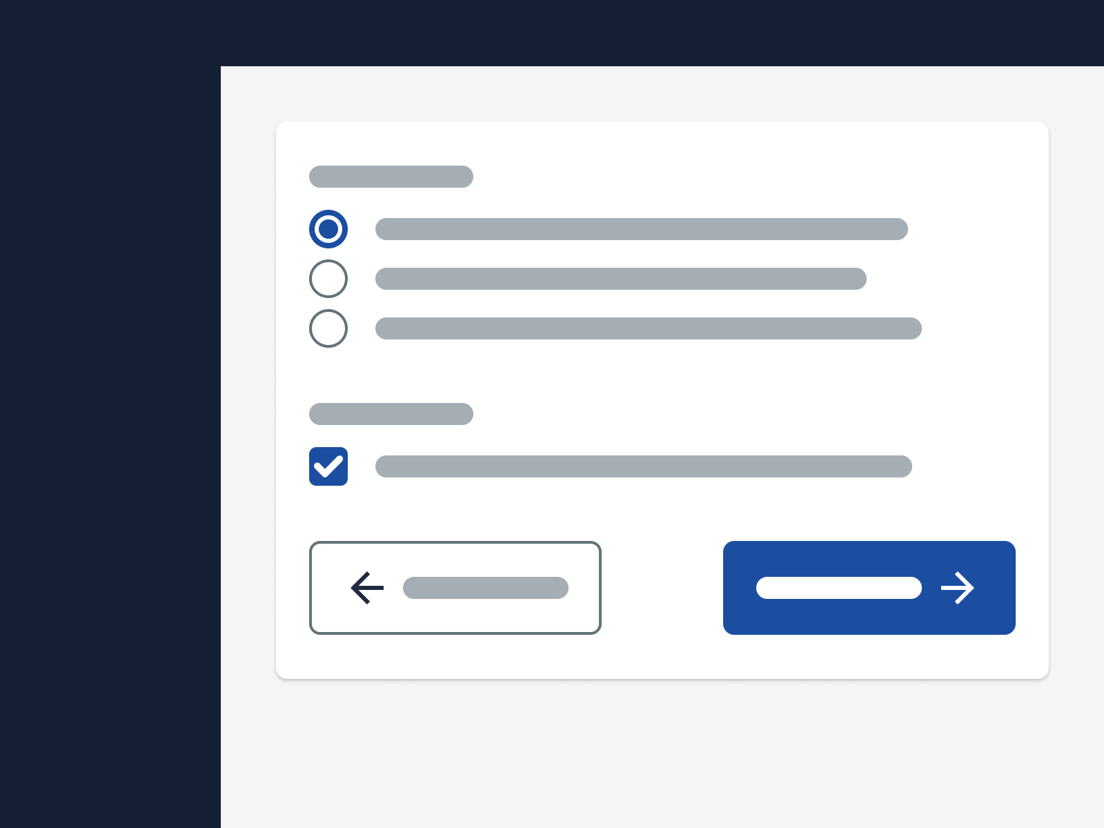
Only show users whether there’s a previous and/or next step.
#General usage
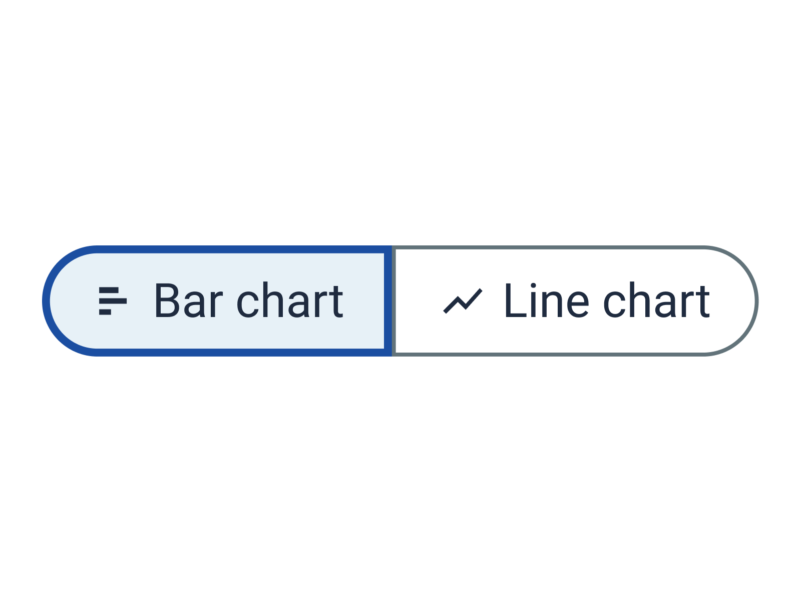
Use icons purposefully to clarify the meaning of UI elements or improve scannability.
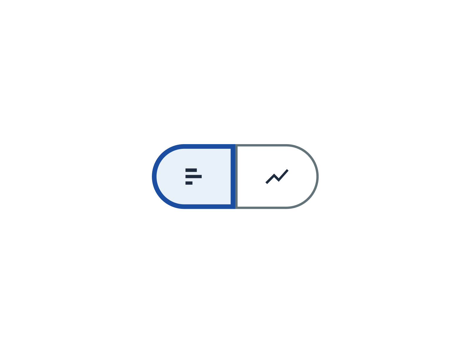
Use icons mainly for aesthetic reasons.
#Visible icon labels
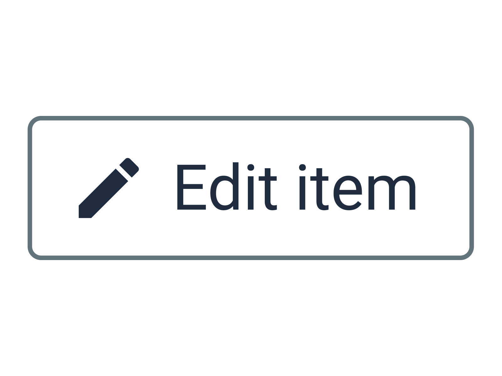
Always try to add visible labels to icons.

Omit visible labels due to aesthetic reasons.
#Tooltip
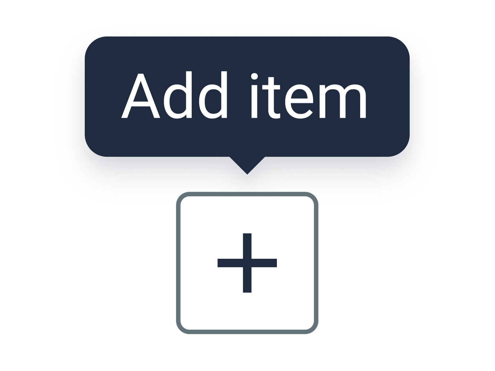
Add a tooltip to an icon if there’s insufficient space for a visible label.
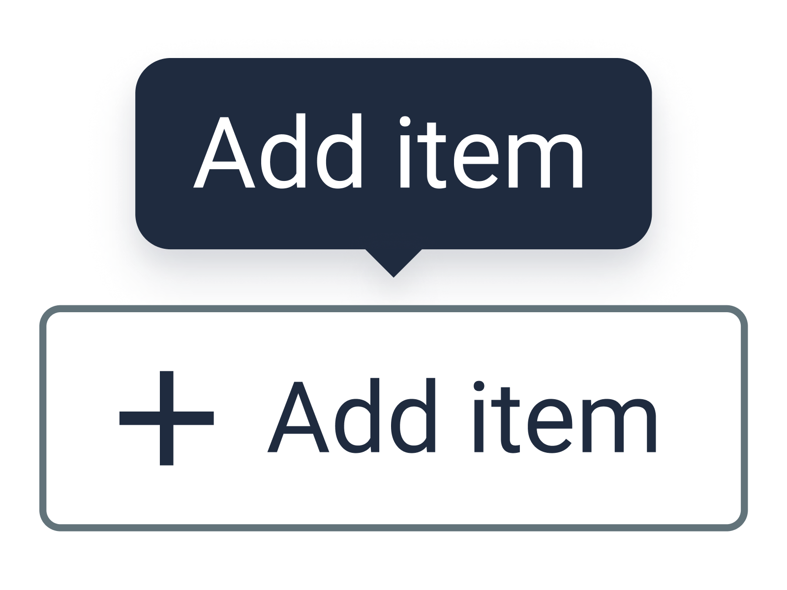
Add a tooltip if an icon has a visible label.
#Flashing animations

Avoid flashing animations as much as possible.

Let animations flash more than 3 times, and never more than 3 times per second.
#Static alternatives

Provide developers with a static alternative (image) for your animation, since users can disable animations.

Always use a single frame from your animation as static alternative. Users may struggle to understand the meaning of such an image.
#Controls

Provide controls to pause, stop, or hide videos or auto-updating content (auto-scrolling feeds, image carousels, GIFs, etc.).

Omit such controls.
