Skip to content
lab components / Visuals

Thumbnail

Thumbnails are compact visual representations of larger images or content. They provide users with a quick preview and help them navigate or select relevant items.

This is a Lab component!

That means it doesn't satisfy our definition of done and may be changed or even deleted. For an exact status, please reach out to the Fancy team through the dev_fancy or ux_fancy channels.

import { Thumbnail } from "@siteimprove/fancylab";

#Purpose

Thumbnails provide users with a quick visual overview of larger content (e.g Snapshot, image). They help users:

  • Preview content: Quickly assess if the content is relevant to their needs.
  • Navigate: Choose from multiple options without having to open each one.
  • Scan: Efficiently browse through a collection of items.

#Examples

#Composition:

  • Image: The primary visual element of the thumbnail.
  • Container: A surrounding element that defines the thumbnail's boundaries, aspect ratio, and provides optional styling (e.g., borders, shadows).

#Default
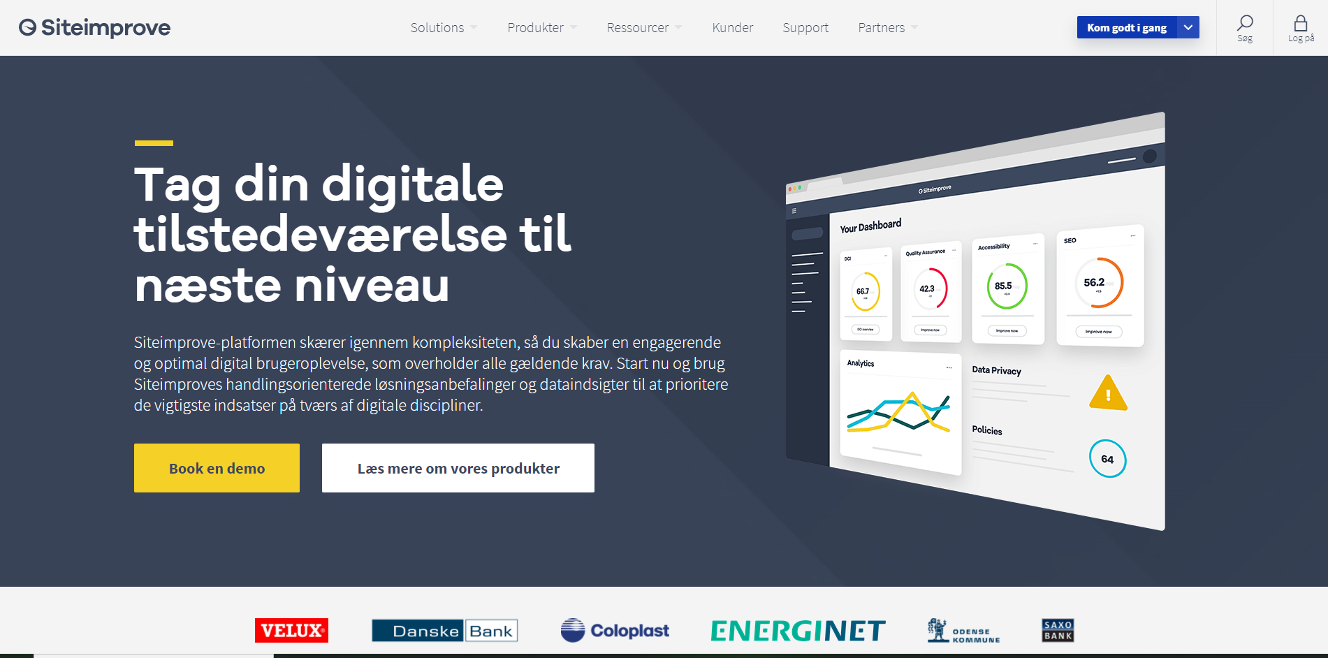
Screenshot of Siteimprove website in Danish 2020/09/25
<Thumbnail src={image} alt="Screenshot of Siteimprove website in Danish 2020/09/25" />

#Size

  • Default (Small): Ideal for displaying multiple items in a compact space (e.g., image galleries, card layouts).
  • Medium: Offers a larger preview, providing more detail for items where visuals are important.
  • Full-Width: Maximizes visual impact and is often used for featured content or in hero sections.
Screenshot of Siteimprove website in Danish 2020/09/25
<Thumbnail style={{ display: "block" }} src={image} alt="Screenshot of Siteimprove website in Danish 2020/09/25" size="small" /> <Thumbnail style={{ display: "block" }} src={image} alt="Screenshot of Siteimprove website in Danish 2020/09/25" size="medium" /> <Thumbnail style={{ display: "block" }} src={image} alt="Screenshot of Siteimprove website in Danish 2020/09/25" size="fullWidth" />

A link thumbnail is interactive and directs users to the associated content when clicked.

<Link href="https://www.google.com" unstyled openNew> <Thumbnail zoom src={image} alt="Screenshot of Siteimprove website in Danish 2020/09/25" /> </Link>

#Properties

Screenshot of Siteimprove website in Danish 2020/09/25
PropertyDescriptionDefinedValue
srcRequired
stringSrc for the thumbnail image
altRequired
stringAlt text for the image
zoomOptional
booleanShould thumbnail do a zoom effect on hover
sizeOptional
"fullWidth" | "medium" | "small"Size of the thumbnail, defaults to `"small"`
idOptional
stringId applied to the thumbnail
aria-hiddenOptional
booleanIndicates whether the element is exposed to an accessibility API.
data-observe-keyOptional
stringUnique string, used by external script e.g. for event tracking
classNameOptional
stringCustom className that's applied to the outermost element (only intended for special cases)
styleOptional
objectStyle object to apply custom inline styles (only intended for special cases)

#Guidelines

#Best practices

#General

Use Thumbnail when

  • You have a collection of visual content (e.g images) that users need to browse or select from.
  • Space is limited and you need to present multiple options efficiently.
  • To give users a quick glimpse of the content before they commit to viewing the full version.

#Placement

Thumbnail is typically used in the following places:

  • Table / List table : thumbnails provide a visual anchor, making it easier for users to quickly scan and identify specific items.
  • Site picker: thumbnails offer a quick way to visually differentiate between sites. Users can recognize their target site based on a representative screenshot.

#Style

  • Siteimprove Design System: Adhere to Siteimprove's guidelines for color, typography, and spacing. If you are not using a component from Fancy, match the styling of your Thumbnail to existing components for visual consistency.
  • Use high-quality images that are clear and representative of the content. Ensure images are properly cropped and optimized for fast loading.
  • Maintain a consistent aspect ratio across all thumbnails for visual harmony. The most common aspect ratios are 4:3, and 16:9.
  • If an image is unavailable, display a placeholder that maintains the thumbnail's aspect ratio and provides a visual indication that content is loading.
  • Thumbnails work well in grid layouts and lists. Ensure consistent spacing for visual clarity.
  • Consider adding captions below thumbnails to provide additional context or information, especially for the full-Width size thumbnail.

#Interaction

  • Provide visual feedback when users hover over or interact with a thumbnail (e.g.Thumbnail with link )
  • If necessary, use Spinner to provide feedback while thumbnails are loading, especially on slower connections.

#Do not use when

  • The content is primarily text-based or lacks a visual representation, a thumbnail may not be useful.
  • If the image is too detailed or busy to be understood at a small size, consider a different preview method.

#Accessibility

#For designers

  • Ensure sufficient contrast between the thumbnail image and its background.
  • Provide alternative text for screen readers.
  • Use clear and descriptive link text or aria-labels.

#For developers

This component comes with built-in accessibility, no extra work required.

Explore detailed guidelines for this component: Accessibility Specifications

#Writing

  • Use clear, concise, and descriptive language for alt text.
  • Avoid jargon and technical terms.